


Aydınlatma metni yükleniyor…
Mobil Uyumlu Tasarım
Günümüz internet kullanımı alışkanlığının oldukça revaçta olduğu bilinirken, elbette ki tasarlanmış olan web adresleri pek çok farklı özelliği içeriğinde barındırmaktadır. Yine mobil cihaz kullanımı da internet ile birlikte gelişmekte olurken, milyonlarca aktif kullanıcı, mobil cihazlar ile birlikte internet bağlantısını gerçekleştirebilmektedir. Daha öncesinde sadece bilgisayarlar ile uyumlu olan web siteleri, artık mobil cihazlara da uyumluluk göstermektedir. Bilmeniz gerekir ki bu özellik, responsive olarak tanımlanmaktadır.
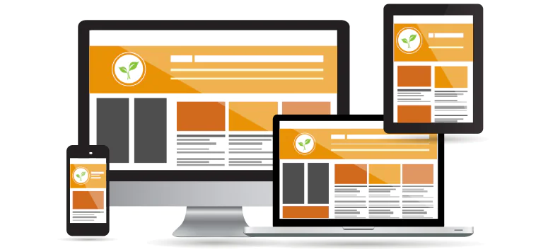
Responsive Tasarım nedir?
Web sitelerinin, mobil uyumlu tasarım halinde getirilmesi responsive olarak tanımlanabilmektedir. Genel olarak tüm cihazlarda daha iyi bir görünüm, ideal bir tasarım sağlanmaya çalışılması, kullanıcılarına kolaylıklar sunmaktadır. Bildiğiniz gibi responsive tasarıma sahip olmayan web adreslerini, mobil cihazlar ile birlikte kullanmak bir hayli zor. Bunu daha kolay bir hale getirebilmek, içeriklerin daha rahat okunabilmesi için bu uyum ciddi ölçüde önemlidir. Bunun için de geliştiriciler her bir özelliği ele alarak, kolaylıklar sunmaya devam ediyor.
Mobil Tasarım Avantajları nelerdir?
Elbette ki yukarıda da bahsettiğimiz gibi en önemli avantajları arasında, ara yüzü daha rahat kullanabilmek yer alıyor. Mobil uyum olmayan web adreslerinde, kategorilere ulaşabilmek ya da içerikte yer alan bilgilere göz atmak biraz zahmetli oluyor. Uyumlu olan web adresleri ise tüm yorumlar ve içerikleri kullanıcısına daha rahat sunabiliyor.
Kurumsal web tasarım çeşitleri nelerdir?
Bu tasarımı sınıflandırmak gerekirse, destkop yani masa üstü, tablet bilgisayarlar ve mobil cihazlar olarak sınıflandırmak mümkündür. Masa üstü kullanımlarda ara yüzü kullanmak daha kolay olurken, responsive tasarım olmayan web adresleri maalesef tablet bilgisayarlar ve mobil cihazlar için uygun olmuyor. İçerikte yer alan video, fotoğraf, makale ya da diğer tanıtım yazılarını okumak, ekranda tam olarak bulunmamasından dolayı daha zor oluyor. Bu sorunları ortadan kaldıran responsive tasarım, ekran boyutuna göre web adresini daha iyi bir hale getirirken, yine çözünürlükte cihazlara uygun bir şekilde uyumlu hale getirilmektedir.
Mobil uyumlu olmayan web sitelerin kullanımı
Her ne kadar artık pek çok web adresi mobil cihazlara uyumluluk sağlasa da, maalesef bazı web adreslerinde bu mümkün olmamaktadır. Eğer ki bir web adresinden bilgi almak istiyor, yazılara tam olarak ulaşamıyorsanız, mobil cihazın zoom özelliğini, yani yakınlaştırma özelliğini kullanarak, içeriklere göz atabilmeniz mümkündür. Ancak bu şekilde istediğiniz bilgilere ulaşabilirsiniz. Elbette ki kullanımı zor ve bir hayli zahmetli olsa da çözüm bu olabilir. Diğer uyumlu web adreslerinde zaten bu gibi bir takım sorunlar yaşanmıyor olacaktır.

Menülere ulaşamama problemi
Bir web adresine, mobil cihazlarınızdan giriş yaptığınızda, menülere ulaşamama gibi bir sorun mu yaşıyorsunuz? Elbette ki web sitesini hedef linke yazdıktan sonra sizlere sunulan seçeneklerde yanlışı tercih ettiğinizden olabilir. Geliştirilmiş olan web adreslerini hedef linke yazdığınız durumlarda, karşınıza seçenekler çıkacaktır. Mobil site olarak devam, masa üstü görünüm ya da uygulama olarak 3 seçenek karşınıza çıkmaktadır. Eğer ki mobil bir cihaz kullanıyorsanız, mobil site olarak devam et butonu tıklanmalıdır. Bu durumda menülere ve içeriklere daha kolay ulaşabilirsiniz.
Mobil site yeterli değil
Eğer ki bazı içeriklere, indirme seçeneklerine ya da daha fazlasına mobil site olarak ulaşabilmeniz mümkün değil ise, bu durumda masa üstü ana sayfa olarak devam edebilirsiniz. Böylelikle artık diğer ulaşamadığınız özelliklere de kısmen devam edebilirsiniz. Halen bunların hiç biri yeterli olmuyorsa, sadece masa üstü için uyumlu olan içeriklere, bir bilgisayar kullanarak erişebilirsiniz.
Sonuç olarak, bir web adresinin mobil cihazlara uyumlu olması, responsive tasarıma uygun bir şekilde gerçekleştirilmesi, internet kullanımı oldukça daha kolay bir hale getirmektedir.