


Aydınlatma metni yükleniyor…
Designing an e-commerce website with Shopify involves much more than choosing an attractive theme and uploading products. A sales-focused store should help customers find the right product, provide the information they need to make a confident decision and reduce hesitation throughout the cart and checkout journey. At the same time, your team must be able to manage products, content, campaigns, orders and integrations without depending on developers for every routine update.
A successful Shopify project therefore brings together commercial objectives, brand identity, catalogue structure, customer behaviour and technical requirements. Whether you are launching a new store or redesigning an existing one, the following roadmap will help you plan the complete experience—from initial product discovery to launch and continuous improvement.
Start Shopify store design with business goals
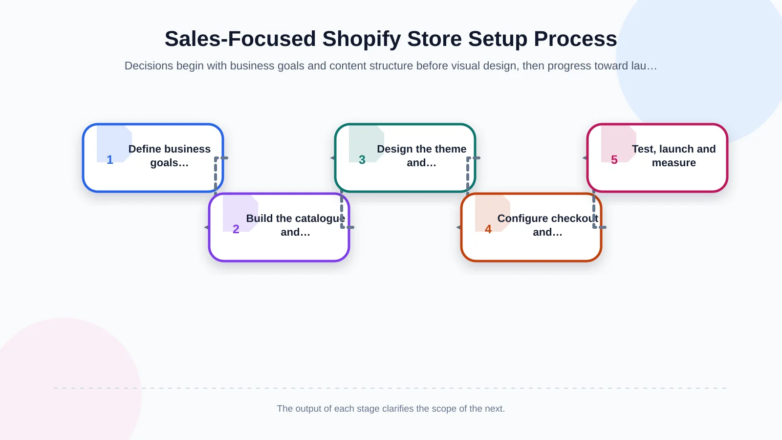
Before discussing colours, layouts or themes, define the commercial outcome the store needs to support. Your priority might be increasing first-time orders, improving average order value, growing a particular product category or entering a new market. If the primary goal remains unclear, the homepage, promotional areas and product recommendations are unlikely to work toward the same result.
Document your target customer groups, core product categories, sales regions, currencies, delivery options and current operational processes at the beginning of the project. Select meaningful performance indicators at the same stage. Events such as product views, add-to-cart actions, checkout starts and completed orders can show where customers are leaving the journey. Measurement is not an optional feature to add after design; it should inform the decisions made throughout the project.
Define real customer tasks
Describe why customers visit the store through practical scenarios. They may want to locate a specific product, compare alternatives, confirm size or compatibility, check a delivery estimate or reorder something they have bought before. For each task, identify the likely entry point, the information required and the expected next action. This helps you organise the store around buying behaviour instead of your company’s internal structure.
Build the product and content architecture first
Collections, filters, navigation and search should reflect the actual structure of your catalogue. Overlapping categories, incomplete attributes and inconsistent terminology within the business will quickly become customer-facing problems. If product data is fragmented, establish naming, category, variant and attribute standards before designing page templates.
For large catalogues distributed across multiple channels, a structured product information approach can clarify which system owns each field and who is responsible for updates. Our guide to product information management across websites, catalogues and marketplaces explains how PIM responsibilities can be separated from ERP, DAM and commerce platforms.
Organise navigation and search around product discovery
Use category names customers recognise in the main menu rather than internal department labels. A mega menu can be useful when there are many subcategories, but it should highlight priority routes instead of presenting every possible choice with equal emphasis. Test search against product names, models, categories, common abbreviations and frequently used synonyms.
Filters should be specific to the catalogue. Size and colour may be decisive in fashion, while dimensions, specifications or compatibility may matter more for technical products. Selected filters must remain visible, easy to remove and practical on a small screen. A search with no results should not end at a dead-end message; suggest close matches, relevant categories or an appropriate support route.
Should you use a Shopify theme or a custom design?
A ready-made theme can provide a fast and cost-conscious starting point. Its limitations may become apparent, however, when the store needs distinctive product discovery, specialised content templates or a stronger brand narrative. Evaluate a theme on more than appearance. Confirm that it can support the required filters, product media, promotional components, languages and accessible interactions.
Shopify’s official theme customisation guide explains how sections and settings can be managed through the theme editor, while changes outside that scope may require code editing. This distinction directly affects maintenance. Excessive code modifications and too many apps can make theme updates, testing and troubleshooting more difficult.
A custom Shopify experience does not mean creating every component from scratch. The objective is to translate typography, colour, photography, icons, spacing and motion into a consistent interface system. Each component should reinforce the brand while helping customers understand information and complete shopping tasks.
Do not turn the homepage into a wall of promotions
The homepage should communicate what the brand offers within seconds and direct visitors toward an appropriate shopping route. The opening section needs a clear value proposition, an understandable visual and a prominent action. Priority collections, featured products, trust signals and selected parts of the brand story can follow in a deliberate sequence.
Giving every campaign the same visual weight makes decisions harder. One focused message supported by relevant content is often clearer than a large rotating slider. Determine the order of homepage components from customer questions: What does this store sell? Which option is right for me? Why should I trust this brand? What are the delivery and return conditions?
Design collection and product pages as decision tools
On collection pages, customers should be able to scan product images, names, prices and essential variant or promotion details easily. Too many badges and competing actions make comparison difficult. Quick-add functionality can be valuable for simple products, but it should not send customers to the cart without necessary size, dimension or compatibility choices.
Prioritise critical information on product pages
A product page should answer purchasing objections in a logical order. The product name, price, variant selection, primary benefit and add-to-cart action should be immediately available. Delivery estimates, return conditions, stock status and payment options should appear where they become relevant. Longer content can be divided into meaningful headings, lists and expandable sections so customers can scan it efficiently.
- Provide clear product images, including close-ups and real-use context.
- Write variant names in language customers understand.
- Place size, measurement or compatibility guidance close to the selection controls.
- Explain the product’s practical benefit before presenting a long specification list.
- Use verifiable reviews, certifications and warranty information as supporting evidence.
Cross-selling should be based on usage context rather than random automation. A complementary item, bundle or repeat-purchase suggestion is useful when it helps the customer complete a task. Otherwise, it becomes another distraction competing with the main purchase.
Treat mobile commerce as its own design challenge
Shrinking a desktop interface is not enough to create an effective mobile store. Navigation, search, filters, variant selection and add-to-cart behaviour must be reconsidered for small screens. Touch targets should be comfortable, fixed elements should not hide content and important information should not be buried behind unnecessary overlays.
Test product pages on real devices, at different screen sizes and under slower connection conditions. Form fields should display the appropriate keyboard, error messages should appear beside the relevant input and customer-entered information should remain intact after an error. These details may seem minor, but together they can determine whether a mobile checkout is completed.
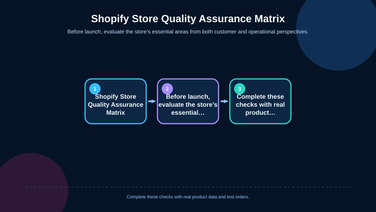
| Area | Customer expectation | Quality check | Success indicator |
|---|---|---|---|
| Product discovery | Find the right product quickly | Navigation, search and filters | Fewer searches with no results |
| Product page | Have enough information to decide | Variants, delivery and returns | Correct products added to cart |
| Checkout | Complete a short, secure transaction | Forms, delivery and payment | Successfully completed test order |
| Mobile experience | Read and interact comfortably | Real-device testing | Unobstructed task completion |
| Store management | Make easy, secure updates | Roles and content templates | Consistent publishing workflow |
Reduce friction in the cart and checkout
The cart should clearly show each product, selected variant, quantity, subtotal and any predictable additional cost. Discount conditions must be explicit, and messages such as free-delivery thresholds must use accurate, current data. When a customer changes the quantity, totals should update without unnecessary delay.
Checkout should request only the information required to complete the transaction. Delivery and payment choices need clear, familiar labels. Although Shopify Checkout provides the core environment for secure order and payment processing, brand continuity, interface copy, policies and locally appropriate payment methods still require planning. Confirm early which checkout customisations are available under the selected Shopify plan rather than discovering limitations near launch.
Plan integrations by mapping data flows
Payment providers, carriers, ERP, accounting, CRM, marketing automation and analytics tools form the store’s operational layer. For every integration, define the source of truth, transfer direction, update frequency, responsible team, error handling and retry method. If it is unclear whether Shopify or the ERP owns inventory data, the result can be overselling, cancelled orders and dissatisfied customers.
Do not evaluate an app solely by its feature list. Consider its effect on theme performance, access to customer data, subscription cost, support quality and any residual code it may leave after removal. When standard apps cannot support important business rules, a controlled custom integration may be more maintainable than combining several overlapping tools.
Manage performance, accessibility and SEO together
For a fast storefront, prepare images in appropriate dimensions and formats, remove unused apps, limit third-party scripts and test templates with realistic content. The web.dev guide to Core Web Vitals covers loading performance, interaction responsiveness and visual stability as core dimensions of user experience. Tests should include collection, product, cart and editorial templates—not only the homepage.
Each indexable page should have a unique title, useful meta description, meaningful heading structure and clean URL. Collection copy should help customers evaluate options rather than exist only to repeat keywords. Descriptive alternative text for product imagery supports both accessibility and content context.
Accessibility also needs to be part of component design and quality assurance. The W3C’s WCAG 2.2 quick reference provides actionable criteria covering text alternatives, keyboard operation, contrast, visible focus and understandable forms. Addressing these areas early is more reliable than attempting to repair inaccessible patterns after development.
Build a Shopify store your team can manage
Decide who will update campaign images, collection ordering, editorial content and product information after launch. Theme sections should offer sufficient flexibility without making it easy to break the design system accidentally. Repeated content should use structured fields and reusable templates wherever possible.
Define administrative roles according to the principle of least privilege, enable two-step authentication and remove access for former users promptly. Review app permissions periodically. Short operating guides for content entry, campaign launches, product updates and order exceptions can prevent the store from becoming dependent on one team member.
Do not leave testing and launch planning until the final week
Quality assurance involves more than checking whether pages load. Test navigation, search, filters, variants, the cart, discounts, checkout, emails and order statuses across relevant devices and browsers. Include exceptions such as failed payments, out-of-stock products, invalid promotional codes and incorrect addresses.
- Review every template with real product data and realistic content lengths.
- Verify tax, shipping, currency and payment rules for each target market.
- Confirm that analytics events trigger accurately and only once.
- Check redirects, indexing settings, domains and canonical behaviour.
- Place test orders and follow notifications and operational steps from end to end.
Assign launch-day responsibilities, define a rollback approach and agree on the indicators the team will monitor. During the first days, watch unsuccessful searches, payment errors, device-level conversion differences and customer-support requests. This evidence should shape the first optimisation backlog.
What does agency support add to a Shopify project?
A sales-focused store requires strategy, branding, content, user experience, interface design, development and operations to work together. As an Istanbul-based digital agency, Kumsal Agency combines web design, custom software, e-commerce and digital brand consulting. Its approach is to plan a consistent experience from product discovery to checkout while addressing integrations, performance, maintainability, testing and launch as parts of the same commercial system.
Contact Kumsal Agency to plan your Shopify store around your business goals, brand language and real customer needs. Whether the project is a new implementation or a redesign, its scope can be defined according to your catalogue, operations, technical requirements and growth priorities.