


Aydınlatma metni yükleniyor…
For an organisation comparing web design services in Sultangazi, “mobile friendly” should mean more than fitting a desktop page into a narrow screen. A visitor using a phone needs to understand which service is relevant, where or within which area it is available, what the first step requires and which contact route fits the task. The organisation needs to know whether a call, message or form record reached an accountable team and received a response.
This guide does not assume that every business in Sultangazi follows the same sector, budget or device pattern. Production, retail, local services, education, health-related services and corporate purchasing can require different information and enquiry systems. The goal is to define mobile priorities that can be verified with the organisation's own evidence and to avoid shortcuts that look fast while producing incomplete or misdirected enquiries.
Why is the mobile service journey a relevant planning question in Sultangazi?
The Sultangazi Municipality 2025–2029 Strategic Plan records a 2023 population of 532,802 from the address-based registration system. It identifies a young population and the presence of many organisations in production and services within its local context. The plan also includes a separate performance indicator for developing municipal services delivered through the internet and mobile application (Sultangazi Municipality 2025–2029 Strategic Plan).
These official facts do not prove that visitors to a private business always arrive by phone or behave in the same way. Device mix, mobile traffic and conversion behaviour must come from the organisation's own analytics. The narrower implication is that, in a dense district with varied neighbourhoods and service needs, access to information and transactions on a small screen deserves explicit planning.
What is the difference between mobile-first and merely responsive design?
Responsive design adapts layout to screen width. Mobile-first planning also decides which information appears first, which action is comfortable to use by touch, what loads first on a variable connection and how a visitor recovers from an interruption.
Stacking desktop service cards vertically can be technically responsive, yet the task remains difficult if a visitor must scroll through a long page to identify the right service. A large fixed call or message button may look fast, but it can generate repetitive or poorly qualified contacts when service area, timing, scope and prerequisites remain unexplained.
The starting question is not “Which component should we shrink?” It is “Which decision is this person trying to make on a phone?”
The Kumsal six-transition mobile enquiry path
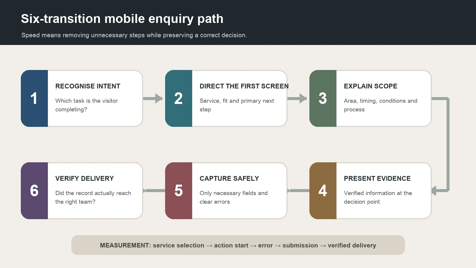
This framework reviews six transitions between a mobile visit and a qualified record delivered to the organisation. Each transition has a purpose, required information and failure condition. Speed does not mean removing fields and explanations at random; it means eliminating unnecessary steps while preserving a correct decision.
1. Recognise intent
Is the visitor researching cost, looking for same-day service, requesting a business proposal, finding an address, booking an appointment or seeking support for an existing engagement? A homepage should not compress every intent into one generic contact button. Label the most frequent and valuable tasks clearly.
Build this task list from search queries, on-site search, call notes, form topics and staff interviews rather than assumptions. A query with many impressions is not automatically the right business enquiry.
2. Direct the first screen
The first mobile viewport should identify what the organisation provides, who it serves and the primary next step. A long slogan, autoplay video, oversized decorative image or stacked notification should not push that information out of view.
The primary action can differ by page. A call may suit an urgent local service; a scoped form may suit project work; a calendar may suit an appointment; and directions may suit a store or collection point. Select channels that reflect real operations.
3. Explain scope and fit
Before contacting the organisation, a visitor should be able to see service scope, service area, minimum project or order conditions, required documents, operating time and the first process step. State the real service area instead of creating copied pages for unverified neighbourhoods.
When a fixed price is impossible, explain the variables that determine it. Avoid an unsubstantiated “lowest price” comparison. In health, legal, financial or other areas requiring professional assessment, the webpage should not decide personal eligibility or promise an outcome.
4. Present decision evidence
A mobile visitor should not need to investigate a desktop-style menu to find trust information. Verified contact and address details, clear service scope, real team or capability information, a permissioned project example, return or cancellation terms, delivery method and current legal copy can sit near the relevant decision.
A logo strip, stock image, animated counter or unattributed review is not evidence by itself. Define permission, freshness and ownership for every evidence type. Design should not imply that evidence exists when it does not.
5. Capture the smallest safe enquiry
Ask only for the information needed for the initial assessment. Name, reply channel, service selection and a short requirement summary can be a starting point, while specific projects may need additional fields. Define why each field exists, who receives it and how the visitor will receive a response.
Phone inputs need a suitable keyboard, clear validation, a visible label, sufficient touch area and safe behaviour when connectivity drops. If file upload is required, define allowed type and size, malware handling, access and retention.
Keyboard use, visible focus, labels, contrast and understandable errors are not desktop-only details. Use the website accessibility planning guide to define accessibility requirements before requesting proposals.
6. Verify delivery and outcome
A success message does not prove that the enquiry reached the correct person. Test the form record, email, CRM or other integration and team notification from end to end. For call and messaging routes, define which team responds, what happens outside operating hours and how an unanswered contact is followed up.
Measure useful events separately: page view, service selection, action start, form error, successful submission and verified delivery. Do not treat every click as a sale or a qualified enquiry. The website form monitoring guide provides an end-to-end method for regular test scenarios.
The framework's original contribution is to treat mobile experience as a governable enquiry chain—intent, direction, scope, evidence, safe capture and verified delivery—rather than as a screen-width setting.
What information should appear first on a mobile homepage?
No single order fits every organisation. A local service homepage can test the following decision sequence:
- A clear service definition and intended user
- The two or three most important visitor tasks
- Service area, timing or basic fit boundary
- Verified evidence needed for the decision
- Process, cost variables or the next step
- A task-appropriate call, form, booking or directions action
- Alternative contact and operating-time information
Validate the order with real page data. If most visitors land on a specific service page, the homepage is not the only entry. Every important landing page should support task completion without forcing a return to the beginning.
How should an organisation choose between calls, messages and forms?
Calls can help when a task requires rapid clarification, availability or urgent routing. Messaging may make it easier to share a photo, location or short context. Forms can standardise fields, present consent information and route a record into the correct process. None is automatically superior.
Answer these questions before selecting a channel:
- Is it genuinely monitored during the stated operating hours?
- Which data will the visitor share, and is it necessary?
- Can the record reach the correct service or team?
- Does the visitor know when to expect a response?
- How will an unanswered call or abandoned form be followed up?
- Is an alternative route available during an outage?
Several fixed buttons can cover a small viewport and obscure content. Choose the primary channel for the page's task while keeping alternatives accessible but secondary.
How should mobile performance be planned and accepted?
Performance is more than one score for the homepage. Measure a critical service page, contact or proposal form, image-heavy page and any integrated transaction separately. Record the tested device profile, network conditions, date, page and measurement type.
Reduce unnecessary autoplay video, oversized imagery, excessive font files, uncontrolled third-party scripts and unused components above the fold. Deliver images at appropriate dimensions in modern formats, and declare dimensions to limit layout movement. Do not remove a useful map, payment or booking function solely to improve a score; review loading strategy and user value together.
The fast corporate website planning guide can help define performance scope, test conditions and acceptance criteria. A proposal should name the templates and conditions to test rather than promise an absolute score or search position.
Does every neighbourhood need a webpage?
A query containing Habibler, Sultançiftliği or another neighbourhood name does not justify a separate page by itself. A page can be useful when there is a verified branch, different service, operating time, delivery area, accountable team or other information that changes the user's decision.
Copies that change only the neighbourhood name create maintenance work without adding information. Distinguish physical branches, service areas and advertising targets. Do not use an address, map or structured data to imply a location that does not exist.
How should web design companies serving Sultangazi be compared?
Give each candidate the same mobile scenario: a visitor searches for a particular service on a phone, checks service area, reviews two pieces of evidence, completes a short form and the record reaches the accountable team. Request a working example or a detailed solution for this journey rather than only a homepage image.
Separate these deliverables in the proposal:
- Mobile user tasks and priority landing pages
- Content order, navigation and page templates
- Rules for calls, messages, forms and bookings
- Form fields, validation, errors and success behaviour
- Enquiry routing, notification, records and backup ownership
- Accessibility, browser and device test scope
- Performance budgets for images, fonts, video and third-party code
- Content management, measurement events and reporting ownership
- TR/EN page linkage, canonicals, hreflang and redirect mapping where required
- Release, backup, acceptance, training, support and access handover
Ask which concrete deliverable and test supports broad phrases such as “mobile friendly”, “SEO friendly” or “high converting”. A portfolio image alone cannot demonstrate form delivery or mobile task completion.
What determines web design cost in Sultangazi?
Cost depends on more than page count. Relevant factors include original templates, content production and migration, number of languages, forms and integrations, user roles, accessibility level, performance expectations, test coverage, analytics events and maintenance responsibilities. A single district-wide price or a claim to be the “most affordable” provider is therefore not meaningful.
Use the same scenario, field list and acceptance criteria when comparing proposals. A basic contact page is not equivalent to a form that connects to a CRM, supports files, routes by service and records failures. State licensing and data responsibilities for third-party messaging, maps, booking or measurement services separately.
Conclusion: Design mobile speed together with correct decisions and delivery
For an organisation planning a website in Sultangazi, mobile priority is not merely a larger contact button. The site should recognise intent, direct the first screen, explain scope and evidence, collect only necessary data and verify delivery to the correct team.
The existing Turkish and English slugs remain unchanged, so this refresh requires no 301. When the six-transition mobile enquiry path is completed with real analytics, call, form and team evidence, proposals from web design companies serving Sultangazi can be compared through a testable workflow rather than visual preference alone.