


Aydınlatma metni yükleniyor…
Website design for hospitals and healthcare organisations is much more than a corporate presentation project. Patients and their relatives usually arrive with a specific task: finding the right department, reviewing a physician’s expertise, booking an appointment, reaching a location or obtaining reliable information about a service. The website’s success should therefore be measured by how easily and safely people can complete these tasks across different devices.
Healthcare users may also be dealing with uncertainty, urgency or stress. Impressive visuals alone are not enough in this context. Information architecture, plain-language content, mobile usability, accessibility, performance, maintainability and data security must be planned together. A well-designed hospital website should communicate the organisation’s expertise with confidence while operating as a practical digital service point that does not burden users with unnecessary steps.
Which user tasks should a healthcare website support?
Before defining a page list, the project team should identify why different audiences visit the website. One patient may search by medical specialty, while another looks for a physician by name. A relative may need visiting hours, an international patient may look for services in another language, and an institutional stakeholder may want to review quality certifications. Placing all these expectations under an unstructured menu makes important information harder to find.
Priorities vary according to the organisation’s service model, but most hospital and medical centre websites need to help users:
- Find a physician by name, specialty, hospital, department or location.
- Understand departments, treatments and available healthcare services.
- Request an appointment or continue to an existing booking system.
- Access addresses, telephone numbers, opening hours and directions.
- Review practical information such as test preparation and visiting rules.
- Complete essential tasks quickly and reliably from a mobile device.
These tasks should be prioritised through research, stakeholder interviews, existing website data and user feedback. The homepage should then act as a clear starting point for common journeys rather than a crowded showcase attempting to display everything the organisation offers.
Information architecture should connect physicians, departments and appointments
Healthcare websites contain many interdependent records. Physicians work within departments, departments provide multiple services, and appointment availability may differ by location. These relationships should be established in the underlying content and data model, not represented only through menu labels. When a physician’s specialty or location changes, connected department pages, search filters and results can then remain consistent.
What should a physician profile include?
A physician page may present title, specialty, practising location, education, experience, professional interests, languages spoken and an appropriate appointment route. It should not become an unstructured collection of lengthy or difficult-to-verify credentials. Scannable headings and a clear hierarchy should help users quickly understand the physician’s area of practice, where they work and what to do next.
Profiles should also have an identified owner and review process. When physicians join, leave or change locations, updates must reach search results, department listings and appointment links. A profile that looks authoritative but contains outdated information can undermine trust and create operational problems.
What should department and service pages explain?
Department pages should not consist only of medical terminology. They can explain the department’s scope, common reasons for visiting, available services, related physicians, methods used and appointment options in an understandable hierarchy. Content should provide general information rather than a diagnosis or personalised treatment recommendation.
Publishing and review responsibilities should be defined internally. Fields such as the last review date and responsible medical or corporate reviewer can strengthen governance and help teams identify outdated material. Related links should serve a genuine user need—for example, connecting a department to its physicians and locations—rather than being added merely for SEO.
The appointment journey should be short, visible and consistent
The appointment action should be easy to identify on both desktop and mobile interfaces. If a user begins from a physician or department page, the relevant physician, department or location should be carried into the next step whenever possible. Preserving context reduces repeated selections and lowers the likelihood of errors.
If the website transfers users to an external booking platform, it should clearly explain that transition. The visual language, mobile behaviour, accessibility and error messages of the external system remain part of the overall patient experience even when another provider operates it.
Forms should request only the information required for the transaction and clearly distinguish mandatory fields from optional ones. After submission, the confirmation must state whether the request has merely been received or whether an appointment is confirmed, as well as when and through which channel the user can expect a response. For the operational journey between a form and an internal follow-up system, Kumsal Agency’s guide to planning website–CRM integration provides a useful framework for field mapping, duplicate resolution, ownership and exception handling.
Mobile usability must be tested through real healthcare journeys
Responsive design is not simply the process of fitting a desktop page onto a smaller screen. On a phone, users should be able to search for physicians, apply filters, call the organisation, open directions and begin an appointment journey comfortably with one hand. A persistent appointment button can be helpful, but it must not obscure content, cookie preferences or form controls.
Touch-target sizes, text readability, menus, date pickers, validation messages and the effect of the on-screen keyboard should be tested on real devices. Large images that fail on a weak connection or buttons that shift as the user tries to tap them can create serious friction, particularly when someone needs to make a quick healthcare decision.
Accessibility should be a starting requirement
Access to healthcare information must include people with different visual, auditory, motor and cognitive needs. The W3C’s Web Content Accessibility Guidelines (WCAG) 2.2 provide testable criteria for making content perceivable, operable, understandable and robust. The intended conformance level should be agreed at the beginning of the project, and accessibility should not be reduced to an automated scan shortly before launch.
A logical heading order, keyboard navigation, visible focus states, sufficient colour contrast, meaningful alternative text and correctly labelled form fields are fundamental checks. Errors should not be communicated through red colour alone; the interface should explain both the problem and how to correct it. Video may require captions and, where appropriate, a transcript.
Automated tools can identify some issues, but they cannot replace human evaluation using keyboards, screen readers and realistic tasks. Accessibility should remain part of design reviews, development acceptance criteria and ongoing content publishing.
Speed and technical performance directly affect patient experience
Oversized media, uncontrolled third-party scripts, elaborate animations and incorrectly loaded fonts can make a healthcare website slow and unstable. Google’s Core Web Vitals guidance evaluates loading performance through LCP, interaction responsiveness through INP and visual stability through CLS. These metrics should not be treated solely as SEO indicators; they reflect whether users can reach content and complete tasks without delay or accidental input.
Images should be delivered in suitable sizes and formats, non-critical code deferred, and caching and content delivery planned. Testing should include mid-range phones and mobile network conditions, not only fast office connections. Laboratory tests help diagnose problems before launch, while real-user monitoring reveals how the live service performs across devices and locations.
| Page / Journey | User goal | Core content | Critical review |
|---|---|---|---|
| Physician profile | Choose the right specialist | Specialty, location, professional interests | Accuracy and appointment link |
| Department page | Understand the service | Scope, physicians, methods | Plain language and content approval |
| Appointment journey | Submit a request | Availability, contact details, confirmation | Few fields, secure transfer, clear errors |
| Contact / Location | Reach the organisation | Address, telephone, opening hours | Mobile calling and map access |
How should forms and healthcare data be protected?
A contact or appointment form may generate information about a person’s health through a selected department or free-text explanation. The Turkish Personal Data Protection Authority’s guide on processing special categories of personal data demonstrates why the scope and processing conditions of health data require careful assessment. Legal, information-security and operational teams should determine what data is requested, why it is needed, where it is transferred and how long it is retained.
Data minimisation should be the default. A general contact form should not ask for diagnoses, test results or detailed medical histories unless they are genuinely necessary for a defined process. Encryption in transit, role-based access, logging, secure error handling, backups and retention policies should be evaluated within the project scope. Forms can also warn users not to enter confidential medical details into unrestricted text fields.
Cookies and analytics tools belong in the same data map. Instead of adding every available tracking code by default, teams should examine its purpose and necessity. Consent controls should remain understandable and must not prevent users from performing the website’s essential tasks. Security is an ongoing responsibility requiring updates, monitoring and incident procedures—not a one-off launch checklist item.
Content management and governance determine long-term sustainability
For organisations with many physicians, departments and locations, content remains accurate only when supported by an appropriate management model. Editors should not have to update the same information separately across numerous pages. Physicians, departments, locations, services and announcements can be modelled as connected content types, allowing a central change to appear wherever that record is used.
Roles should reflect the organisation’s working practices. A content editor might prepare a draft while an authorised medical or corporate reviewer approves publication. Version history, scheduled publishing, previews, required fields and activity logs improve control and accountability. On multilingual websites, translation status should be visible so incomplete or outdated language versions are not published accidentally.
Healthcare SEO requires trustworthy, discoverable content
SEO for hospitals is not a matter of repeatedly inserting a target keyword. Physician, department, service and location pages respond to different search intentions and should be planned accordingly. Each page needs a distinctive title, descriptive headings, a readable URL, a relevant meta description and useful internal connections. Producing near-identical pages for many locations offers limited value to users or search engines.
Structured data should represent only information that is genuinely visible and verifiable on the page. The organisation’s name, address, telephone number and opening hours should remain consistent across digital channels. An expert review process and a scheduled update cycle can support accuracy, particularly for content that affects patient decisions.
What should be checked before launch?
A launch plan should go beyond confirming that pages open. Critical user journeys, content accuracy, integrations and internal responsibilities must be validated together:
- Test physician, department, location and appointment relationships with realistic scenarios.
- Check successful, invalid, interrupted and duplicate form-submission states.
- Review common browsers, screen sizes, mobile devices and slower connections.
- Inspect keyboard access, focus order, contrast, labels and alternative text.
- Verify redirects, broken links, metadata and search-engine accessibility.
- Confirm analytics, cookie preferences, backups and rollback procedures.
- Assign post-launch owners for content, security, integrations and performance.
How should a healthcare website project be planned?
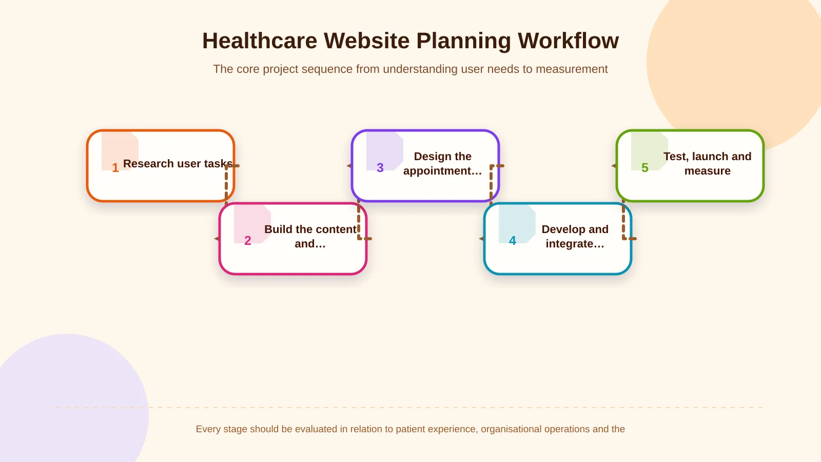
Kumsal Agency’s approach begins with research and needs analysis. Once user tasks, the organisation’s service model, content ownership, appointment journeys and integration requirements are clear, the information architecture can be defined. Brand-specific interfaces are then designed, followed by responsive development, content-management capabilities, forms and the system connections required by the project.
Performance, essential accessibility checks, data security and pre-launch testing are criteria for design and development decisions throughout the process, not tasks reserved for the end. This creates a digital experience that is visually distinctive while supporting real patient tasks, remaining manageable for internal teams and adapting to changing organisational needs.
To evaluate your healthcare organisation’s user needs, content structure, appointment journeys and integration requirements, contact Kumsal Agency.