


Aydınlatma metni yükleniyor…
Why is a real estate catalogue more than promotional material?
A corporate catalogue for a construction or real estate development brings the project’s location, architectural approach, lifestyle proposition and investment value into one coherent narrative. Prospective buyers may browse a printed copy in a sales office, investors may refer to it during a presentation, and sales representatives may share its digital version after a meeting. The catalogue must therefore do more than look polished: it should simplify evaluation, build confidence and preserve the same brand perception across every channel.
Starting with page layouts before defining the content often creates repetition, missing information and an uneven story. The audience, communication objective and usage scenario should be established first. A family evaluating a home for occupation will not ask the same questions as an investor focused on financial potential. Likewise, a sales representative who needs a concise narrative has different priorities from a corporate stakeholder conducting a technical assessment.
The strongest catalogues recognise these differences without fragmenting the brand message. They provide a clear route through the project while allowing readers to find the details that matter to them. This balance between narrative and practical information is the foundation of credible real estate catalogue design.
In what order should catalogue planning proceed?
A reliable catalogue process requires content and design decisions to be made in a controlled sequence. It should move from the brief and information inventory to message architecture, the creative concept, page-system design and production checks. This order reduces costly late-stage changes and protects the visual and editorial integrity of the finished publication.
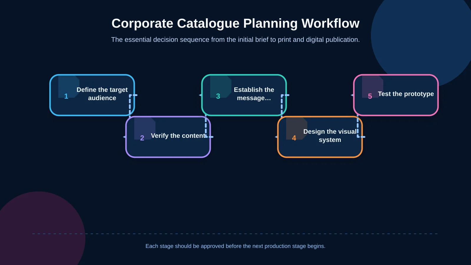
Audience and usage scenarios
Begin by identifying who will receive the catalogue, where they will use it and at which point in the sales journey. A concise project brochure for a pre-launch campaign should not follow the same structure as a detailed catalogue prepared near completion. The brief should also cover print quantity, digital distribution, language requirements and the way sales representatives will use the publication in conversations.
Content inventory and approval responsibilities
Collect the project name, location data, transport information, architectural descriptions, amenities, unit types, floor plans, technical specifications and legal notices in one inventory. Record the source, status and approval owner for every item. Areas, delivery dates, journey times and technical promises require particular care because promotional language must remain consistent with approved project information.
Message hierarchy and creative concept
Not every fact should receive equal visual emphasis. Lead with the project’s central promise, then organise the location, architecture, lifestyle and investment evidence that supports it. The creative concept should establish a shared direction for the cover, typography, colour, imagery and tone of voice. It must govern the entire page system rather than appearing only on the cover and opening spreads.
Design, prototyping and production
Once the content sequence is stable, prototype the principal page types. Test the cover, section opener, full-page image, feature explanation, site plan and unit layout before extending the system across the publication. After approval, apply the system consistently and complete editorial, visual, technical and print checks before preparing final files.
How should the content hierarchy be structured?
A clear hierarchy enables readers to understand the main value proposition even when they do not read every page. A practical sequence commonly covers the project vision, location, architectural approach, landscaping and social life, residential or commercial options, technical specifications, investment rationale and contact information. The dominant advantage of the development should nevertheless determine the final order.
Each section should answer one principal question. Location content should explain what the project is close to and how it can be reached. The architecture section should show what kind of living or working experience it creates. Plans and unit types should help readers identify an appropriate option. Short introductions, informative subheadings, verifiable facts and precise image captions are generally more useful than long, uninterrupted copy.
Differences between information shown on the website, in the catalogue and in sales presentations can undermine trust. If the project contains numerous units, plans or specifications, teams should consider managing approved information centrally. The channel-consistency principles discussed in Kumsal Agency’s guide to product information management offer a relevant framework for organising controlled information across catalogues and digital channels.
How should the visual language support architectural reality?
Renders, photography, plans, maps and icons should appear to belong to the same communication system. Colour treatment, perspective, lighting and cropping should not shift unpredictably from one spread to another. Visualisations for an incomplete development can be aspirational, but they should not create a misleading impression of approved architectural features, materials or landscaping.
A location map is not merely a decorative city graphic. It should clearly communicate access, showing major transport routes, relevant destinations and the project marker at a readable scale. When distances or journey times are included, state the mode of transport and any important assumptions. Site and floor plans should use consistent orientation markers, scales, legends, room names and area terminology.
Photography and video production should be planned for the wider communication system, not only for the printed pages. Horizontal and vertical compositions, architectural details, surroundings and short motion assets can be defined in a shared shot list. This makes it easier to carry a consistent visual direction into the project website, social media, sales displays, presentations and campaign material.
Typography and readability standards
Typography should express the brand’s character while supporting extended copy, technical tables, captions and plan annotations. Define a limited set of styles for headings, subheadings, body copy, captions, footnotes and technical data. Size, weight, line spacing and surrounding space should remain consistent whenever content performs the same function.
Type sizes should not be approved solely on a large monitor. Test printed samples at a realistic reading distance. Light text placed over a visually active render, extremely thin fonts and dense line lengths can all weaken legibility. For the digital PDF, the W3C guidance on minimum contrast provides a useful baseline: at least 4.5:1 for normal text and 3:1 for large text.
Whitespace is also part of the typographic system. Instead of filling every area, use consistent spacing to reveal relationships between headings, descriptions, images and data. For multilingual catalogues, do not assume that copy in another language will occupy the same space. Text expansion, word length, punctuation and character requirements should be tested in representative templates before production begins.
Which technical checks do print and digital catalogues require?
A print catalogue and an on-screen PDF may originate from the same design system, but their technical requirements differ. Print production depends on page dimensions, colour profiles, bleed, trim safety, image resolution, fonts and binding direction. A digital edition prioritises file size, functional links, navigation, mobile readability and download performance.
Before final artwork, obtain the printer’s specifications for page size, paper, binding, bleed and accepted PDF standard. Adobe’s guide to producing print-ready PDF files recommends preflight checks for missing links and fonts, low-resolution images and bleed settings. It also identifies PDF/X-4 and high-quality print presets as options for commercial production, although the printer’s requirements should determine the final choice.
- Confirm that cover and internal page dimensions suit the selected paper and binding method.
- Extend images and backgrounds that reach the trim edge into the required bleed.
- Keep copy, page numbers and essential graphic markers within the safe area.
- Check the effective resolution of renders, photographs, maps and plans.
- Agree on colour conversion, spot colours and black reproduction with the printer.
- Test page numbering, contents entries, section transitions and links in the final PDF.
- Review the optimised digital edition separately on phones, tablets and desktop screens.
A physical proof is especially valuable for evaluating scale, colour, paper opacity, fine lines and binding behaviour. The digital file should also be treated as a distinct deliverable rather than a heavily compressed copy of the print PDF.
| Control area | Printed catalogue | Digital catalogue | Shared objective |
|---|---|---|---|
| Colour | Printer profile and proof | On-screen appearance | Brand consistency |
| Images | Effective resolution | File optimisation | Clear and accurate communication |
| Pages | Bleed and safe area | Phone and tablet testing | Easy reading |
| Interaction | QR code and concise prompt | Clickable links | Seamless transition |
| Delivery | Print PDF and preflight | Compressed, accessible PDF | Version control |
How should QR codes and digital touchpoints be integrated?
A QR code can connect the printed catalogue to a project website, virtual tour, current plans, video or enquiry form. Adding one to every spread, however, does not automatically improve the experience. Its destination should be a natural continuation of the surrounding content, supported by an explicit prompt such as “Explore the virtual tour” or “View current floor plans.”
Because a destination may change after printing, a managed redirect and a responsible owner are useful. Test each code at its intended physical size using different phones, viewing angles and lighting conditions. DENSO WAVE, the QR Code developer, specifies a quiet zone four modules wide around the code. Logos, text and decorative elements should not obstruct the pattern, and sufficient contrast must be retained.
Digital touchpoints should not be planned independently from the catalogue. Messaging, visual direction and calls to action should connect with the project website, social content, email templates, advertising and sales presentations. A prospect moving from print to a digital destination should encounter a continuous brand experience rather than a conflicting tone, promise or set of facts.
Quality control and approval workflow
Catalogue approval should not sit with marketing alone. Architects should validate plans and technical details; sales teams should confirm unit choices and recurring customer questions; legal advisers should review claims and required disclosures; and brand teams should protect verbal and visual consistency. One current comment log and a clear version number reduce conflicting amendments from multiple PDF copies.
Final review can be divided into three layers: content accuracy, visual consistency and technical production. Content checks cover names, figures, dimensions, dates and contact information. Visual checks address alignment, styles, cropping, legends and plan markers. Technical review covers bleed, colour, resolution, links, fonts and export settings. Whenever possible, approve a proof that approximates the intended paper, scale and binding.
Kumsal Agency’s approach to catalogue design
Kumsal Agency treats a corporate catalogue as part of an integrated brand communication system rather than an isolated print-design assignment. Research-led digital brand consulting is combined with Art Director-led creative concepts, visual direction and design production. Content hierarchy, page architecture, digital identity and connected touchpoints are planned within the same strategic framework.
Depending on the project, production can include photography, video, animation, architectural visual direction and supporting digital material. This approach helps establish a consistent language across the catalogue, website, sales presentation, social media and campaign assets. The outcome is not simply an attractive publication, but a durable system that sales, marketing and corporate communication teams can use with confidence.
Conclusion: Trust begins with a properly planned catalogue
Corporate catalogue design for construction and real estate projects combines audience analysis, verified information, purposeful message hierarchy, consistent visuals, readable typography and controlled production. A successful catalogue does not overwhelm readers with data. It explains the project’s difference, supports claims with credible evidence and guides each audience towards an appropriate next step.
Contact Kumsal Agency to plan a brand-aligned corporate catalogue and supporting digital communication materials for your construction or real estate project.