


Aydınlatma metni yükleniyor…
When a corporate website, e-commerce platform, customer portal and mobile app are developed by different teams, small visual differences can multiply quickly. A primary colour appears under several codes, heading sizes vary between screens, and button radii or animation timings change across the product. The result is more than visual disorder: development slows down, accessibility decisions become inconsistent, and every brand update requires manual work across numerous files.
Design tokens turn decisions about colour, typography, spacing, dimensions, radii, shadows and motion into named, shared and manageable values. They establish a contract between design and software that does not depend solely on visual files. Used well, tokens allow web, iOS and Android experiences to express the same brand character without forcing every platform to become an exact copy of the others.
What is a design token?
A design token is a piece of data that represents an interface decision through a meaningful name rather than a raw value. Instead of inserting a colour code directly, a team might use color-action-primary. A 16-pixel value could become space-medium, while a 200-millisecond duration could become motion-fast. The Design Tokens Community Group’s Design Tokens Format Module similarly treats tokens as platform-independent design decisions that can move between tools and technologies.
Scope is what distinguishes a token from an ordinary CSS custom property. A CSS variable is one possible technical implementation on the web; a token first describes brand meaning and intended use. The same source can later be transformed into CSS variables for the web, theme values for Android, and suitable colour or text styles for iOS. A token system should therefore become a shared product language, not merely a code-organising technique for developers.
Why brand consistency means more than copying identical values
Consistency does not mean applying the same colour code or pixel measurement to every screen. Browsers, iOS and Android have different conventions for typography scaling, navigation, touch targets, dark mode and accessibility. The brand’s essence should remain recognisable while the implementation adapts to each platform. An accent colour, for example, may stay consistent across all three channels, while text size and component height respond to device accessibility settings.
This distinction prevents a design system from becoming a generic interface library. The objective is not to make every brand look alike, but to express a distinctive visual direction through rules that teams can implement. In Kumsal Agency’s research-led Digital Brand Consulting and Art Director-led design approach, brand character, user needs and experience principles are defined first. Tokens then become the technical carriers of those decisions.
How should a token architecture be layered?
A sustainable architecture usually has three layers. Primitive tokens store foundational palette colours, type families and sizing steps. Semantic tokens describe what those values do, such as defining primary text, a surface, an error state or a primary action. Component tokens provide controlled decisions for a specific element, such as a button, card or form field, when that additional precision is genuinely necessary.
- Primitive layer: foundational values such as
blue-600,space-16andradius-8. - Semantic layer: purpose-led names such as
color-surface-brand,text-secondaryandspace-section. - Component layer: controlled customisations such as
button-primary-backgroundorcard-radius.
When components reference semantic tokens instead of raw colour codes, changes such as light and dark themes become easier to manage. The semantic token text-primary can resolve to a dark value in a light theme and a light value in a dark theme. Its meaning remains stable even though its technical value changes with context.
How to create design tokens for web and mobile
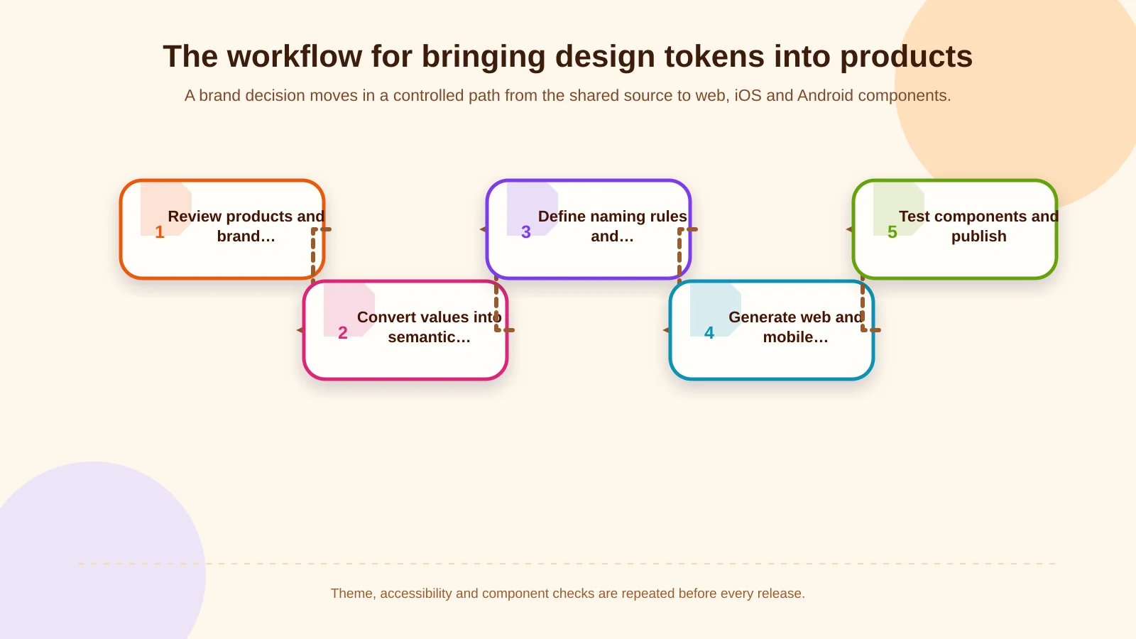
1. Inventory the brand and its products
Do not begin by extracting colours from one design file. Review the corporate website, e-commerce journeys, portal interfaces and mobile apps together. Record repeated values, contradictions, accessibility risks and distinctive brand expressions. Include established decisions about colour contrast, typography, interaction and responsive behaviour so the inventory reflects the product as users actually experience it.
2. Convert visual decisions into roles
Identify where each value is used and what it means. Rather than labelling a colour simply “red,” determine whether it represents an error, warning or brand accent. For typography, evaluate family, weight, line height and letter spacing together, not just font size. Motion tokens should account for easing and reduced-motion preferences as well as duration.
3. Define naming and governance rules
Token names should not be overly dependent on one platform or current tool. A clear category-role-state structure helps designers and developers locate the same concept. Give every token a description, owner, reason for change and usage example. This supporting information reduces ambiguity as the system expands and new teams begin using it.
4. Generate platform-specific outputs
Transform the shared source according to the needs of each channel. Outputs might include CSS custom properties or theme objects for the web, TypeScript theme values for React Native and native resources for platform-specific layers. Google’s guide to custom design systems in Compose shows that colour, typography and shape systems can be extended or replaced with brand-specific structures. This flexibility makes it possible to preserve platform strengths while creating a distinctive system.
5. Validate tokens through components and release them
Test tokens in buttons, forms, cards, navigation and feedback states rather than reviewing them in isolation. Validate light and dark themes, small and large screens, long content, localisation, keyboard use and text magnification. Once approved, release the version with documentation and a change log so product teams know what changed and how to adopt it.
Which decisions should token categories cover?
Colour tokens should cover not only the brand palette but also roles for text, surfaces, borders, focus, success, warning and error. Typography tokens should define semantic styles such as headings and body copy. Spacing tokens should establish a deliberate rhythm instead of preserving every arbitrary gap found in legacy screens. Dimensions, corner radii and shadows help components feel as though they belong to the same family.
Motion is also part of brand experience. Teams can define distinct durations and easing curves for quick feedback, page transitions and emphasis. Each motion decision should, however, have an accessible alternative that respects reduced-motion settings. Depending on the product, the system may also include icon size, stroke width, elevation and focus-ring tokens. Categories should be introduced because they govern repeated decisions, not merely to increase the token count.
One brand across platforms, implemented for context
Responsive layouts, browser variation, keyboard focus and flexible type sizes matter on the web. iOS requires attention to safe areas, Dynamic Type and system conventions. Android introduces density-independent dimensions, theme roles and varied window sizes. Apple’s accessibility guidance recommends supporting larger text and system accessibility features. A typography token should therefore define a scalable role rather than enforce an inflexible visual size.
A shared theme can significantly improve delivery speed for iOS and Android products built with React Native. Even so, teams must handle status bars, navigation patterns, touch feedback and platform-specific accessibility behaviour deliberately. Planning a branded mobile application should make both shared and platform-specific decisions visible before focusing on the percentage of code that can be reused.
| Decision | Web | iOS | Android |
|---|---|---|---|
| Colour roles | CSS theme values | Light and dark appearances | ColorScheme roles |
| Typography | Flexible scale and rem units | Dynamic Type | Scalable text |
| Spacing and dimensions | Responsive spacing | Safe areas | Density-independent dimensions |
| Motion | Reduced-motion settings | System preferences | Animation scale |
How does a single source of truth connect design and development?
A single source of truth does not require everyone to work in one file. It means the design tool, code repository and documentation are connected through a defined publishing workflow. Token ownership is explicit; changes are reviewed, versioned and subjected to automated checks. Generated platform files should not be edited by hand. They should be rebuilt from an approved change in the authoritative source.
This workflow also makes differences between design and production code easier to find. Teams can identify unused tokens, broken references, conflicting values with similar names and potential accessibility failures before release. A design-system team may govern the source and publishing rules while product teams consume tokens through approved components. Central governance can therefore protect quality without unnecessarily restricting product delivery.
How should token changes and versions be managed?
Changing a primary colour may appear simple, yet it can affect dozens of components, theme variants and platforms. Token updates should be managed like software releases. Backwards-compatible additions, behaviour-changing updates and removals need separate treatment, and release notes should identify affected products.
- Document the brand, user and technical reasons for every change request.
- Compare representative web, iOS and Android components in a preview environment.
- Run contrast, text-scaling, theme and visual-regression checks.
- Deprecate old tokens for a defined migration period instead of deleting them immediately.
- Review adoption, defects and user feedback with product teams after release.
A controlled process turns a brand refresh from weeks of scattered fixes into a predictable product update. For multi-brand, multilingual or dealer-themed platforms, variant theme sets can remain connected to a shared core, making differences intentional and traceable.
How can success be measured?
Success should not be measured by the number of tokens created. More useful indicators include the proportion of hard-coded values in components, design-to-code discrepancies, the time required to publish a brand change and the reuse rate of components across products. Accessibility defects, visual regressions and the time team members need to locate the correct token can also reveal whether the system works in practice.
Start with a pilot built around critical journeys. Login, product listing and checkout components, for example, can move to the shared system first. Observe gains and bottlenecks, then improve naming, documentation and automation before expanding across the product portfolio. This phased approach generates evidence without requiring every interface to migrate at once.
Common design-token mistakes
A frequent mistake is automatically turning every existing raw value into a token. That only gives inconsistency a set of names. First decide which decisions should be retained, consolidated or removed. Another mistake is tying tokens too closely to individual component names, reducing reuse. Systems that grow without a semantic layer become increasingly difficult to theme and maintain.
Platform differences can also be misread as inconsistency. Making iOS and Android interactions look identical is not always the correct objective; brand principles should remain coherent while platform expectations are respected. Undocumented naming, unclear ownership, manually maintained outputs and untested bulk updates create further technical debt.
A brand-specific design system with Kumsal Agency
Design tokens involve more than changing the colours in a ready-made theme. Kumsal Agency combines digital brand consulting, Art Director-led digital design and software development in one process. Research establishes the brand direction and experience principles; those decisions are then translated into an interface system for websites, e-commerce experiences, customer or dealer portals and mobile products.
A project-specific web design service, custom web software and React Native development for iOS and Android can all consume the same token architecture. The design system therefore becomes a tested, evolving part of real components rather than a static presentation document.
A shared language for sustainable brand consistency
A well-designed token system does more than specify where to use a colour or spacing value. It determines how brand decisions continue to live across teams, products and channels. With a shared source, semantic layers, platform-appropriate outputs, accessibility checks and version management, organisations can develop web and mobile products faster and update them with greater control.
Contact Kumsal Agency to create a distinctive, maintainable and sustainable design system for your web and mobile products.