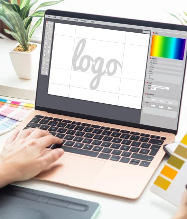
The Importance of Your Logo Design (Identity) in Representing You
We can define the word "logo" as the representation of you, or rather, your business on paper. A logo is specially designed for businesses so that people can understand who you are and what you do when they look at it. Is a logo only for businesses? Of course not, people who feel the need to introduce themselves, who are in working life and have their own business cards, can also use it. As a result, anyone who wants can create a logo for their own name.

Points to Consider in Logo Design
As stated above, the logo must fully describe the company it represents. It would not be wrong to say that a logo is the identity of a business. The colors, font styles, sizes, lines, and graphics you use are all small details, but when they come together, they express you completely. For this reason, every line used in the logo must be used carefully. A good logo should be message-giving. For example, if you are a construction company and you present your business card with your logo on it to someone, that person should first feel a sense of trust. They should feel that you use quality materials, that the house you build is durable, and that their family will be happy in it. The logo should be designed according to the target market. For example, if the target market is children, the fonts should be more dynamic and fun. Or, if the target market is women, colors and drawings for women should be used.
In other words, it must be eye-catching, descriptive, shout to the customer "you must examine me!, don't pass me by!" and most importantly, it must be memorable.
A good logo should be unique to your company. A logo designed for you should not lead the customer to a different brand, or resemble the logos of similar brands.
The colors you use should be appropriate without clashing, confusing, and should be no more than three colors for the sake of simplicity. Technically, when a logo is designed, it should be designed with the thought that it can be used in different sizes on promotional tools such as various notebooks, notepads, mugs, and canvases, and should have a look and resolution that will not be distorted during scaling down and up.

Colors to Be Used in a Logo
When designing a logo, the sectors in which colors are used have matched due to the emotions they express. For example; Red is used a lot in the food sector because it is an appetite-stimulating color that increases blood pressure. Green is the color of nature and represents trust and peace. This is why it is frequently used in bank logos. Businesses that want to attract attention and give a message of warmth use the color yellow. While using white, black, pink, purple, and orange colors, their meanings and their effects on the human subconscious must be known and used in the logo to express your sector.
Since the logo must give the right message in the right way, it must be done by professionals. It should not be forgotten that the logo represents you where you are not.
