


Aydınlatma metni yükleniyor…
E-commerce website design involves far more than displaying products in an attractive interface. Customers need to find the right product, compare their options, review their cart with confidence and complete payment without uncertainty. An unexplained charge, forced account creation, confusing form or technical delay at any point can interrupt that buying task.
Cart and checkout flows should therefore not be treated as a few screens added near the end of a project. Information architecture, content, interface design, inventory and pricing rules, payment infrastructure, data security, administration tools and operational processes must be planned together. The goal is not to apply the same formula to every business. It is to build a measurable, sustainable shopping experience suited to the brand, its customers, its product model and its technical requirements.
Where does the e-commerce purchase journey begin?
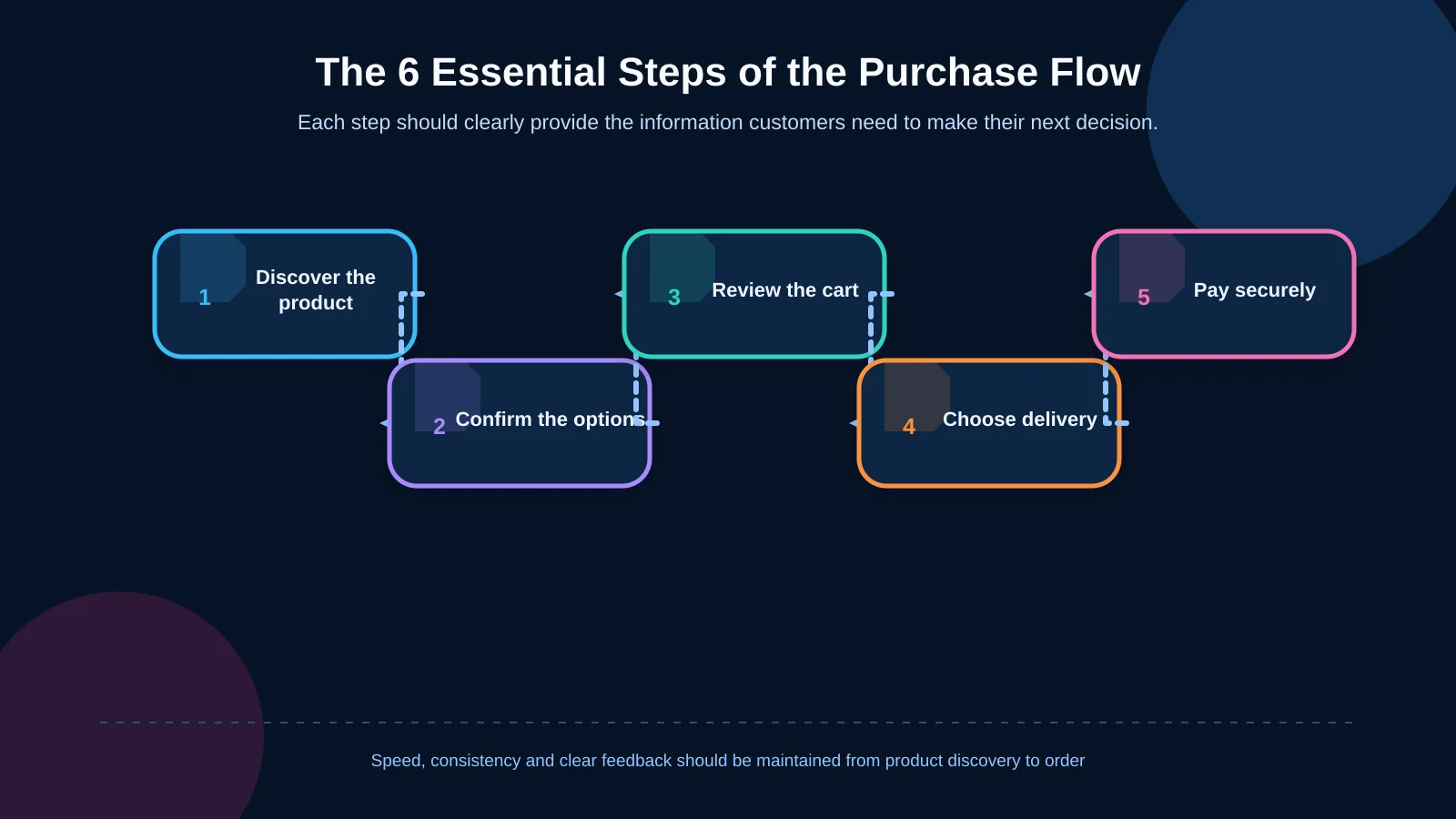
The purchase flow starts when a customer discovers a product, not when they reach checkout. Category structure, on-site search, filters and product cards should help visitors understand the available options. On the product page, price, variants, stock status, delivery coverage, return conditions and the primary purchase action need a clear, consistent hierarchy.
Incomplete product information carries uncertainty into the cart. If a selected size, promised delivery date or campaign condition changes unexpectedly, trust can quickly decline. Information architecture must therefore cover more than navigation. It should define the source of product data, relationships between variants, pricing logic and the rules behind stock messages.
Product information also needs reliable ownership across channels. For businesses managing complex catalogues, the guide to Product Information Management explains how product models, data quality and channel distribution can be coordinated across commerce systems.
When planning a brand-specific platform, Kumsal Agency approaches e-commerce design and development as one connected digital product system, extending from discovery to the final payment result. This prevents the brand’s visual language and its sales functions from becoming disconnected.
How should the cart support decision-making?
A cart is not merely a list of selected items. It is a working area where customers review their order, check the total cost and decide whether to continue. Product names, images, variants, quantities, unit prices and line totals should be easy to scan. Removing an item, changing its quantity or saving it for later should always produce clear feedback.
The order summary should separate the subtotal, discounts, estimated delivery charge and any applicable taxes or mandatory fees. If a cost cannot be finalised until an address is provided, the interface should explain why. Baymard Institute’s research into cart abandonment distinguishes natural abandonment from experience-related problems such as long or complicated checkout processes. These findings do not guarantee the same outcome for every store; priorities should be validated against the business’s own customer and analytics data.
Information that should be visible in the cart
- Product, variant, quantity, price and applied discounts
- Delivery cost or an explanation of how it will be calculated
- Campaign requirements, benefits and current eligibility
- Warnings about stock changes, purchase limits or unavailable items
- A prominent, unambiguous action leading to checkout
The discount-code field should not dominate the page. Customers without a code may otherwise assume they are missing an important saving. Cross-selling recommendations should also remain secondary to the cart’s main purpose and must not make the order summary or checkout button harder to find.
Checkout should be understandable, not merely short
Compressing every checkout into one page is not always the right answer. A single-page structure can work when address, delivery and payment information can be managed without creating visual overload. A staged flow may be clearer when there are several delivery methods, business invoice options or industry-specific verification requirements.
The meaningful measure is not the number of screens. Customers should understand what they need to do now, what comes next and how far they have progressed. In a staged checkout, labels such as “Contact,” “Delivery,” “Payment” and “Confirmation” are clearer than internal system terminology. Information already entered should remain intact when the customer returns to an earlier step, and the order summary should stay accessible. Any change to the final amount must be explained.
Guest checkout should be considered when an account is not necessary to fulfil or manage the order. The option to create an account can still be offered after purchase, using details the customer has already provided instead of interrupting payment with another obligation.
How does form design reduce friction?
A checkout form should request only the information needed to complete the purchase, fulfil delivery or meet legal requirements. Field labels must remain visible after typing begins, while example formats can be shown as supporting text. Phone, postcode and card fields should open the appropriate mobile keyboard. Browser autofill should be supported, and pasting should not be blocked without a genuine security reason.
An error message should say more than “Invalid information.” It needs to identify the affected field, explain the problem and tell the customer how to correct it. Validation should happen at an appropriate moment and close to the relevant field, rather than forcing customers to search the page after seeing a generic alert.
When a payment is declined, the interface should avoid exposing an unexplained technical code. It should provide a plain-language message, a safe way to try again and, where possible, an alternative payment method. Previously accepted address and delivery information should remain available so that one failure does not require the entire form to be completed again.
How should mobile cart and checkout experiences work?
Mobile optimisation is not simply a desktop layout squeezed into a smaller width. Touch targets, on-screen keyboards, sticky actions, expandable components and the space occupied by the order summary must all be reconsidered. While a customer completes one field, the next field should remain easy to reach. The keyboard must not hide validation feedback or the payment action.
Core totals and the checkout action should be easy to locate in a mobile cart, but sticky buttons should not cover product details. Address selection, instalment options and legal approvals can be simplified with expandable sections. Their labels should clearly describe what they reveal, and their behaviour should be tested with keyboards and screen readers as well as touch input.
Why is performance part of the purchase flow?
Large product images, third-party marketing tags, payment components and personalisation tools can make commerce pages heavy. A slow cart or an unresponsive payment button may leave customers unsure whether their action was registered. Repeated clicks can then create duplicate order or payment attempts.
Performance targets should be established when design and development begin. Google’s Web Vitals guidance uses shared indicators including LCP, INP and CLS to assess loading performance, responsiveness and visual stability. These metrics should be monitored through real-user data as well as laboratory testing. Product, cart and checkout templates deserve separate analysis because they contain different content, scripts and technical dependencies.
| Stage | Customer need | Control point | Primary risk |
|---|---|---|---|
| Product | Make the right choice | Variants, stock and delivery | Missing or conflicting information |
| Cart | Evaluate the total | Fees, discounts and quantity | Costs revealed too late |
| Checkout | Enter details easily | Concise form and clear errors | Form or integration failure |
| Confirmation | Understand the outcome | Order number and notification | Unclear status or duplicate transaction |
How should payment security and privacy shape design?
Trust is not created by adding a padlock icon or security badge alone. Customers should understand why information is requested, and necessary privacy, sales and contractual terms should remain accessible. The way card data travels between the browser, payment provider and the business’s systems must be defined during technical design.
The PCI Security Standards Council’s e-commerce security guidance explains that redirects, iframes, direct submission and API-based payment models produce different data flows and responsibilities. An integration should not be selected for appearance alone. Exposure to card data, provider responsibilities, applicable regulation, failure handling and the organisation’s operational capacity must be evaluated together.
Administration tools also require least-privilege access, strong authentication, activity records and controlled access to personal data. Data sent to analytics and advertising platforms should be reviewed separately. Unnecessary third-party code should not have access to sensitive payment fields.
How do integrations affect customer experience?
The information shown in the cart must reflect the same reality as operational systems. Delays between inventory, pricing, campaign, delivery, invoicing and payment systems can turn into a broken promise for the customer. Each integration should have a defined source of truth, update frequency, failure behaviour, retry strategy and responsible team.
Edge cases are especially important. A payment may succeed while the order record fails to appear. The technical scope should account for idempotency keys, safe retries, verification of provider notifications and reconciliation records. A customer should see “Your order has been received” only when that status is consistent with a verified background transaction.
What does a manageable commerce platform provide?
A polished customer experience cannot be sustained through internal processes that are difficult to manage. Authorised teams should be able to update product information, campaigns, order statuses, delivery methods and content areas in a controlled way. Rather than placing every possibility on one screen, the administration interface should reflect actual roles and workflows.
Post-purchase scenarios—including cancellation, returns, partial shipment and refunds—should be included in the initial project scope. Customer emails, panel statuses and carrier information should use the same underlying status model. Permissions, activity records and approval mechanisms can be introduced for critical changes to reduce operational mistakes.
How should cart abandonment be measured?
An overall abandonment rate does not reveal which problem needs to be fixed. Events such as product view, add to cart, cart view, checkout start, step completion, payment error and order result need consistent definitions. Context including device, traffic source, new or returning customer, delivery method and error type can then be evaluated in accordance with privacy principles.
Quantitative data indicates where customers leave, while usability studies and customer feedback help explain why. Teams should prioritise verified problems and monitor technical errors, performance and business outcomes after each design change. A pattern that works for another retailer may not produce the same result for a different product range or audience.
What should the testing and launch plan include?
Pre-launch testing must cover more than one successful card payment. Teams should test multiple devices, browsers, screen sizes, address formats, campaign combinations, inventory changes and payment results. Expected behaviour must be documented for declined payments, timeouts, browser back navigation, repeated clicks and delayed provider notifications.
- Guest and registered-customer purchase scenarios
- Mobile-device, on-screen keyboard and accessibility checks
- Successful, declined, interrupted and retried payments
- Consistency across stock, pricing, discounts and delivery fees
- Order notifications, invoices, shipping records and administration data
- Analytics events, security controls and rollback procedures
Where possible, a gradual release with limited traffic can support closer monitoring. Owners, error thresholds, provider contacts and rollback conditions should be agreed before launch. This gives both the customer-facing experience and the operational response a defined path if something goes wrong.
How should a custom e-commerce website be planned?
The project should begin with discovery covering objectives, customer groups, the product model, operational processes and technical dependencies. Shopping journeys, information architecture, interface flows and content requirements can then be defined. A custom interface should express the brand’s visual world without obscuring the buying task. Once approved, the experience can be developed responsively alongside the administration panel, forms and integrations required by the agreed scope.
Performance, security, privacy, accessibility and testing should inform design decisions from the beginning rather than becoming a final checklist. Success should not be reduced to conversion rate alone. Payment success, error frequency, task completion, page performance and operational workload provide a more complete view of whether the platform is working.
For a custom e-commerce platform with cart and checkout flows planned around your business objectives, customer needs and technical requirements, contact Kumsal Agency.