


Aydınlatma metni yükleniyor…
Static screens may show investors what a mobile application could look like, but they rarely explain how the product creates value. Investors need to understand whose problem the product solves, how quickly a user reaches a meaningful outcome and whether the team can turn the concept into a viable product. A clickable mobile prototype provides a concise, experience-led answer to those questions.
The objective is not to make an unfinished concept appear production-ready. The right prototype demonstrates the product’s central assumption, primary user journey and distinctive value while clearly identifying what has not yet been built. It turns an investor pitch from a visual showcase into evidence that product strategy, user experience and development planning have been considered together.
What questions should an investor prototype answer?
Start with what investors should understand at the end of the demonstration, not with a list of screens. Who is the primary user? What friction do they experience with the current alternative? Which mechanism enables the proposed product to reduce that friction? How quickly can the user experience its first meaningful value? Why is this approach different from competing options?
The product promise should fit into one clear sentence: “This user can complete this task more easily in this situation.” Every critical screen should support that promise. If a screen does not contribute to the core value, build trust or help complete the scenario, it probably does not belong in the investor demo. This does not merely reduce scope; it makes the story more focused.
Create a visible connection between the problem and the solution
A presentation should not spend several minutes describing a problem and then open an unrelated dashboard. If the product prevents field employees from losing track of tasks, the same journey should reveal the task list, priorities, offline status and proof of completion. If speed is the value proposition, a demonstration that begins with unnecessary registration steps undermines that claim. The interface must show how the promised benefit works.
Define observable evidence for every major claim. “Easy to use” might mean that a first-time user completes the main task without instructions. “Faster” might mean reducing a process from six decisions to three. “More reliable” might be demonstrated through clear status information, recovery from an error and confirmation that the result has been recorded.
How should you choose the primary user scenario?
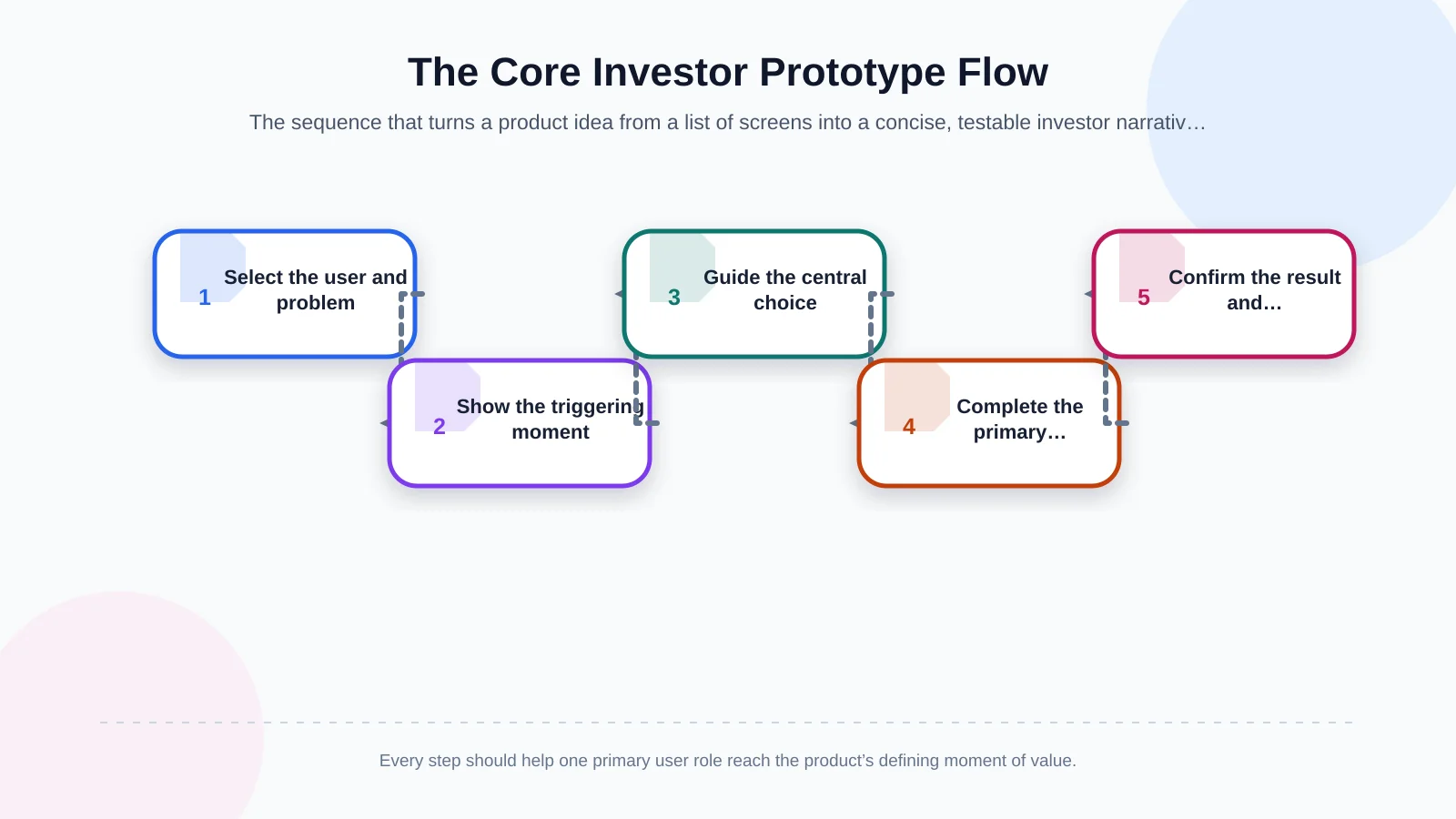
An investor demo should be a controlled story built around the product’s strongest use case, not a tour of everything the application might eventually do. Select one primary user role, then document that person’s trigger, goal, decisions and moment of success. Replace vague statements such as “the user opens the app and browses” with observable actions: “the user finds a nearby service, compares suitable options, confirms a choice and tracks the result.”
A strong core journey often contains four to six meaningful stages: establish the context, express the need, find an appropriate option, make the central decision, complete the transaction and verify the outcome. Nielsen Norman Group describes a prototype as a proposed solution to a specific design problem that can be evaluated through user behaviour. Clickability therefore means more than linking screens; it makes the product hypothesis testable. Its guide to low- and high-fidelity prototypes provides further context for selecting the appropriate level of detail.
Keep optional branches available only when they help answer a likely investor question. A secondary persona, complex settings area or future marketplace may be important to the long-term vision, but including it in the main journey can obscure the first value moment.
Which critical screens and clickable areas should be included?
Most investor stories need an entry screen, the primary task screen, a selection or detail view, a transaction or decision screen and a success result. Add a permission, verification or payment step when it is essential to trust. Profile settings, a comprehensive help centre and secondary filters should not be designed merely to make the product appear larger.
The primary action on every screen must be unmistakable within the visual hierarchy. Buttons should work, back behaviour should be consistent and an accidental tap should not leave the presenter trapped. W3C explains that adequate target size or spacing can reduce unintended activation. Even though a prototype is not a live product, applying the principles behind WCAG 2.2 target size guidance makes the experience more dependable on a real phone.
Use realistic content and controlled data
Lorem ipsum, arbitrary figures and meaningless avatars make it difficult to assess the product logic. Use scenario-appropriate names, dates, prices, labels and results. Clearly identify demonstration data as fictional, and never transfer personal or commercially sensitive information into the prototype.
Text lengths should also resemble real use. Short placeholders can hide truncation, wrapping and the decision burden created by actual content. Controlled but credible data helps investors understand both the experience and the operational model behind it.
How does navigation make the product logic visible?
Navigation is not simply a menu connecting screens. It expresses the information architecture and the user’s mental model. Bottom tabs, hierarchical transitions, modal views and back actions should follow a coherent logic. Android documentation describes a navigation graph as a structure containing destinations and the connections between them. This perspective helps determine which prototype screens genuinely need to be connected.
The main task should remain understandable along one route, without secondary paths interrupting the story. Even on a prepared happy path, users need to know where they are and what happens next. Back should return to the expected context, close should dismiss or end the appropriate process, and tabs should not move the user into an unrelated state.
If the product will run on both iOS and Android, account for familiar platform behaviours without trying to reproduce every operating-system detail. The prototype needs enough realism to support confident interaction, not two fully specified applications.
Why should empty, loading, error and success states be shown?
Screens filled with ideal data ignore the conditions users encounter in practice. At minimum, design the empty state, loading feedback, one recoverable error and the success state that affect the central journey. Can a first-time user understand what to do on an empty screen? Is progress visible during a delay? Does a form error identify the field requiring correction? Does the success screen explain the result and the next action?
You do not need to prototype every possible exception. A few meaningful states are enough to demonstrate that the team has considered more than the ideal path. Examples include manual selection after location permission is denied, retrying a failed payment or changing criteria when no results are available.
These states also expose product and technical requirements. A retry action suggests transaction-state management; an offline indicator raises synchronisation questions; a confirmation screen may require a verifiable server response. Showing such implications makes the prototype a useful bridge to delivery planning.
How should prototype scope be separated from development scope?
A clickable prototype must not imply that live APIs, real payments, authentication, notifications or offline synchronisation already exist. Document which areas use demonstration data, which behaviours are simulated and which links are outside scope. During the presentation, the team should be able to say: “This step is simulated in the prototype and will require this integration during development.” Transparency demonstrates control over technical risk.
Classify every important element as “shown in the prototype,” “planned for the MVP” or “candidate for a later phase.” Investors can then distinguish an illustrated concept from a delivered capability. This classification also gives designers, product owners and developers a shared basis for estimating the next stage.
Record open questions alongside the matrix: data ownership, integration responsibility, security constraints, regulatory requirements and the evidence required before a later feature is prioritised. The purpose is not to solve the complete roadmap during the pitch, but to show that the path from demonstration to delivery is understood.
| Element | Prototype | MVP | Later phase |
|---|---|---|---|
| Core user journey | Clickable | Uses live data | Optimised |
| Payment or API | Simulated | Integrated | Additional providers |
| Error states | Critical examples | Business rules | Advanced exceptions |
| Secondary features | Out of scope | Priority-dependent | Roadmap candidates |
How should visual design support the investor narrative?
Brand character involves more than colour and a logo. Tone of voice, hierarchy, content, interaction feedback and trust signals should reinforce the same value proposition. An Art Director-led approach can translate an innovative, corporate, accessible or community-focused personality into a consistent digital experience. Kumsal Agency’s digital design service brings brand-specific creative direction and interactive interface thinking together.
Intensive animation, decorative transitions and unnecessary micro-interactions should not distract from the central benefit. Use motion only when it clarifies a change, confirms an action or directs attention. A small design system covering typography, colour, spacing, controls and feedback states is usually more valuable than polishing isolated screens independently.
Research-led positioning helps the product create the intended perception instead of merely resembling competitors. Kumsal Agency’s digital brand consulting approach considers brand position, visual direction, experience principles and communication as a connected roadmap.
How should the prototype be tested before the investor demo?
Test the prototype with people outside the product team who resemble the intended user. Give them a task without explaining where to tap, then observe hesitation, wrong choices and unclear language. The goal is not to ask whether they like the design; it is to determine whether they can complete the main task without help. Revise the flow, content or interactions according to what you observe.
Next, rehearse under presentation conditions. Confirm that the prototype opens on the intended phone, sharing permissions work and the journey can be reset quickly. The presenter should be able to complete the main story in two or three minutes and reach alternative starting points for questions.
Prepare an offline backup video or ordered screen sequence in case connectivity or the prototyping platform fails. This backup should preserve the same narrative rather than introducing a different version of the product.
Moving from the prototype to React Native development
An approved prototype is not a complete coding specification, but it is a strong starting point. Convert screens into user stories, interactions into acceptance criteria, states into error rules and example content into an initial data model. Define API ownership, user roles, analytics events, notifications, security requirements and third-party integrations separately.
Kumsal Agency plans and develops React Native-based mobile products for iOS and Android by considering business goals, user needs and technical requirements together. This continuity helps preserve a traceable connection between the experience shown to investors and the product that is later delivered.
Not every prototype screen should automatically enter the first release. Reassess each capability against investor objectives, user evidence, technical risk, budget and operational readiness. The MVP should contain the smallest coherent product that can deliver and measure the promised value.
Final checklist for a strong investor prototype
- The target user and the problem are clear within the first minute.
- The core value proposition can be experienced through one end-to-end scenario.
- Critical screens and realistic content are separated from unnecessary features.
- Navigation, touch targets and back behaviour work reliably on a real phone.
- Empty, loading, error and success states demonstrate product maturity.
- Simulated functions are clearly distinguished from developed capabilities.
- The prototype has been tested with users and rehearsed for the investor meeting.
- The MVP boundary, technical requirements and next development steps are documented.
A successful clickable mobile prototype is not a digital mock-up containing as many screens as possible. It is a decision-making tool that combines user need, product value and a viable delivery path within one concise story. To turn your mobile product idea into an investor-ready experience and plan the scope from prototype to development, contact Kumsal Agency.