


Aydınlatma metni yükleniyor…
Offering a digital product in several languages involves much more than moving interface copy into translation files. A button that fits on one line in English may wrap onto two lines in German. A short tab label can become substantially longer in another language. Writing systems such as Japanese, Arabic, Thai and Devanagari can also affect character width, line height, spacing and reading direction. If the interface cannot respond to these differences, cards lose alignment, navigation overflows, actions disappear and essential guidance becomes difficult to read.
Multilingual interface design is therefore a shared product challenge that begins before translation. Information architecture, content models, component rules, responsive behaviour, software architecture and quality assurance must be planned together. The objective is not to preserve an identical pixel layout in every language. It is to preserve meaning, task completion and visual hierarchy while allowing the interface to adapt.
Why does text length change in translation?
Languages do not express the same idea with the same number of characters or words. Word formation, grammar, context and accepted abbreviations vary. Proportional expansion can be especially striking in short interface strings. The W3C overview of text size in translation explains that short English source strings may become two or three times longer in some languages. It also notes that compound words in languages such as German and Finnish may offer few suitable line-breaking points.
Character count alone is not a reliable measurement. A Japanese phrase may contain fewer characters yet require considerable horizontal space because of glyph width. Marks used in Thai, Devanagari or Arabic may extend above or below the usual line area. If the selected typeface lacks the required glyphs, the system can fall back to another font with different dimensions, weight and readability.
Content type matters as well. A marketing headline may need freer localisation to preserve its message and tone, whereas an action label such as “Add to basket” must remain concise and immediately understandable. Dates, currencies, measurements, addresses and telephone numbers also occupy different amounts of space across markets. Interface decisions should not rely on one set of sample translations or a universal expansion percentage.
Build a flexible component system instead of fixed containers
The fundamental principle is to let content determine component dimensions wherever practical. Buttons, cards, alerts and form controls can use minimum heights rather than rigid heights. Padding should remain consistent while labels are allowed to wrap when necessary. Flexbox and Grid layouts should include explicit rules for how elements grow, shrink, wrap and reorder on narrow screens.
Flexibility does not mean removing every limit. A product-card title might be restricted to two or three lines to keep a listing scannable, provided that the complete name remains available on the product page or through an accessible alternative. Truncating a critical action with an ellipsis can hide what the user is about to do. When copy must be shortened, the decision should be made through content design and product priorities—not applied unpredictably through CSS.
Buttons generally need a minimum width, sufficient padding and an agreed two-line state. Tabs and filters require a defined overflow behaviour, such as horizontal scrolling, regrouping or conversion into a menu. Cards need separate layout rules for headings, descriptions, metadata and actions so that visual alignment does not depend on clipping useful information.
Forms should never assume that labels, supporting copy and validation errors occupy a single line. The field group must be able to grow vertically without covering the next control. On tables and management screens, essential columns should remain visible while secondary information can move into an expandable row or detail view. Word-breaking and overflow rules must also be tested language by language rather than imposed globally.
These decisions become easier to maintain when they are encoded in a reusable design system instead of corrected screen by screen. Kumsal Agency’s digital design approach brings brand expression, component behaviour and cross-screen requirements into one coherent system.
| Component | Typical risk | Flexible behaviour | Check |
|---|---|---|---|
| Button | Label is clipped | Use a minimum width and allow two lines | Is the action clear? |
| Tab / filter | Items overflow | Scroll or regroup items | Is the selection visible? |
| Card | Title breaks the layout | Expand the content region | Is any information lost? |
| Form | Error copy overlaps content | Allow vertical reflow | Is the message readable? |
| Table | Columns become compressed | Prioritise and move details | Is critical data preserved? |
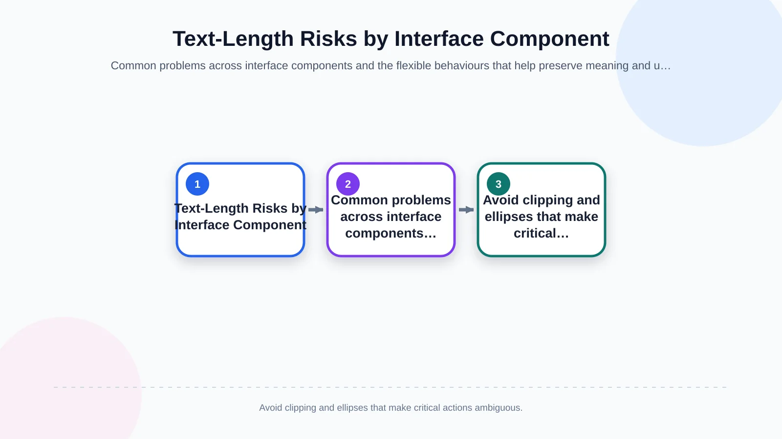
Component-level safeguards
- Use minimum dimensions and flexible padding instead of fixed button widths and heights.
- Define wrapping, scrolling and regrouping behaviour for tabs, filters and navigation items.
- Separate card content into predictable regions without hiding essential information.
- Allow labels, guidance and error messages to increase the height of form groups.
- Prioritise columns in data-heavy views and move secondary details into a suitable disclosure pattern.
- Test language-specific line breaking, and avoid embedding user-facing text inside images.
Information architecture and content planning should start before design
Overflow is sometimes a symptom of weak content architecture rather than a purely visual defect. If navigation contains several long, similar service names, adding more space only conceals the problem temporarily. Teams should first examine how users distinguish concepts, how content should be grouped and whether labels remain clear in every language. A short but ambiguous source-language label can become both longer and less meaningful after translation.
A language matrix is useful at the beginning of the project. It should record target markets, writing systems, text direction, currencies and date formats. Teams can then list critical content surfaces: primary navigation, product cards, campaign areas, forms, validation messages, baskets, checkout flows and account dashboards. For every surface, define the content owner, translation context, any justified length constraint and the person responsible for publication approval.
Content models should avoid assembling sentences from fragments. Combining a greeting, username and status through separate strings may produce the wrong word order in another language. Complete message patterns, plural rules, translator notes and interface previews create safer results. Placeholders must also communicate what each variable represents and whether its value could be unusually long.
URL structures, language switching and relationships between localised pages are connected to interface decisions too. Each language version needs a clear destination, while the language selector should preserve context where an equivalent page exists. Missing translations, fallback behaviour and publishing rules must be decided before the site grows.
How should the design and development process work?
A sound process begins by identifying target languages and the user tasks that cannot be allowed to fail. Designers should work with realistic short and long content, not only the neatest source-language examples. Developers then implement flexible behaviour at component level, while content and localisation teams provide translators with screen context and product terminology. Once real translations arrive, the outcome must be reviewed in the working product rather than only in a design file or spreadsheet.
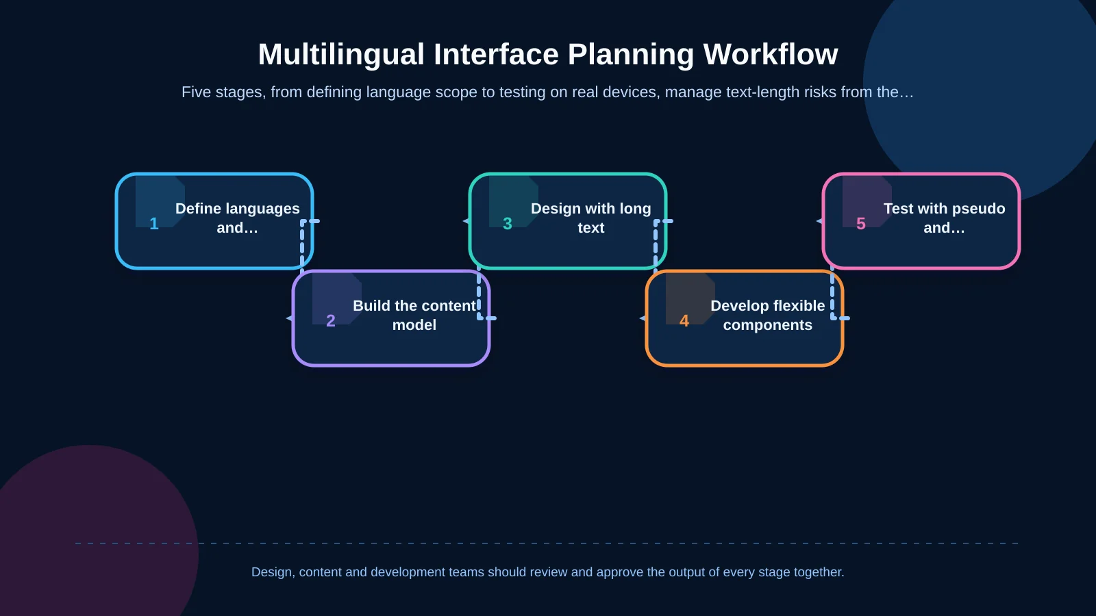
A five-step implementation workflow
- Define the scope: Record target languages, writing directions, supported screens and critical transactions.
- Model the content: Separate copy from code and define variables, pluralisation rules, context and ownership.
- Design for variation: Prepare navigation, card, form, table and button states using realistic long strings.
- Develop flexible components: Implement reflow, wrapping, minimum dimensions and responsive behaviour in the shared system.
- Test by language: Add pseudolocalisation, real translation, device and accessibility checks to the release process.
When a website or portal supports specialised workflows, language flexibility should not depend on the limitations of a ready-made theme. Kumsal Agency’s custom web development services approach roles, data, content and integrations as parts of the same product model, allowing localisation behaviour to remain consistent from the management interface to customer-facing screens.
Responsive design is about more than screen width
Responsive design is often reduced to desktop, tablet and mobile breakpoints. In a multilingual product, content length is another responsive variable. Two language versions displayed on the same phone can produce very different page heights and interaction patterns. Browser zoom, operating-system accessibility settings and user-selected text enlargement can alter the layout again.
Microsoft’s guidance on adaptive user interfaces explains how layouts based on fixed coordinates can cause translated content to be clipped. Flexible layouts allow controls to grow, wrap or move in response to their content. In practice, two adjacent actions might stack vertically on a narrow screen, while a long filter label may occupy an additional line without hiding its selected state.
Teams should test combinations rather than isolated breakpoints: a long translation at 200% zoom, an error message beneath a narrow input, or a modal containing dynamic customer data. The objective is to ensure that reflow preserves reading order, focus order and access to the primary action. Shrinking the font until the copy fits is rarely an acceptable solution because it sacrifices readability and accessibility.
Mobile applications introduce additional constraints, including on-screen keyboards, safe areas and platform text-scaling settings. React Native can provide shared component logic across iOS and Android, but font rendering, native control dimensions and device behaviour still require verification on both platforms.
Which risks should multilingual interface testing cover?
Pseudolocalisation can reveal structural problems before final translations are available. It expands source strings in a controlled way, surrounds them with distinctive characters and can simulate right-to-left presentation. Fixed containers, hard-coded copy, missing glyphs, fragmented sentences and incorrectly mirrored components become visible earlier. Android Developers’ guide to testing with pseudolocales describes how the technique helps identify text expansion, hard-coded strings and bidirectional-text issues.
Pseudolocalisation is an early warning system, not a substitute for linguistic review. Real translators must be able to check meaning, terminology, tone and cultural suitability in context. Likewise, automated screenshots can detect visual differences, but a person still needs to confirm that tasks remain understandable and accessible.
Pre-release checkpoints
- Inspect primary navigation, submenus, language selectors and breadcrumbs for overflow and unclear wrapping.
- Confirm that buttons, tabs, badges, modals and notifications retain their purpose with longer translations.
- Test form labels, placeholders, supporting copy, validation messages and confirmation states together.
- Review alignment, item order, back arrows and directional icons in right-to-left languages such as Arabic and Hebrew.
- Check readability with font fallback, enlarged text, browser zoom and small screens.
- Use realistic dates, times, numbers, currencies, plural forms and dynamic user-entered values.
- Verify that accessible names remain aligned with visible copy and that reflow does not disrupt keyboard focus order.
The test matrix should contain more than a list of languages. Combine language, viewport, operating system, user role and content state. Long product names and promotion terms deserve priority in e-commerce; table columns and status labels are major risks in dealer portals; navigation and forms are critical on corporate websites. Each defect should be recorded with its language, device, component, content state and reproduction steps so the underlying component can be corrected once.
How does content management affect sustainability?
A flexible interface does not justify uncontrolled content. The management system should show publication status, last review date and owner for every language. Required fields may differ by locale, and teams must decide whether missing translations trigger a source-language fallback, a controlled placeholder or removal of the page from publication. Editors should see meaningful guidance about limits, but the system should not silently cut copy.
Translation strings should remain separate from application code. Variables, plural forms and grammatical context need to be managed where translators can understand their use. A preview of the relevant screen is often more valuable than an unexplained character limit. Terminology should also be governed across the website, commerce platform, customer portal and mobile app so users do not encounter different labels for the same action.
Governance continues after launch. When the source copy changes, localised versions may need review rather than automatic replacement. A status such as “translation outdated” helps prevent old claims or instructions from remaining live. This operational structure makes adding a new language a controlled content process instead of a manual development project affecting hundreds of screens.
A better starting point for flexible multilingual products
Multilingual support is not a switch to activate at the end of delivery. It is a product requirement that shapes architecture, content, interface behaviour and quality assurance. When markets are identified early, content and layouts are designed together, components respond to text and testing becomes part of the release process, overflow and breakage are substantially reduced.
The result is more than a product that can be translated. It is an experience that remains understandable, accessible and manageable across languages, devices and content states. The strongest solutions establish clear ownership as well: designers define adaptive patterns, developers protect component behaviour, content teams maintain meaning and localisation specialists validate language in context.
Kumsal Agency is an Istanbul-based digital agency that brings together web design, custom web development, manageable e-commerce platforms, React Native mobile applications, research-led digital brand consulting and digital design around business goals and real user needs. To plan the content, interface and technical requirements of your multilingual digital product together, contact Kumsal Agency.