


Aydınlatma metni yükleniyor…
When an organisation manages a corporate website, dealer portal, e-commerce platform, mobile app and internal software at the same time, different teams often make the same interface decisions repeatedly. They create different buttons, form behaviours, colours and mobile rules for identical functions. The result is more than visual inconsistency: design time, development costs, testing effort and the amount users must learn all increase.
A design system addresses this fragmentation through shared principles, design tokens, reusable components, code packages and usage guidance. Yet not every organisation needs a comprehensive system immediately. The investment case depends less on a fixed number of products than on the nature of repetition, frequency of change, team structure and value that standardisation can create.
A design system is more than a UI library
A design system is living product infrastructure that defines how a brand behaves across digital products and turns design and software decisions into shared standards. Alongside visual rules such as colour and typography, it can cover form validation, error messages, accessibility, responsive behaviour, content tone and the limits within which components should be used.
A UI kit may contain only visual elements in a design file. A code-based component library provides implementation-ready building blocks. A design system connects these assets through governance, documentation, quality criteria and versioning policies. The GOV.UK Design System similarly treats components as reusable interface elements and provides both usage guidance and code examples. Its practical scope can be explored in the GOV.UK component guidance.
This distinction matters because a collection of polished components does not automatically improve delivery. Teams also need to know which component solves which problem, how it behaves in different states, who maintains it and what happens when a product requires an exception.
How many digital products justify the investment?
There is no universal threshold stating that every organisation with three products must build a design system. Three unrelated products may share so little that a large system creates limited value. Conversely, one extensive dealer portal used by several teams may repeat the same forms, tables and workflows often enough to justify shared infrastructure much earlier.
As a practical starting signal, assess two or more active products together with any channels planned for the near future. A corporate website, customer portal and mobile app become candidates when they share brand language or recurring needs such as authentication, notifications, forms and transaction feedback. With five or more products, multiple development teams and frequent releases, a systematic approach usually gains a stronger business case. These figures are prompts for investigation, not fixed rules.
A more useful measure is how often the same solution has been redesigned and rebuilt. If different projects have recreated similar login screens, filters, cards, tables and error states during the past six months, the opportunity for standardisation is already tangible.
Four thresholds that signal the need for investment
Repeated interfaces and workflows
Look beyond basic buttons, fields and cards. Repetition has greater economic value when products share complete workflows: requesting a quotation, inviting a user, uploading a document, tracking an order, completing a payment or opening a support ticket. If teams are solving essentially the same problem for a third time, it is worth evaluating the solution as a reusable component or pattern.
The strongest candidates are frequent, stable enough to standardise and costly to implement incorrectly. A rarely used, highly specialised workflow may remain product-specific even if it looks similar elsewhere.
Brand consistency
If users feel they have entered a different brand when moving from a website to a portal or mobile app, the visual system is not doing enough. Slightly different colour values, shifting heading hierarchies, conflicting icon styles and inconsistent transaction feedback can weaken trust. Research-led visual direction and experience principles can be established through digital brand consulting, creating the strategic foundation for a system rather than merely standardising surface details.
Development and quality costs
Hidden costs grow when similar components are coded and tested from scratch for every project, and the same defect must be corrected separately in several products. Investment becomes reasonable when the effort required to establish and maintain a shared component is lower than the ongoing cost of repetition.
The U.S. Web Design System explains that shared, accessible solutions help teams spend less time building common elements from scratch and allow improvements to reach products at scale. The broader rationale is described on the USWDS key benefits page.
Cross-team decisions and delivery
A shared language becomes necessary when designers, developers and product teams use different names for the same elements or require recurring clarification meetings during handoff. As external suppliers and teams using different technologies join the portfolio, component documentation, acceptance criteria and release notes preserve institutional knowledge.
Another clear signal is decision drift: one team changes a validation rule or accessibility behaviour without other products knowing. A governed system makes changes visible and gives teams a defined way to adopt them.
How to make the design system investment decision
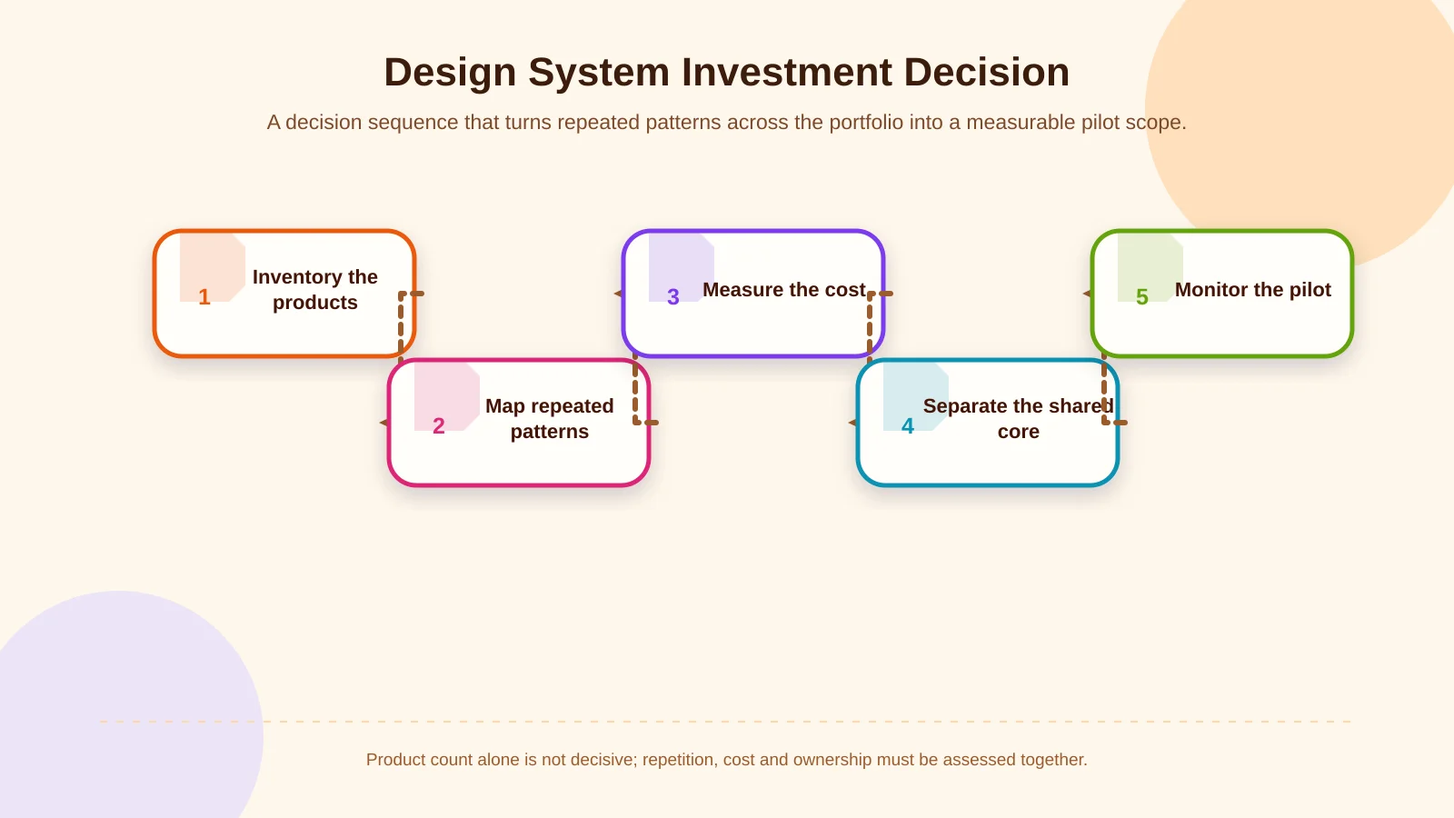
Start with a focused audit of the existing portfolio. Collect representative screens, then map components that serve the same purpose, their variations and their code equivalents. Identify which are used frequently, cause defects or repeatedly extend delivery times.
- Inventory active screens across websites, portals, e-commerce platforms and mobile apps.
- Classify repeated components and user journeys together with their frequency of use.
- Measure how inconsistency affects design, development, testing and support costs.
- Separate reusable core elements from experiences that should remain product-specific.
- Select a limited pilot and monitor time, defects and adoption indicators.
The initial business case should replace an abstract goal such as “greater consistency” with a measurable starting point. Reducing form delivery time, preventing repeated accessibility defects or accelerating a new portal interface can provide a useful pilot objective. The number of assets created is less important than whether product teams use them in design and production code.
Balancing shared components with product-specific experiences
The purpose of a design system is not to make every product an identical copy. Brand foundations, accessibility rules, form controls, status messages and essential navigation behaviours may belong in a shared core. Sector-specific tasks, device contexts and role-dependent workflows should usually remain within the product layer.
For example, product cards and basket notifications may be critical in e-commerce, while an ERP interface prioritises dense data tables, filters and bulk actions. A Smart TV app’s remote-control-first navigation should not be forced into the interaction model of a touchscreen mobile app. The GOV.UK guidance likewise recommends assessing maintenance, updates, accessibility and technical-debt risks when modifying existing components for a specific user need.
A healthy architecture commonly has three layers: foundational tokens carrying brand decisions such as colour, typography and spacing; core components used across several products; and patterns developed for the tasks of a particular product. This structure protects consistency without blocking useful innovation.
For transferring colour, typography and spacing decisions between tools, the format published by the W3C Design Tokens Community Group provides a shared technical foundation. Its scope is documented in the Design Tokens Format Module.
| Decision area | Shared core | Product-specific layer | Example |
|---|---|---|---|
| Brand foundations | High | Low | Colour and typography |
| Basic controls | High | Medium | Forms and notifications |
| Business workflows | Medium | High | Basket or bulk action |
| Device interaction | Low | High | Remote control or touch |
What should the first release include?
Trying to cover every possible requirement in the first release delays return on investment. Begin with colour, typography, spacing, grid, icon principles and baseline accessibility decisions. Then add components genuinely repeated across the portfolio, such as buttons, links, text fields, selection controls, notifications, modals and tables.
Each component should document its purpose, appropriate use, variants, content rules, responsive behaviour, keyboard interaction, error states and code example. Designing only the happy path is insufficient. Loading, empty, unauthorised, offline and failed-transaction states also need coverage. The perceivable, operable, understandable and robust principles in WCAG 2.2 can support a shared definition of quality.
An Art Director-led digital identity can preserve creative direction across products. Through Kumsal Agency’s digital design service, this approach can connect interface components with motion, campaign and content systems instead of treating the design system as an isolated software artefact.
Plan technical architecture and governance together
A design file alone does not create a functioning system. For web products, teams must decide how code packages will be distributed, versioned, tested and maintained. Mobile products require a clear scope for React Native components, while portfolios with several technology stacks may share design tokens without forcing every platform into identical implementation. Each platform should retain its native interaction strengths.
The system needs an owner, contribution process and change policy. Requests for new components should be evaluated against a demonstrated user need, the likelihood of reuse across products and evidence that existing elements cannot solve the problem. GOV.UK’s contribution criteria similarly look for evidence that a proposal benefits multiple teams or services, differs from current solutions and can remain usable, consistent and adaptable.
A central team should not make every decision in isolation. It should collect usage data and feedback from product teams. Experimental components need clear labels, stable releases require a backward-compatibility policy, and unused assets should eventually be deprecated. This keeps the system useful rather than allowing it to become an ever-growing catalogue.
How to measure design system ROI
Success should not be measured by component count alone. Track design and development time, the proportion of reused components, visual divergence between products, accessibility findings, defects and the time required for new team members to contribute. Without a baseline captured before the pilot, demonstrating impact will be difficult.
- Cycle time for designing and developing new screens
- Percentage of active products using shared components
- Number of custom forks and version conflicts
- Accessibility, responsive-behaviour and visual-regression findings
- Documentation usage and contributions from product teams
Value compounds over time. If a defect can be fixed once in a shared component and safely distributed across products, the system is working. If teams routinely bypass components or copy and alter their code, review the system’s scope, implementation experience and governance. Low adoption is operational evidence, not simply resistance to change.
When can the investment be postponed?
A comprehensive system may be premature for one short-lived campaign page, an unvalidated product idea or several small channels without shared requirements. If product strategy remains uncertain, validating user needs and core journeys is more valuable. A lightweight style guide and limited component set may be sufficient during this phase.
Investment should also remain modest when no team owns the system or no maintenance budget exists. A large initial release will quickly become outdated without ongoing stewardship. A design system is not a one-off deliverable; it is infrastructure that evolves with the product portfolio. The decision must therefore account for long-term operating capacity as well as setup cost.
Define the right scope for your portfolio
No single product-count formula determines the need for a design system. The right threshold emerges by considering repeated workflows, brand divergence, parallel development costs, accessibility effort and lost decisions across teams. The safest approach is to audit the portfolio, pilot a small group of high-value shared elements and expand the system according to measured use.
Kumsal Agency is an Istanbul-based digital agency working across digital strategy, web design, custom web software, digital brand consulting, digital design, React Native mobile apps, e-commerce, ERP and Smart TV applications. By considering brand language, user needs, business processes and technical requirements together, the agency plans sustainable design infrastructure for complex digital portfolios.
Review the repeated interfaces, inconsistencies and development needs across your digital products with Kumsal Agency, and plan a design system scope suited to your brand and technical architecture.