


Aydınlatma metni yükleniyor…
Should a corporate website use a dark theme or a light theme? The question is often treated as a matter of personal taste, but the decision affects much more than visual style. A theme influences how visitors perceive the brand, how comfortably they read its content, how prominently its imagery appears and how easily they can complete tasks such as comparing services, requesting a quotation or contacting the company.
A light theme can provide a familiar, spacious and content-led setting for corporate communication. A dark theme can create a focused atmosphere that gives selected products, projects or creative work greater visual impact. Either approach can still produce a poor experience when the colour system lacks contrast, conflicts with the content or fails across devices. The right decision therefore depends on brand identity, audience, content density, viewing conditions, accessibility and conversion objectives—not on which option happens to look more fashionable.
What Is the Main Difference Between Dark and Light Themes?
In a light theme, primary surfaces use white or pale colours while text and controls appear in darker tones. Users regularly encounter this pattern in news websites, corporate portals and documentation. It offers a familiar reading environment for long articles, data tables and information-rich page structures. When spacing is handled well, headings, supporting details and calls to action can also be separated clearly.
A dark theme reverses the overall luminance relationship: primary surfaces use black or low-brightness colours, while text and interface elements use lighter tones. Photography, video, three-dimensional work and high-impact product imagery may feel more dramatic against this setting. Yet designing a dark interface involves more than changing a white background to black. Surface levels, borders, shadows, icons, status colours, illustrations and media assets must all be designed and tested as part of the system.
Neither format is inherently more professional. Professionalism comes from how consistently the visual treatment supports the organisation’s message, content and user journeys. A technically refined dark theme can still be unsuitable for a document-heavy website, while a carefully composed light theme can feel distinctive rather than generic.
Six Criteria for Choosing a Website Theme
1. Brand personality and communication style
If a brand positions itself around trust, clarity and ready access to information, a light theme may be a natural starting point. Finance, engineering, healthcare and professional-service websites often benefit from surfaces that support direct, orderly communication. Technology, automotive, entertainment, architecture and premium product brands may use a dark theme to create a more focused, innovative or cinematic atmosphere. These are useful tendencies, not fixed industry rules; every choice must be tested against the brand’s actual positioning.
The existing identity system matters as well. A logo may only work correctly on one type of background, brand colours may appear overly intense on dark surfaces, or the established photography style may require a particular setting. Theme selection should therefore be part of an integrated corporate web design system rather than an isolated colour preference.
2. Content type and density
Readability becomes the priority when a website contains long articles, technical documentation, investor information, product tables or detailed service descriptions. A light theme often feels more familiar for these content types. If a dark theme is selected, line length, font size, line spacing, weight and separation between surface levels require especially careful attention.
Dark interfaces can strengthen visual focus in portfolios, launches and experiences built around a limited number of messages. However, a corporate site must be evaluated as a whole. As it grows, its blog, search results, forms, legal pages, error states and content added later through the CMS must all remain usable within the same system. A theme that works only for the polished homepage is not a sustainable design decision.
3. Target audience and viewing conditions
A website may be viewed on an office monitor, on a phone outdoors, at reduced brightness or late at night. A light interface can remain easier to perceive in bright surroundings, while a dark one may feel more comfortable in low light. No single assumption represents every visitor, however. Age, visual ability, screen quality, device settings and personal preferences can all alter the experience.
User research should therefore go beyond asking participants which version they prefer. Give them realistic tasks: locate a service, read a technical document, review a project and complete an enquiry form. Compare completion rates, time, mistakes and reported comfort. A design that wins a visual-preference vote may not be the version that helps users act with confidence.
4. Readability and accessibility
The theme alone never guarantees accessibility. Pale grey text on white and pure white text on pure black can create different forms of strain or insufficient distinction. Under the WCAG 2.2 minimum contrast criterion, normal text should reach at least 4.5:1 and large text at least 3:1. Links, form fields, error messages, keyboard focus indicators and icons must also remain identifiable without relying on colour alone.
Meeting a numerical ratio is only the beginning. Excessively bright text, very thin type, crowded lines or uninterrupted dark surfaces may still make reading tiring. A practical accessibility process combines semantic colour tokens, interaction states, scalable typography, keyboard checks and testing on real devices. It should also cover zoom, high-contrast settings, reduced motion and content states that may not appear in the original mock-ups.
5. User tasks and conversion goals
The purpose of a corporate website is not merely to establish a memorable atmosphere. Visitors need to compare services, assess the company’s capabilities, find contact information, download a document or submit a quotation request. The theme should make the primary action easy to recognise, distinguish input fields clearly and communicate form success or failure without ambiguity.
A dark opening section may enhance brand storytelling while a long quotation form works better on a light surface. Similarly, a light corporate framework can use a dark project showcase to concentrate attention. Changes in surface colour should explain a transition in content or task rather than serve as decoration. The entire path—from landing page to confirmation state—must be reviewed for continuity and confidence.
6. Technical and operational sustainability
Providing two themes involves much more than adding a second palette. Logos, photographs, illustrations, charts, email components, third-party widgets and native form controls must work in both modes. Rules must be documented so that a new banner uploaded by an editor or a new component introduced by a developer does not break the experience.
Browsers can detect an operating-system preference with prefers-color-scheme. The color-scheme property can also help browser-rendered elements, including form controls and scrollbars, adapt to supported themes. If visitors can override the system setting, their choice should be retained and applied consistently on later visits.
When Is Each Theme Most Appropriate?
The comparison below is a starting framework, not a rigid industry template. The final choice should be validated against representative content and real user tasks.
- If long-form copy, technical documents and dense tables dominate, a light theme is a strong candidate.
- If photography, video or product visualisation carries the main narrative, a dark theme may create greater focus.
- If trust, clarity and rapid information retrieval are central, lighter surfaces may provide an advantage.
- If the desired brand atmosphere is selective, experimental or cinematic, a dark system may be appropriate.
- If environments and visitor preferences vary widely, a controlled hybrid treatment or optional dual theme may offer better coverage.
The safest choice is not always the most neutral-looking option. It is the one that preserves the brand’s distinctiveness while keeping priority content and actions clear under realistic conditions.
| Criterion | Light Theme | Dark Theme | Hybrid / Dual Theme |
|---|---|---|---|
| Content | Long-form copy and tables | Image and video showcases | Different content types |
| Brand effect | Clear and direct | Focused and cinematic | Variable by context |
| Viewing context | Bright environments | Low-light environments | Changing conditions |
| Maintenance | One system | One system | More testing and assets |
| Best-fit scenario | Information-rich website | Experience-led website | Portal or mixed experience |
When Does a Hybrid Approach Work Better Than One Theme?
A hybrid approach does not mean assigning an unrelated colour to every section. It begins with one dominant theme and introduces a controlled contrasting surface when a visual narrative, case study or specific task genuinely benefits from it. For example, a light B2B website might use a dark project gallery, while a dark technology website could present its blog and help content on a lighter reading surface.
Another option is to let visitors choose between complete light and dark themes. This can be valuable for portals, content platforms and products used throughout the day. On a corporate marketing website, however, the design, testing and maintenance cost of two complete themes should be weighed against the expected benefit. If a selector is offered, it should be easy to locate, make the current state obvious and preserve the visitor’s preference.
Visual continuity in a hybrid system comes from typography, spacing, grids, corner treatments and motion—not colour alone. These shared rules reassure visitors that they remain within the same experience when the surface changes. Animation should clarify the transition, not turn theme switching into a distracting performance. A research-led digital brand consulting process can define which characteristics should remain constant across both visual modes.
How Should You Make the Right Theme Decision?
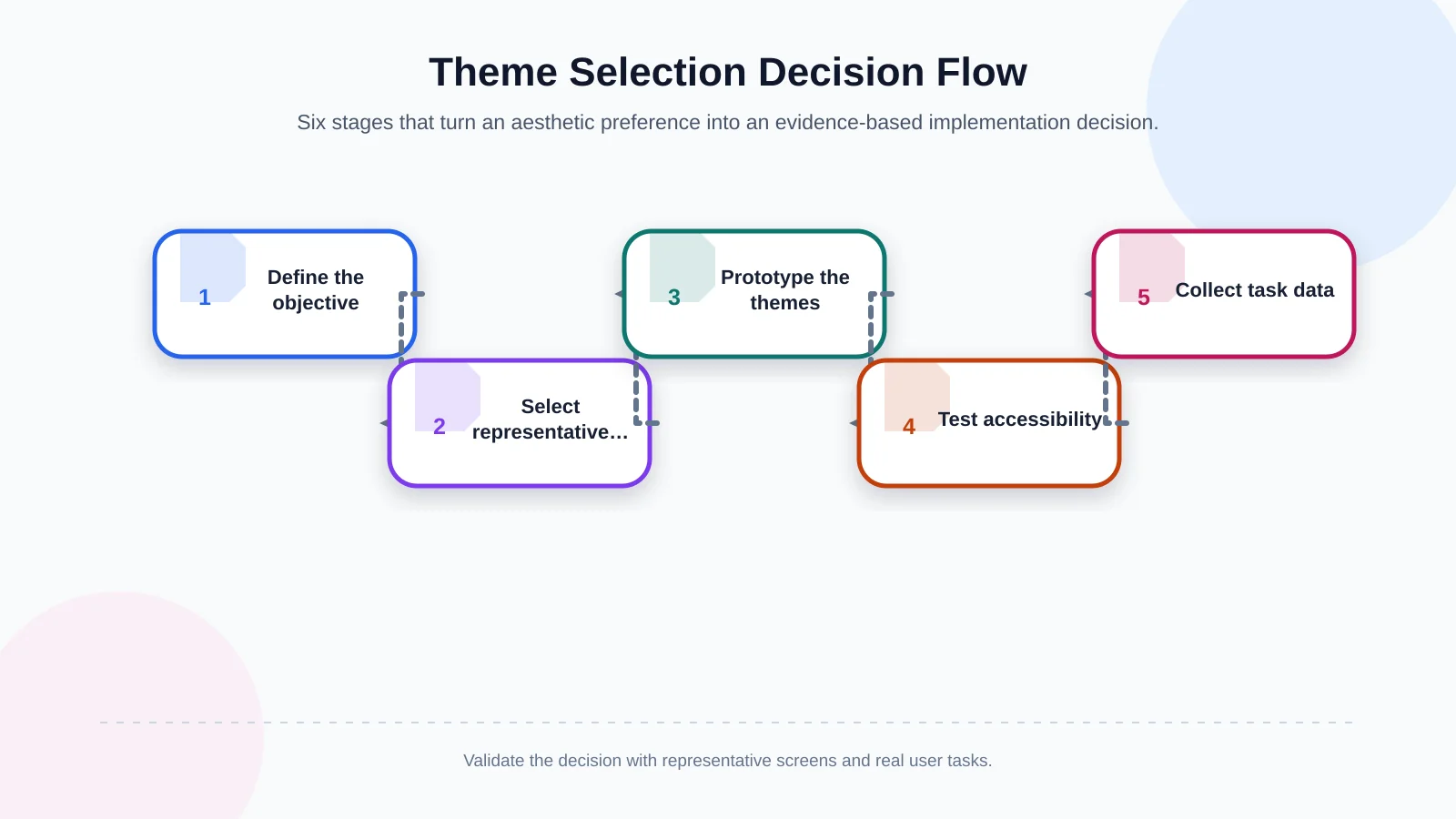
The process should not begin with the brand team voting between two attractive homepage concepts. First define the audience, content requirements, critical tasks and success measures. Then build compact but representative prototypes that expose each approach to the same evidence.
- Document the brand personality and the website’s business objective.
- Select the densest content page, the most important form and a visually led page.
- Prototype light, dark and, where justified, hybrid approaches using identical content.
- Test contrast, keyboard operation, mobile behaviour and different lighting conditions.
- Collect task-completion, error, time and perception data from representative users.
- Translate the result into component rules, content guidelines and design tokens.
Testing should not be limited to an ideal homepage. Include long headings, missing images, validation errors, cookie panels, search results, multilingual text and lower-quality displays. Also examine loading states, hover and focus behaviour, downloaded documents and third-party embeds. Sustainable performance under imperfect conditions matters as much as impact during a controlled presentation.
Common Theme Design Mistakes
- Assuming a dark theme is automatically premium or a light theme automatically conventional.
- Using brand colours for links and buttons without testing their contrast in every state.
- Placing small, thin, pure-white body text on a completely black background.
- Failing to adapt logos, charts, shadows, icons or form controls when the theme changes.
- Losing a visitor’s selected theme while they move between pages.
- Testing only on desktop screens in a dark studio environment.
- Weakening quotation, contact or document-download journeys for visual impact.
A semantic design system reduces these risks. Instead of assigning colours separately on each screen, define roles such as canvas, elevated surface, primary text, secondary text, border, interactive element, focus, success, warning and error. Each component then refers to a role whose value changes with the theme. This makes future updates more predictable and gives designers, developers and content teams a shared operational language.
Conclusion: The Best Theme Is the One That Serves the Purpose
There is no universally superior light or dark theme for a corporate website. The right approach communicates the brand consistently, keeps content readable, supports accessibility and guides visitors towards the intended task. Some organisations will achieve this with a light interface, others with a dark one, and some with a carefully governed hybrid system.
Kumsal Agency approaches theme selection through research-led digital brand consulting. Under Art Director leadership, it develops a brand-specific creative concept, digital identity and interface system, while planning information architecture, user experience, advanced animation, responsive development, performance and fundamental accessibility checks as one connected project.
To identify the right theme for your brand, content structure and user goals—and plan an original, accessible and sustainable corporate website—contact Kumsal Agency.