


Aydınlatma metni yükleniyor…
Microinteractions are the small, meaningful responses an interface provides when someone clicks, makes a selection, enters information or completes a task. A button changing state when pressed, a form confirming valid input, a product count updating after a filter selection or a submission screen explaining what happens next are all examples. Although visually small, their purpose extends beyond decoration: they answer questions such as “Did the system recognise my action?”, “Is it still working?” and “What should I do now?”
On a corporate website, decisions rarely happen in one dramatic moment. A visitor may compare services, review technical information, examine project evidence, assess the effort required by a form and decide whether sharing personal or business data feels safe. Microinteractions should not pressure that visitor into converting. Their role is to reduce uncertainty between these smaller decisions. When planned well, they help people complete quote requests, product searches, appointments and contact journeys with greater confidence.
What is a microinteraction, and what are its components?
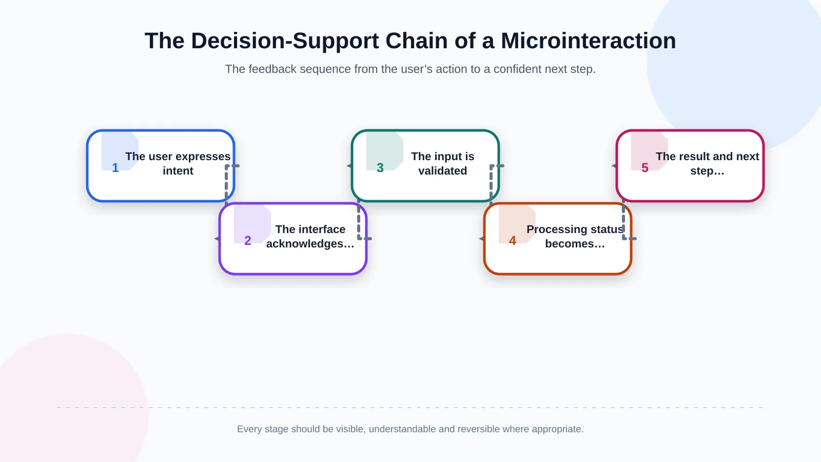
A microinteraction can usually be described through four connected components: trigger, rule, feedback and resulting state. The trigger may be a tap on a button or an entry in a field. The rule determines what the system does next. Feedback makes it clear that the action has been recognised. The resulting state helps the user understand what has changed. For example, after someone selects “Request a quote,” the button may become temporarily unavailable, display a processing state and then reveal a confirmation message.
The value of this chain does not come from movement alone. It comes from providing useful information at the right moment. Nielsen Norman Group’s guidance on visibility of system status emphasises that interfaces should keep users informed through appropriate, timely feedback. Animation is therefore one possible method of communicating state—not the goal itself.
How do microinteractions make decisions easier?
1. They make the connection between action and result visible
If nothing changes after a visitor clicks an element, they cannot know whether the action was registered. They may click again, leave the page or assume the website is broken. A pressed state, immediate progress indicator or controlled content expansion creates a clear cause-and-effect relationship. This visibility is particularly important for actions with meaningful consequences, including quote submissions, payments and document uploads.
2. They divide uncertainty into manageable steps
Evaluating an entire long form at once can create unnecessary cognitive load. Clearly identifying required fields, revealing relevant questions according to earlier choices, showing progress and marking completed steps make the task easier to assess. When users understand how far they have progressed and what remains, they can make a more informed decision about continuing.
3. They explain errors where they occur
A generic warning such as “The form contains errors” does not tell someone how to recover. Timely, field-level feedback should explain both the problem and the correction: “Include the country code in the phone number” or “The file must be 10 MB or smaller.” Validation should also appear at an appropriate moment rather than aggressively interrupting people before they finish typing. Done well, the interaction becomes a guide to completion instead of a punishment.
4. They preview the effect of a choice
A product filter can update the result count, a service option can change the scope summary, and a selected appointment date can reveal available times. These responses let people compare the consequences of choices instead of merely reading labels. The approach is especially valuable in technical catalogues, price configurators and service enquiries containing several conditional options.
5. They create confidence in completion and recovery
Explaining what happened after an action matters as much as acknowledging its beginning. A useful success state confirms receipt, sets expectations for what follows and provides a reference number when appropriate. Users should also know whether a choice can be reversed. A temporary “Undo” action after removing an item or a clear filter-reset control lowers the cost of experimentation and encourages exploration.
The right microinteraction sequence for a critical user journey
Microinteractions should be planned as connected parts of a decision journey, not as isolated screen embellishments. A healthy sequence begins with visible user intent; the interface acknowledges the action immediately, performs the necessary validation, communicates any processing period and presents the result together with an appropriate next step. At every stage, teams should identify the user’s likely question and the interface’s answer.
In a quote form, selecting a service type might reveal only the relevant fields. An upload should show genuine progress, while submission should prevent accidental duplicate requests. The success screen should confirm that the enquiry arrived, explain the response channel and offer another useful action. Content, interface states and technical behaviour must be designed together, including delivery through email, CRM or webhook services.
Practical examples for quote forms and product discovery
Quote and contact forms
A clear focus state shows users where they are. Formatting guidance, an example value or concise help text can clarify what a field expects. Useful fundamentals include a restrained confirmation for valid input, a specific message beside an invalid field and a button that visibly changes during submission. Colour alone should never carry the message; text, icons and accessible status announcements should work together.
Microinteractions cannot compensate for an unclear data request. Even when a form appears short, visitors should understand why particular information is required and how it will be used. Teams should also verify the complete path beyond the visible interface, because a successful-looking screen is meaningless if the enquiry never reaches its intended destination.
Product and service discovery
Discovery becomes easier when a selected filter appears immediately, active filters can be removed easily, the result count updates and an empty state suggests useful alternatives. Showing the status of a technical-document download or visibly marking an item added to comparison also reduces memory demands. These details work best on a strong information architecture. Kumsal Agency’s brand-specific web design approach considers navigation, content hierarchy and interactive behaviour as parts of the same experience.
Menus, expandable content and mobile controls
When a mobile menu opens, its control should become a close control, keyboard focus should move appropriately and background content should not remain accidentally interactive. Accordion headings need to expose their expanded or collapsed state both visually and technically. Touch targets must be comfortable to use, and essential information cannot depend exclusively on hovering with a mouse. Mobile responsiveness is not simply a desktop motion reduced to a smaller screen; feedback must suit the mobile context.
What separates a useful microinteraction from a distracting animation?
A useful microinteraction is brief, predictable and connected to a task. It directs attention to the point that requires it without delaying access to content or controls. Its duration and direction should make the state change understandable. Elements that bounce after every click, long transitions, constantly moving calls to action and elaborate scenes that conceal loading can add attention costs instead of supporting decisions.
Accessibility is a defining test. W3C’s explanation of animation triggered by interaction addresses the ability to disable motion that is not essential to functionality or the information being communicated. Websites should therefore respect reduced-motion preferences, avoid making parallax or large zoom effects mandatory and provide a static visual state or text alternative. Meaning must never depend on motion alone.
Why are performance and software behaviour part of the design?
A microinteraction that looks effective in a prototype can have the opposite effect when its response is delayed. Google’s Interaction to Next Paint guidance explains that INP evaluates the latency of visual feedback following clicks, taps and keyboard interactions throughout a visit. It identifies an INP of 200 milliseconds or less at the 75th percentile as a good responsiveness target. This metric cannot explain conversion performance on its own, but it helps teams determine whether feedback actually appears in time.
If a network request will take longer, the first acknowledgement should still be immediate. The button can change state at once and then show real processing progress. Fake progress, premature success messages or animations that merely occupy the user undermine trust. Testing should include slower devices, mobile connections, keyboard operation and repeated clicks.
For custom forms, administration panels and integrations, interface states must remain consistent with server responses. Error handling, retry behaviour, retained input and duplicate prevention should be explicit requirements within the custom web development scope, rather than decisions left until implementation.
How should microinteractions be planned and tested?
The process begins by mapping critical journeys, not by selecting an animation catalogue. Teams first identify business-relevant tasks such as requesting a quote, finding a product, downloading a document or booking an appointment. For every step, they then record the user action, expected response, possible error, waiting state and successful outcome. This inventory gives design, content and development teams a shared definition of behaviour.
- Identify journeys with the greatest business value and their main abandonment points.
- Define empty, focus, active, loading, success, error and disabled states for each control.
- Write feedback that explains the problem and the path to correction.
- Include motion duration, reduced-motion settings, keyboard use and screen-reader announcements.
- Test slow networks, repeated clicks and server failures on real mobile devices.
- Connect form starts, field errors, successful submissions and filter use to the measurement plan.
Usability testing should observe task success instead of asking whether participants liked an animation. Did they understand that their selection was saved? Could they recover from an error? Did they click again before the result appeared? Analytics can then connect these observations with form completion, error distribution, step abandonment and repeated-click data. The objective is not to attribute every change to animation, but to determine whether clearer feedback reduces avoidable uncertainty.
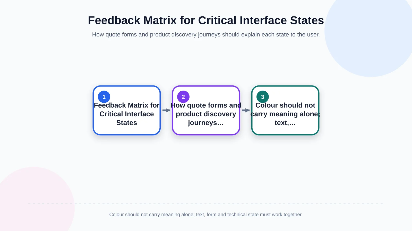
| State | User’s question | Interface response | Verification |
|---|---|---|---|
| Focus / selection | Where am I? | Clearly highlighted field or selected item | Keyboard and touch |
| Validation error | What should I correct? | Solution-focused message beside the field | Non-colour indicator |
| Loading | Is the process still running? | Immediate status or genuine progress | Repeated clicks |
| Success | Was my request received? | Confirmation and next step | Server response |
| System error | What can I do now? | Explanation, retry option or alternative | Data retention |
How should the scope be defined for a corporate website project?
Microinteraction requirements should not be reduced to “the website will include animation.” Documentation should specify the journeys involved, states to be designed, accessible alternatives, performance expectations and acceptance tests. For a quote form, that could mean defining validation timing, error messages, upload progress, duplicate-submission prevention, integration failures and post-success routing individually.
In Kumsal Agency’s Art Director-led approach, creative concepts, advanced animation and interactive experiences are considered alongside information architecture, genuine user needs and business goals. Responsive interface development, forms, content-management capabilities and project-specific integrations continue that experience technically. Microinteractions therefore become product behaviours supported by data security, performance and sustainable management—not effects confined to a presentation layer.
How can you tell whether microinteractions are succeeding?
Success is measured by whether users complete the correct task with less hesitation, not by the number of animations on a page. Fewer field errors, fewer duplicate clicks, understandable filter use, stronger form completion and fewer support requests after submission can all be positive signals. Results must still be read in context. If weak service content, missing trust evidence or an unnecessarily long form causes the conversion problem, adding interaction effects alone will not resolve it.
Kumsal Agency can help identify hesitation, delayed feedback and unclear states across your critical journeys, then translate appropriate microinteractions into a coordinated design and development scope. Contact Kumsal Agency to plan an experience in which every interaction offers a meaningful next step at the right moment.