


Aydınlatma metni yükleniyor…
When users search, apply filters or try to retrieve a specific record, they may encounter a “No results found” message. On a corporate website, this might mean they cannot find a service; on an e-commerce platform, a product; in a B2B portal, an order; or in a mobile app, a piece of content. The real problem is not that the system returned zero results. It is that the user may not know what to do next.
A well-designed no-results state does more than report an empty result set. It keeps the user’s search visible, explains the likely cause in plain language and prioritises useful next steps. A potential dead end can then become an opportunity to correct a query, remove a filter, explore relevant alternatives or move to an appropriate support channel.
Why is a “No results found” screen a critical UX touchpoint?
Searching or filtering communicates clear intent. When the requested model, document, order, service or article cannot be found, that intent does not disappear; the current system has simply failed to satisfy it. Leaving the page empty effectively asks users to understand the product’s information architecture and search vocabulary without assistance.
Baymard Institute’s research into no-results pages notes that users struggle to recover from unsuccessful searches on roughly half of the evaluated e-commerce sites that fail to provide effective alternatives. A central lesson is that generic search advice is rarely enough. Recovery options should relate to the user’s query and current context.
A no-results event is also a demand signal for the product team. If many users search for the same product under different names, the synonym dictionary may be incomplete. If particular filter combinations repeatedly return nothing, the catalogue structure or default filters may be creating unnecessary restrictions. If the requested product genuinely is not available, the data may reveal an opportunity for purchasing, content or sales teams.
Identify the type of no-results state first
Not every empty result set has the same cause. Although one generic screen may be easier to implement, the right message and recovery action depend on what went wrong. Product teams should classify no-results states before defining the content, actions and system behaviour for each one.
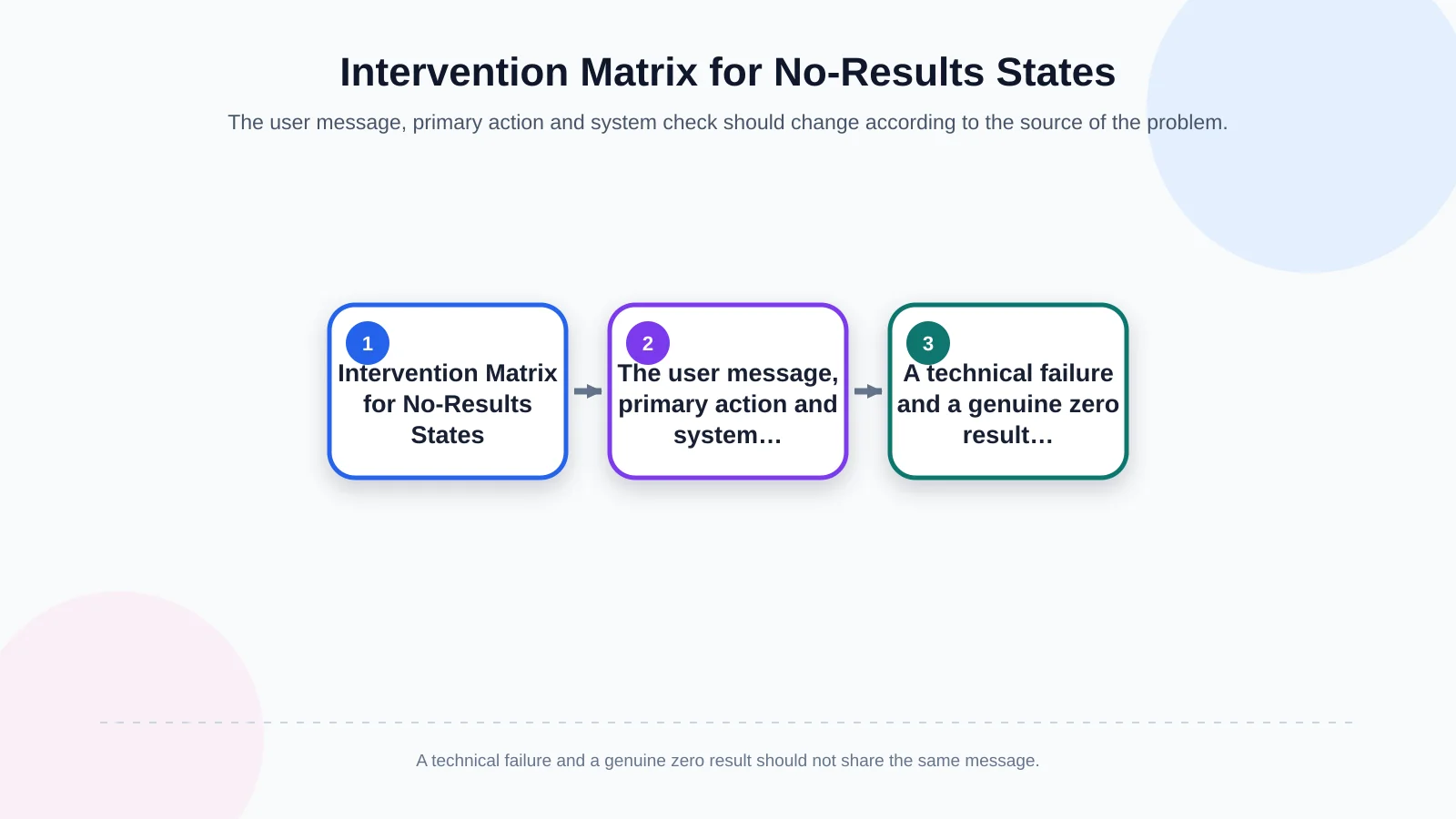
| State | Explanation for the user | Primary action | System check |
|---|---|---|---|
| Query does not match | No match was found for the search term | Try the corrected query | Synonyms and spelling tolerance |
| Filters are too restrictive | The selected conditions produce no results | Remove the restrictive filter | Result count per filter |
| Record is not visible | Check the date, account or permission scope | Change the search scope | Role and data ownership |
| Service is not responding | The search could not be completed | Try again | API, queue and ERP status |
States caused by the search query
A spelling error, an alternative product name, an overly specific phrase or an unsupported product code can produce zero matches. Preserve the original query and offer a likely correction or broader term as a selectable action. Instead of merely saying “Try more general keywords,” provide a link that searches for “industrial sensor” when “wireless industrial sensor” produces no results.
States caused by filters
Relevant items may exist in the catalogue even when the intersection of brand, price, availability, date or location filters produces nothing. Do not present this as though the search itself failed. Keep active filters visible and offer “Clear all filters.” If the system can calculate which individual filter prevents a match, provide a more precise action such as “Remove ‘In stock’ to see 12 products.”
States caused by data, permissions or system availability
In a B2B portal, a record may genuinely be absent. However, the same screen could result from an incorrect date range, the wrong customer account, insufficient permissions or an incomplete ERP transfer. Distinguish a technical failure from a genuine zero result. If an integration is unavailable, explain that the search could not be completed and offer a retry instead of claiming that no record exists.
Recovery sequence for a no-results screen
Recovery options should follow a deliberate order. The first action should preserve the user’s current intent with the least effort; later actions can progressively broaden the journey. Making “Return to homepage” the only option discards the query, filters and context the user has already supplied.
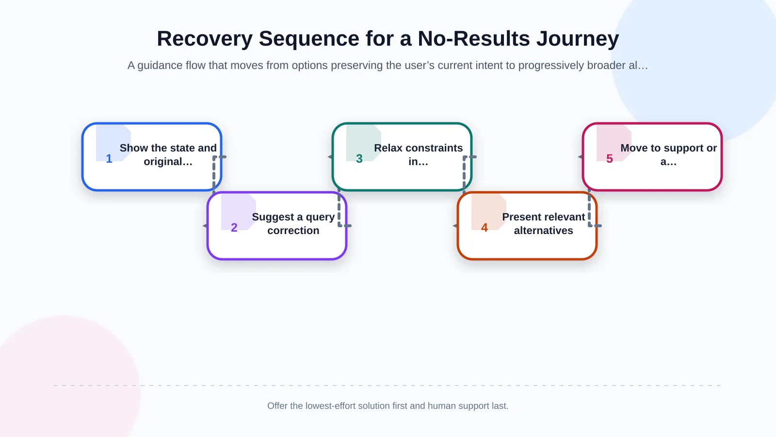
1. Explain the state clearly and in context
Replace ambiguous messages such as “An error occurred” with a description of the unsuccessful task: “No product found for ‘ABC-120’” or “No orders were found in the selected date range.” Showing the submitted query helps users confirm what the system evaluated. Keep the language neutral and concise rather than blaming the user, making jokes or exposing technical details.
2. Make the query easy to correct
Keep the search field visible and retain the previous query. When confidence is high, a “Did you mean?” suggestion can provide a one-click correction. If the system automatically changes the query, disclose the change and preserve a way to search for the original wording. This is particularly important for part numbers, names and specialist terminology where a seemingly unusual entry may be correct.
3. Relax constraints in a controlled way
On filtered listing pages, show active constraints as removable labels. First offer to remove the filter that narrows the results most, then provide an option to clear everything. In B2B catalogues, customer-specific product visibility and stock rules must still be respected. Guidance should be useful without revealing products, prices or records outside the user’s authorised scope.
4. Present relevant alternatives and content
Recommendations should be based on nearby categories, product families, synonyms or intended use—not a random list of popular pages. Corporate websites can suggest related services, case studies or guides. E-commerce platforms can show alternative products and categories, while portals can surface common tasks. When search fields, information architecture and interactions need to work as one system, Kumsal Agency’s web design and user experience approach considers the next action as part of the experience rather than treating the empty screen as an isolated component.
5. Provide a route to human support or a request
If a product cannot be found, the user may want a substitute, a custom item or a bulk-purchase quotation. The final recovery step could be a quotation form on a corporate website, an account representative in a B2B portal or a support ticket in a mobile app. Where permission and privacy rules allow, pass the query, active filters and page context into the form automatically so the user does not have to repeat the same information.
How should recovery options change by channel?
The shared principle is to preserve intent, but the appropriate actions vary by business model. Content discovery matters on a corporate website; product discovery dominates e-commerce; record verification is critical in B2B portals; and prioritisation becomes especially important on smaller mobile screens.
Corporate websites
If services, industries, projects and blog articles share one search experience, group results by content type. When nothing matches, suggest nearby service pages and provide a contact or quotation route. The search scope should also be explicit: users need to know whether they are searching the full site, only projects or a specific catalogue. Labels, examples and relevant suggestions should reflect the terminology used by the intended audience.
E-commerce platforms
Spelling tolerance, synonyms, product codes, category recommendations and stock states must work together. If a product is temporarily unavailable, show its availability state, possible alternatives and a notification option instead of treating it as nonexistent. A custom e-commerce platform should also coordinate the search index with ERP, PIM, price, inventory and campaign sources so recommendations do not lead users to stale or unavailable offers.
B2B customer and dealer portals
For order, invoice, shipment or quotation searches, give appropriate hints about reference-number formats, date ranges, company accounts and permission scopes. If a record exists in the ERP but has not reached the portal, monitor synchronisation status and define error queues and safe retry behaviour. Never disclose the existence of a restricted record merely to explain why the current user cannot see it.
Mobile applications
On a small screen, prioritise the strongest primary action instead of displaying every recovery choice at once. Preserve the query, use adequately sized touch targets and make the keyboard behaviour support immediate editing and resubmission. In iOS and Android products built with React Native, define separate interface states for offline access, API failure, initial empty content and a genuine zero result. These states may look similar, but they require different explanations and actions.
Accessibility, performance and security must work together
When the number of results changes dynamically, a screen-reader user cannot rely on visual feedback alone. W3C’s ARIA22 technique explains how status messages can be presented in an element with role="status", with aria-atomic="true" where appropriate. Announce the result without moving focus unnecessarily away from the search field or active control.
Recommendation logic should not make the page noticeably slower. Popular categories and nearby queries may be cached, but changing information such as stock, prices and permissions should be verified against an authoritative source. Search logs also require care: personal data, customer numbers and commercially sensitive terms should not be transferred into analytics platforms without defined controls, retention rules and access restrictions.
Nielsen Norman Group’s UX research similarly supports presenting popular or related content when no match exists, while making clear that these items are secondary suggestions rather than search results. This distinction prevents users from believing the system found a genuine match.
How should no-results searches be measured and improved?
Tracking only the total number of zero-result searches is not enough. Group spelling variants of the same query and analyse events by channel, device, user role, category and active filters. Measure what happens next: whether the user changes the query, clears a filter, selects a suggestion, requests support or abandons the journey.
- Zero-results rate: the percentage of all searches that return no result.
- Recovery rate: the percentage of affected users who subsequently reach a meaningful result or target action.
- Requery rate: the percentage who edit and resubmit a query within the same session.
- Suggestion engagement: use of corrected queries, suggested categories or alternative products.
- Abandonment and support rate: users who leave the journey or move to a help channel.
Reports should not remain within the UX team. Content teams can identify missing pages, product managers can assess unmet demand, sales teams can find quotation opportunities, operations teams can investigate data delays, and developers can improve matching logic. Assigning owners and review intervals turns unsuccessful searches into a manageable improvement backlog.
How should implementation scope and acceptance criteria be defined?
Start by inventorying every screen that supports searching, filtering or listing. For each one, design genuine zero results, technical failure, restricted access, first-use and loading states separately. Keep the message, primary action, secondary suggestions, analytics events and source data in the same requirement record.
Acceptance testing should go beyond confirming that the screen appears. Test whether misspellings can be corrected, removing a filter restores results, suggestions obey stock and permission rules, screen readers announce the status, and an API outage is not described as “no record found.” Include latency targets, logging boundaries, security controls and ERP-integration failure behaviour in the project scope.
Test with realistic terminology, long product codes, empty and expired records, slow responses, multiple roles and narrow mobile screens. Confirm that every suggested action produces the promised change and that analytics can distinguish genuine recovery from repeated failure. These criteria make the experience measurable and protect it from becoming a purely cosmetic empty-state design.
Turn an empty screen into a productive user journey
A successful “No results found” experience does not merely tell users what is missing. It helps them understand the situation and move towards the best available next step. Preserving the query, offering meaningful corrections, relaxing filters carefully, presenting contextual alternatives and enabling support together increase the chance of task completion.
Kumsal Agency combines creative design with robust software infrastructure to plan search, filtering, recommendations, forms and data or ERP integrations around the real operation of corporate websites, e-commerce platforms, B2B portals and React Native mobile applications. To analyse where users reach dead ends in your digital product and define a project-specific solution, contact Kumsal Agency.