


Aydınlatma metni yükleniyor…
Redesigning a corporate website’s navigation involves much more than rearranging menu labels. For B2B companies with hundreds of pages, multiple languages or extensive product and service catalogues, navigation is the primary wayfinding system connecting visitors, content and business goals. Strong visual design cannot compensate if users cannot find the right service, technical document, product family, investor information or contact channel.
Tree testing is a research method for evaluating a proposed menu hierarchy through realistic user tasks before interface design and software development begin. Instead of seeing a fully designed menu, participants navigate a plain text tree made up of categories and subcategories. By removing colours, animation, visual hierarchy and mega-menu behaviour, the test focuses on whether the structure and labels make sense.
Tree testing does not guarantee perfect navigation or commercial success. It does, however, expose assumptions and provide evidence for discussing unclear terminology, overlapping categories and unnecessary depth before they create expensive design and development changes.
What is tree testing, and what does it help you learn?
Tree testing is a task-based information architecture method in which participants try to find specific information or functionality using only a hierarchical category structure. A participant might receive the task “Find the technical data sheet for a product,” then move from the top-level categories to the location they believe is correct. The focus is not how the page looks, but where the person expects the information to be.
Nielsen Norman Group’s overview of tree testing explains that the method evaluates menu labels and categories independently of visual design. This distinction helps teams determine whether a navigation problem comes from the underlying information architecture or its interface implementation.
Tree testing can help answer questions such as:
- Do users look for important content under the expected category?
- Do top-level labels provide enough clues about the content beneath them?
- Do similar categories create hesitation at the first choice?
- Can users reach the correct destination directly, or do they backtrack?
- Should certain content be accessible from more than one logical context?
The method does not directly measure page readability, mobile-menu interactions, search quality or form usability. Those aspects should be examined later through prototype and usability testing.
Why run tree testing before designing a corporate website?
An information architecture decision affects many connected deliverables. When the menu changes, page templates, content production, URL planning, mobile navigation, CMS classifications and even integration requirements may change with it. If a structural problem appears after interfaces have been approved, teams may need to revisit much more than a single label.
Because tree testing does not require a finished design, it fits naturally into the early discovery stage. Teams can test critical tasks using the existing content inventory and a proposed sitemap, improve the hierarchy and then proceed to wireframes, responsive interfaces and custom development with stronger evidence. Within Kumsal Agency’s corporate web design approach, requirements analysis, information architecture, content planning, design and development are treated as connected decisions.
Early testing can also make internal disagreements more productive. Sales may favour product families, marketing may prefer solutions and technical teams may organise content around internal systems or data models. User-task evidence allows these options to be assessed against audience behaviour rather than departmental preference alone.
How should you plan a tree testing study?
A useful study does not begin by copying the current menu into a testing tool. First define business goals, priority audiences and the content users must be able to find. Then simplify the test tree, write neutral tasks, run the study with appropriate participants and translate the findings into structural improvements.
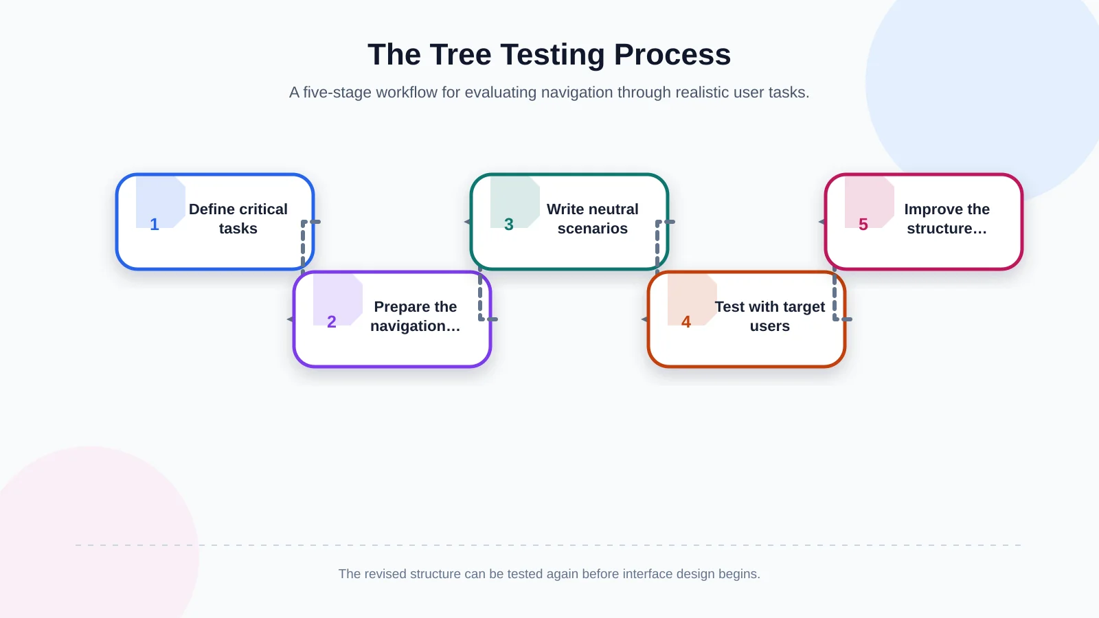
1. Define goals and critical user tasks
“Is the menu easy to understand?” is too broad to be an effective research question. Instead, list important decisions and visit scenarios. Examples include a procurement specialist finding a certificate, an engineer locating technical documentation, an investor searching for a report, a candidate reviewing open roles or an overseas buyer finding regional contact details.
Do not limit the study to content promoted on the homepage. Include information that may be difficult to find but carries significant commercial, operational or compliance value. Analytics, internal search terms, call-centre questions, sales enquiries and known usability issues can all contribute to the task pool.
2. Prepare the navigation tree
The tree should represent the hierarchy from main categories to destination pages. Remove visual design, promotional imagery and page copy so participants see only category labels. This prevents a strong banner or featured card from masking a weak navigation term.
Keep the tree realistic but manageable. Planned content can be included, while internal filenames, temporary pages and technical classifications hidden from visitors should be removed. For multilingual websites, do not merely translate words. Test whether labels are understandable in each language and market, because familiar terminology and expectations may differ.
3. Write neutral task scenarios
If a task repeats the exact destination label, participants may match words instead of interpreting the structure. Rather than saying, “Find the maintenance page under Services,” use a contextual prompt such as, “You want to review periodic maintenance options for equipment you purchased. Where would you look for this information?”
Tasks should be concise, realistic and focused on one destination. Do not assume that participants understand internal company terminology, and avoid clues that reveal the intended route. A small pilot can uncover confusing wording or tasks with several equally plausible interpretations before the main study begins.
4. Test with participants who represent the audience
Recruiting only existing customers may distort the findings because long-term customers have already learned the organisation’s terminology. Consider new prospects, users in different decision-making roles and, where relevant, participants from different markets. Whether the study is qualitative and exploratory or quantitative and comparative will also shape recruitment.
In moderated sessions, researchers can ask follow-up questions to understand hesitation. Unmoderated studies may make it practical to reach more people and compare navigation paths numerically. The method, sample and number of tasks should reflect the project’s questions; there is no universal participant count suitable for every study.
5. Turn findings into improvements and retest
Do not reduce the outcome to a single success rate. Review first choices, complete paths, backtracking, incorrect destinations and patterns by task. The guide to interpreting tree test results recommends considering success, first clicks and directness in context.
If participants choose the correct top-level category but diverge at lower levels, the main menu may be working while subcategory labels need attention. If first choices split between two categories, their meanings may overlap or the content may reasonably fit more than one mental model. After revising the hierarchy, retest critical tasks to compare the new structure with the earlier version.
Which tree testing metrics and behaviours should you evaluate together?
Relying on one metric can lead to incomplete decisions. Reaching the correct destination matters, but the confidence and directness of the route also reveal how clearly the structure communicates. Because tasks vary in difficulty, analyse results by task and audience segment rather than relying only on an overall average.
- Task success: Whether the participant reaches the defined correct destination.
- First choice: Which top-level category the participant selects first.
- Directness: Whether the participant reaches the destination without backtracking or exploring alternative branches.
- Paths taken: Where incorrect expectations cluster across labels and categories.
- Time: A supporting indicator of hesitation, but not conclusive proof of clarity by itself.
Avoid classifying every result as successful or unsuccessful against one universal threshold. Consider the importance of each task and changes between tested versions. Failure to find a legally required document, for example, presents a different business risk from difficulty locating a general blog post.
How do common navigation problems appear in the findings?
Ambiguous category names often cause first choices to scatter across multiple branches. Similar headings such as “Solutions,” “Expertise” and “Services” may create hesitation when their scopes are not distinct. Acronyms and department names that make sense internally may also provide little information scent to an external audience.
With unnecessary depth, users may enter the correct main branch but backtrack among similar intermediate levels. In an excessively broad structure, they may face too many sibling choices at once. The answer is not always to remove levels: content groupings, label distinctiveness and user expectations must be considered together.
Misplaced content often appears when participants consistently select the same supposedly incorrect branch for a destination. Treat this as evidence, not user error. The team might move the content, make it accessible from two valid contexts or rewrite the parent labels. Cross-listing should remain deliberate, however, because placing every page in several categories can make navigation bloated and difficult to maintain.
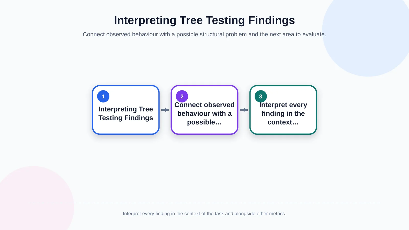
| Observed behaviour | Possible problem | What to evaluate |
|---|---|---|
| First choices are scattered across branches | Labels are ambiguous or overlapping | Differentiate category names |
| Users enter the correct branch but frequently backtrack | Lower levels are too deep or too similar | Review intermediate levels and their scope |
| The same incorrect branch is chosen repeatedly | Content conflicts with user expectations | Consider moving it or providing controlled cross-access |
| Users find the destination through a winding route | The structure works but is not direct | Simplify labels and category order |
Tree testing vs card sorting vs usability testing
These methods are complementary rather than interchangeable. Card sorting helps reveal how users group content and describe those groups. Tree testing evaluates whether an established hierarchy supports realistic tasks. Usability testing examines the complete experience in a real or prototype interface, including menu visibility, interaction, content and page context.
The comparison of card sorting and tree testing positions card sorting as a way to generate information architecture options and tree testing as a way to evaluate a proposed structure. A redesign might begin with site observations and a content inventory, use card sorting when new grouping models are needed, validate a candidate tree and finish with prototype usability testing.
Moving from test findings to interface design and development
An approved sitemap does not mean the design is complete. Teams must still determine how navigation works on desktop and mobile, how the active location is communicated, how long labels behave and how people reach deeper levels on touch devices. Accessibility, keyboard operation, focus order and dropdown behaviour also need prototype and development testing.
The content plan should define the purpose, owner, language and update responsibility for each destination page. CMS content types do not have to mirror visitor-facing navigation exactly. Where custom business rules, integrations or user roles are involved, Kumsal Agency’s web development services can be planned alongside information architecture decisions.
Existing URLs also need careful treatment during a redesign. Moving a page within the menu does not automatically require changing its URL. If URLs must change, map old addresses to new ones and manage redirects, internal links, sitemaps and search visibility through a dedicated migration plan.
Make navigation decisions measurable
A corporate website menu should not simply reproduce the organisational chart. It should help different audiences complete their tasks. Tree testing isolates that wayfinding system from visual design, showing where labels are unclear, where users expect content and where the hierarchy causes hesitation.
The most valuable result is not a standalone score. It is a shared evidence base connecting discovery, user tasks, information architecture, content planning, responsive interface design and development. Combining tree test findings with prototype and usability testing allows teams to evaluate both the structure and its eventual interface.
To plan your corporate website navigation around real user tasks and business goals, contact Kumsal Agency.