


Aydınlatma metni yükleniyor…
For brands connecting products, services, store visits or appointments in Nişantaşı and Teşvikiye, a strong visual identity matters. Yet large photography, animated transitions and distinctive typography fail when they make the offer harder to understand, slow the page, block keyboard use or weaken mobile actions. Website scope should protect aesthetic expression while solving visitor tasks, content operations and technical acceptance together.
This guide does not use the area as evidence of an office or local results. It helps teams create a professional brief that balances visual quality with measurable user and operating requirements.
Define the business task before the visual expression
Assign one primary visitor task to each important page: discover a collection, understand a service, compare fit, find store information, start an appointment or request advice. The visual language should support that task rather than replace it.
When the same page presents many campaigns, videos, products and calls to action, priority disappears. Brand, content and design owners should agree which question the first view answers, which evidence follows and which action is primary.
The design acceptance ledger: six decision areas
Kumsal Ajans developed this ledger to record each visual decision with six controls. It turns subjective approval at the end of the project into a discussion about purpose and acceptance evidence.
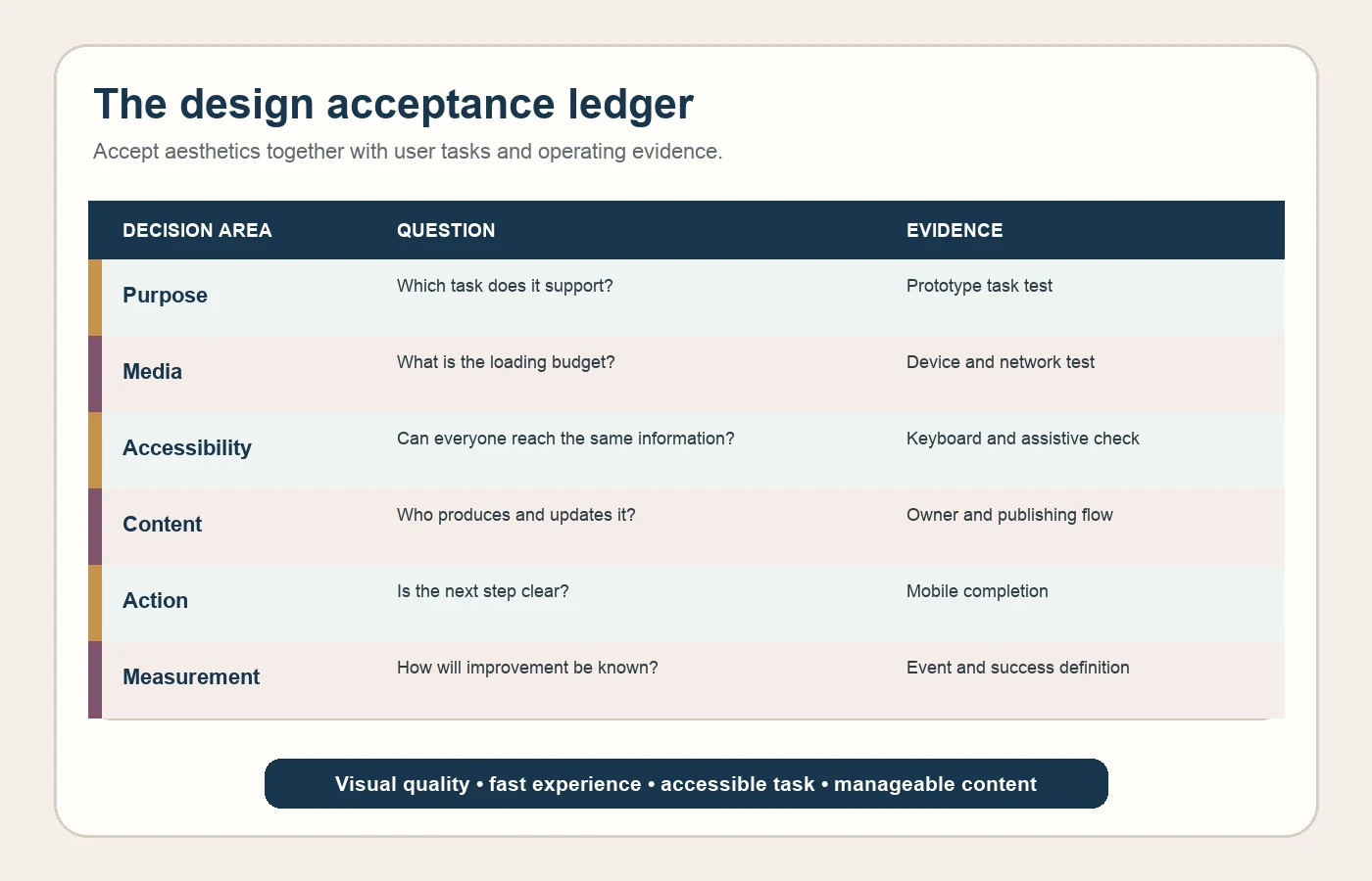
| Area | Question | Acceptance evidence |
|---|---|---|
| Purpose | Which user task does this visual support? | Prototype task test |
| Media | What is the file, size and loading budget? | Representative device and network test |
| Accessibility | Can visitors access the same information without vision or a mouse? | Keyboard and assistive check |
| Content | Who produces, approves and updates it? | Owner and publishing flow |
| Action | Is the primary next step clear and contextual? | Mobile completion test |
| Measurement | How will the team know the task improved? | Event name and success definition |
Design the visual system for real content
Perfect landscape photography in a design presentation may not exist in production. Define aspect ratios, minimum resolution, safe crop areas, file formats and text alternatives for product, team, store and service media. Components must survive missing images, different ratios and long titles.
Google recommends standard img or picture markup with a usable src fallback, descriptive filenames and contextual alt text (Google image SEO guidance). Alt text is not a keyword list; it briefly explains the image's function in context. Decorative images may use empty alt text.
Keep media budgets inside design decisions
Set budgets for hero media, video, fonts and third-party tools by page type. Specify desktop, tablet and mobile sources, compression quality, first-view priority and delayed loading for off-screen media. Autoplay video may require muted start, a pause control and a useful poster alternative.
Google's current Web Vitals model evaluates loading, responsiveness and visual stability through LCP, INP and CLS (Web Vitals). Review real-user data separately for mobile and desktop rather than relying on one lab score. Performance should guide media and component selection, not become a final optimisation task.
Accessibility does not diminish brand expression
Contrast, readable typography, visible keyboard focus and understandable labels can be solved within a high-quality design system. Define allowed colour pairs, text scales, focus styles and component states. Do not communicate essential information through colour, motion or text embedded in images alone.
WCAG 2.2 includes criteria for text contrast, resize, images of text, descriptive headings and labels, and visible focus (WCAG 2.2). Test brand fonts and light palettes with representative copy lengths and interaction states.
Separate product discovery from campaign display
Campaign areas carry temporary messages; category and service architecture provide permanent discovery. Presenting products only inside a visual slider makes comparison and return difficult. Category names, filters, descriptions and breadcrumbs should create a meaningful discovery system.
Define the minimum decision information for each card. Products may need name, distinguishing feature, variant and availability/contact state; services may need scope, fit and next step. Avoid both overloaded cards and image grids that force users to guess.
Make appointment and store actions contextual
Replace a universal “Contact us” button with an action appropriate to the stage: view in store, ask about availability, choose an appointment, request advice or get directions. Explain requirements and the next step before the action. Do not imply a branch or service area that does not exist.
Fixed mobile actions must not cover content or form fields. Test phone, map and appointment links against the right analytics events. Prototype failure, cancellation and no-availability journeys as well as success.
Connect content operations to the design system
Allowing editors to freely invent colours, type sizes and spacing gradually breaks brand consistency. Provide approved components, limited variants, required fields, image ratios, preview and draft–approval workflow. Product, service, store, team and campaign content may have different owners and review cycles.
For multilingual sites, test copy length, images containing text and CTA localisation with real examples. HTML text is easier to update, localise and access than text embedded in imagery.
Measure beyond aesthetic approval
Do not limit the first month to sessions and form totals. Track category entry, filter use, product or service detail views, store information, appointment starts, successful completion, errors and returns. High media interaction with poor task completion may mean the design attracts attention without providing direction.
Deliverables to require
- User tasks and page-priority map
- Brand components, states and accessible colour/focus rules
- Image production, crop, format and performance budgets
- Desktop and mobile prototypes using representative content
- Discovery, store, appointment and failure scenarios
- Content models, roles, approval and localisation workflow
- Analytics events, handover files and maintenance ownership
Use the website requirements guide to develop the brief and review the Kumsal Ajans web design service for implementation scope. A strong brand website sustains aesthetic quality together with speed, accessibility, manageable content and the right business action.