


Aydınlatma metni yükleniyor…
Someone choosing an investment fund, insurance policy, loan or portfolio management service is not simply selecting a product. They are making a decision about future costs, risks, commitments and possible outcomes. Yet financial product pages often mirror an institution’s internal structure, regulatory documents or technical product categories. The questions that matter most to the customer—“Is this suitable for me?”, “What could I gain or lose?” and “What should I do next?”—can become difficult to answer.
The purpose of financial services website design is not to hide complexity or make a product appear simpler than it is. It is to present necessary information in the right order, explain unfamiliar terms, reveal meaningful differences between options and help users take an informed next step. Achieving this requires brand language, information architecture, user experience, content, software and data security to be planned as one connected system.
Start explaining complex financial products with user questions
Turning an existing brochure into a webpage may produce something that appears complete internally but remains difficult for customers to use. Before deciding what the product owner wants to say, identify what the intended audience must understand to make a decision. Interviews, search queries, call-centre records, form abandonment, sales notes and frequently asked questions can all provide useful evidence.
For each product, define the intended customer, the need it addresses and the circumstances in which it may not be suitable. Then organise the content around practical decision questions:
- What need does the product address, and whom is it designed for?
- How are returns, premiums, interest or total costs calculated?
- What are the principal risks, exclusions and customer obligations?
- How long should the product be held, and what happens after an early exit?
- What information and documents are required to apply?
- At what point can the customer obtain support from a specialist?
The priorities vary by product. Investment pages may emphasise the relationship between risk, return and liquidity. Insurance pages need to clarify cover, exclusions and claims. Financing pages should make rates, terms, fees and total repayment visible. This prevents one rigid template from being imposed on products with different decision models.
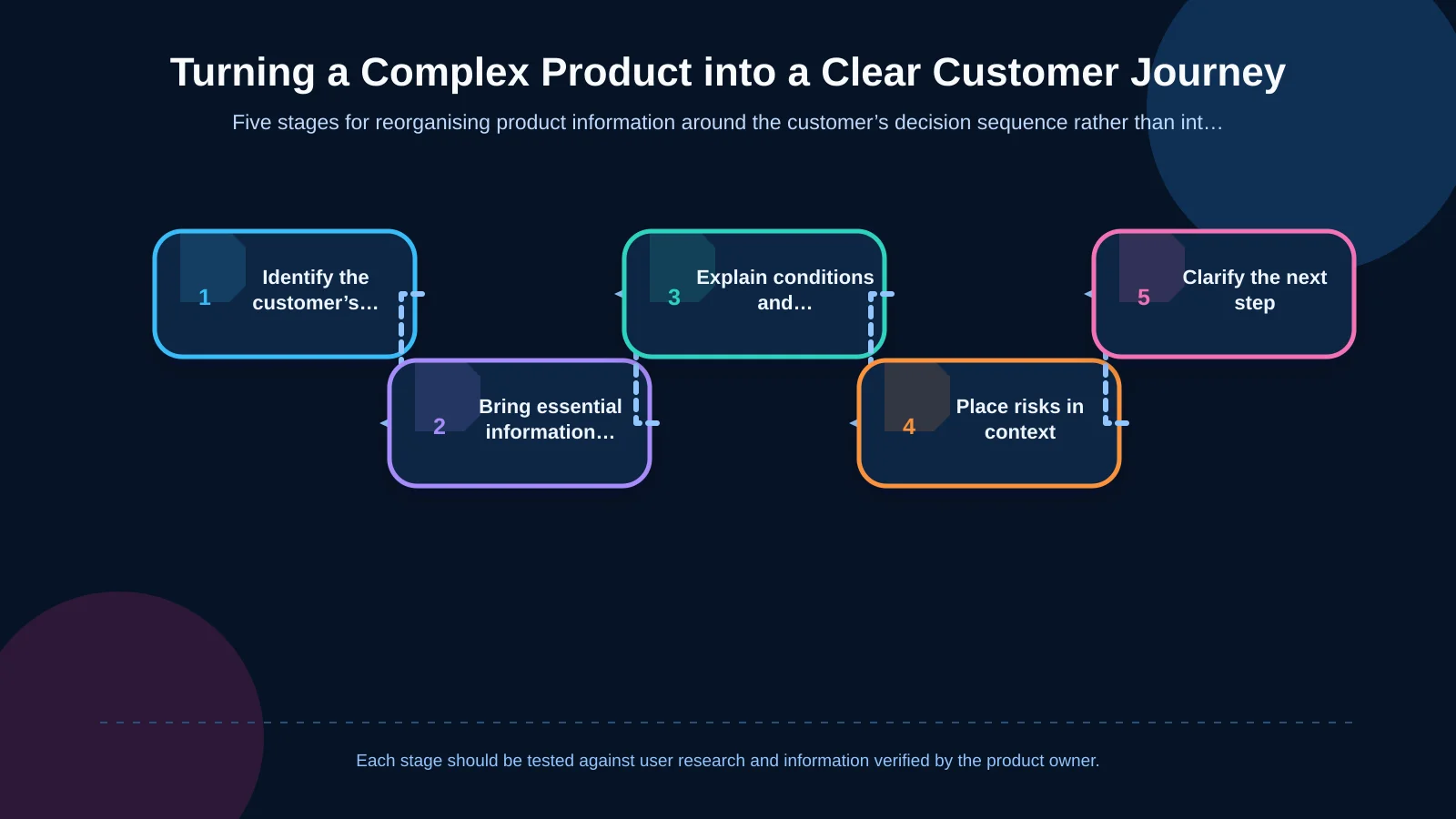
Layer information in the order customers make decisions
Placing every product detail at the top of a page does not automatically create transparency. It can cause essential information to compete with secondary detail. Layered content keeps the core proposition visible while making deeper information available when it becomes relevant. The first layer should communicate the product’s purpose, suitable customer profile, primary benefit and main risk. The second can explain how it works, its costs, its term and representative scenarios. The third can contain contracts, legal documents, methodology notes and detailed conditions.
The US Securities and Exchange Commission’s Plain English Handbook recommends clear document structures, informative headings, shorter sentences and tables where they aid understanding. This does not mean removing formal legal documents. Before directing users to them, the product page should explain what they contain and why that information matters to the decision.
Use a consistent decision framework across product pages
A shared content framework helps customers find familiar types of information when moving between products. Sections such as “Product at a glance”, “Who is it for?”, “How does it work?”, “Costs”, “Risks and important conditions”, “Application process” and “Support” can provide a foundation. The order may change according to the product’s decision logic, but equivalent information should use consistent labels.
When a technical term is unavoidable, explain it in everyday language at first use. “Liquidity risk”, for example, should not lead only to a glossary definition. Explain the practical consequence: the possibility that customers may be unable to convert their investment into cash at the expected price when they want to. Accordions can organise supporting detail, but critical costs, risks or exclusions should not be concealed behind closed interface elements.
Compare products by decision criteria, not feature lists
Customers may recognise the names of several products without knowing which differences matter for their needs. A comparison tool should therefore do more than place feature lists side by side. It should first clarify relevant selection criteria, including the customer’s goal, expected time horizon, need for access to funds, attitude to risk and available budget.
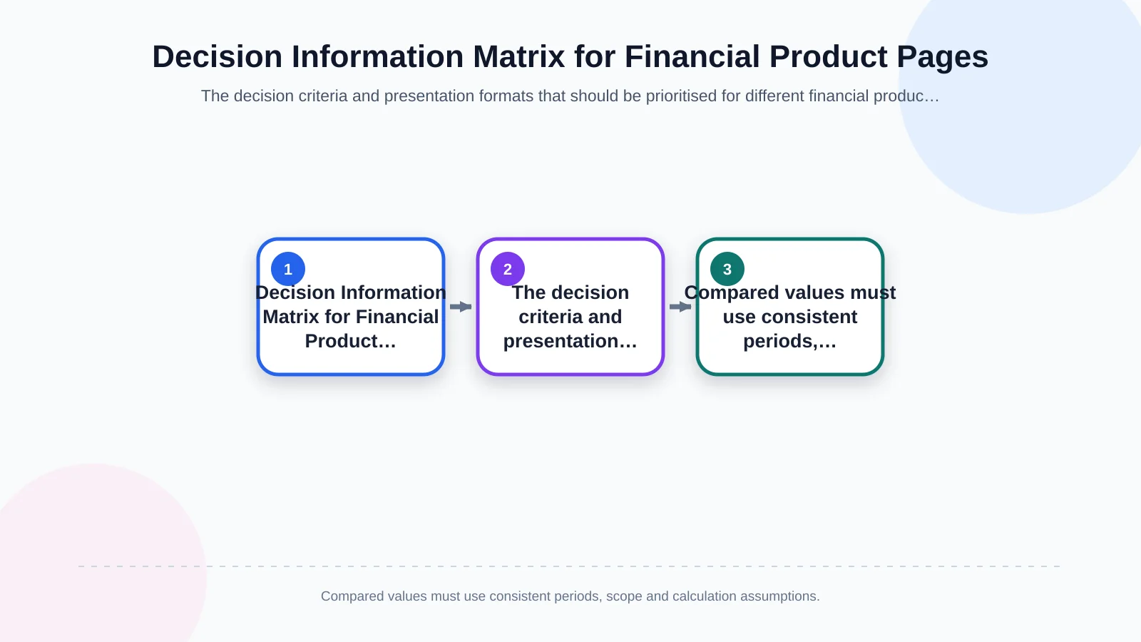
Comparable fields must use consistent definitions. A cost displayed as a monthly rate for one product cannot be meaningfully compared with an annual amount for another. State the applicable period, calculation assumptions and whether taxes or additional charges are included. Relative labels such as “low risk” also need a defined scale, a clear explanation and an indication of possible outcomes.
| Product type | Priority criterion | Essential explanation | Suitable presentation |
|---|---|---|---|
| Investment | Risk and time horizon | Fees, liquidity and potential loss | Scenarios and scale |
| Insurance | Coverage need | Cover, limits and exclusions | Comparison table |
| Financing | Total cost | Rate, term, fees and repayment | Calculator and summary |
| Portfolio management | Objective and approach | Strategy, risk, fees and reporting | Layered explanation |
Do not confuse comparison with personal advice
A short needs-discovery flow can narrow dozens of products to a more relevant set. However, the results should show how answers affected the filters and preserve the distinction between general information and personal advice. Customers should be able to change their answers, return to the full range and understand that results are not guarantees or commitments.
Interactive calculators should display default rates, data dates, charges and calculation methods close to their results. Multiple scenarios covering different market, term or payment conditions provide a more balanced view than one optimistic projection. It should also be clear that an illustrative calculation does not replace professional advice.
Turn visible risks, costs and exclusions into trust signals
Moving risk information to the bottom of the page may make the sales message feel easier in the short term, but it can damage trust and create false expectations. Explain risks while describing how the product works and place them near the related benefit. If a page discusses potential returns, it should also address the possibility of loss. If it promotes flexible withdrawal, it should disclose exit charges or waiting periods nearby.
Where possible, present costs through a representative scenario rather than a rate alone. For financing, show total repayment, fees and variable-rate conditions alongside the monthly payment. For insurance, explain deductibles, limits and exclusions alongside the premium. For investments, place management fees and the absence of guaranteed returns in the same decision context. Clearly identify assumptions and state that actual results may vary.
The UK Financial Conduct Authority’s review of good practice in supporting consumer understanding highlights prominent key information, early communication of risks and exclusions, layered content and testing with real customers. Although these principles are not automatically legal requirements in every jurisdiction, they provide a useful design reference for understandable financial communication.
Build trust through design, content and evidence
Trust does not come from corporate colours or claims of being “reliable” alone. Licensing and authorisation details, the organisation’s role, the product provider, data update dates, contact channels and complaint or support processes should be easy to find. Claims about returns or benefits should identify their applicable period and assumptions. Rates and conditions that may change should display a visible last-updated date.
A tailored corporate web design project builds the visual identity around this information hierarchy. Colour, typography, spacing and motion should guide customers towards critical details without competing with the content. In financial tables and charts, readable labels, scales, data dates and comparison context are more important than decorative effects.
Design a short, explanatory and secure application journey
Once customers understand a product, the next step should not be ambiguous. “Apply”, “Get a quote”, “Speak to a specialist” and “Request information” lead to different outcomes. Each call to action should explain what follows: a binding application, an initial assessment or simply a request to be contacted.
Before a form begins, state which documents are needed, approximately how many stages it contains and why the data is requested. Collect only the information required at the current stage. Where sensitive information is necessary, its transmission and storage must be considered within the project scope. Clear error messages, progress indicators, save-and-return functionality and confirmation screens can help reduce abandonment in longer financial applications.
Through custom web development and integrations, form data can be transferred in a controlled manner to CRM, customer service or eligibility-assessment systems. Permission models, audit trails, failure scenarios, data minimisation, encrypted communication, backups and access controls are not merely technical concerns; they are requirements for customer trust. Security claims should remain limited to measures that have actually been implemented and verified.
Make mobile usability and accessibility part of the product explanation
Leaving a desktop comparison table to horizontal scrolling is rarely sufficient on a small screen. Group fields by priority, preserve important differences in card or row layouts and help customers retain context while navigating. Calculator inputs should trigger suitable keyboards. Errors should be communicated through text and icons as well as colour. Touch targets, focus order and accordion behaviour should be tested on real devices.
WCAG 2.2 provides criteria for making web content perceivable, operable, understandable and robust. On a financial services website, this includes text alternatives for charts, correctly labelled forms, keyboard support and predictable interface behaviour. Accessibility is not a cosmetic check performed just before launch. It is a quality discipline spanning research, design, content, development and testing.
How should you measure customer understanding?
A short or attractive page does not prove that the product has been understood. During prototyping, conduct task-based tests with intended users. Ask participants to explain in their own words who the product suits, its main cost, its principal risk and the next step. Incorrect answers may expose problems not only in copy but also in sequence, labels, comparisons or interaction design.
After launch, teams can monitor movement between products, calculator use, views of critical explanations, form starts and completions, error rates, support requests and abandonment points. A high click-through rate is not sufficient evidence of success. Applications for unsuitable products, repeated questions and withdrawal later in the process should also inform evaluation.
Content ownership must be explicit. Who updates rates? Which pages require review after a regulatory change? How are obsolete documents removed? CMS fields, approval workflows, publishing permissions and change logs should reflect this operating model. Clear financial communication is not a one-off copywriting exercise; it is a measured and maintained product-management practice.
How should a financial services website project be scoped?
A robust project begins with a product inventory, audience research and analysis of existing journeys. The team can then prototype the information architecture, content model, product templates, comparison logic and application flows. Following interface approval, the scope may include custom software, integrations, responsive development, a management panel, performance, core accessibility and data-security requirements. Testing should verify not only that pages work, but also that customers understand the information and submitted data reaches the intended system securely.
Kumsal Agency approaches a financial services website as a sustainable digital experience that connects brand language, user needs, product structure and business goals—not simply as a visual shop window. Its Art Director-led original design approach is combined with research-led digital brand consulting, content and user-experience planning, custom software and a strong infrastructure with data security as a priority.
To analyse your financial products and customer journeys together and define the right scope, contact Kumsal Agency.