


Aydınlatma metni yükleniyor…
Typography on a corporate website is about far more than choosing a typeface that looks attractive on screen. It shapes the visitor’s first impression of the brand, determines the order in which information is perceived and influences how quickly people can find what they need. If headings feel confident but body copy is tiring to read, lines break awkwardly on mobile or button labels disappear into surrounding content, the aesthetic choice is not doing its job.
A well-planned typography system connects font families, sizes, weights, line height, text width, contrast and responsive scaling through a shared set of rules. The result should express the brand consistently while guiding visitors towards meaningful actions, such as reviewing a service, evaluating a project or making an enquiry. For brand managers, marketing teams and corporate communications professionals, typography is therefore both a design decision and an operational standard.
Why is typography a strategic part of a corporate website?
Visitors perceive the form of text before they begin reading it closely. Large, assertive headings may suggest confidence or innovation, while measured spacing and calm body copy can reinforce credibility. Too many typefaces, arbitrary weight changes and inconsistent sizes can create the opposite impression: a fragmented brand that has not established clear priorities.
Typography is strategic because it organises perception and information flow. The same system must work across the homepage, service pages, case studies, forms and long-form articles. Users should recognise headings, explanations, evidence, links and actions without having to stop and interpret the interface.
Consistency also improves production. When content teams have named styles and clear rules, they do not need to make a fresh visual decision for every new page. The website becomes easier to learn, manage and expand without gradually losing its identity.
How can brand character inform typeface selection?
Starting with “let’s find a modern font” reduces brand strategy to personal taste. Begin by defining how the organisation wants to be perceived: expert, established, approachable, technical, premium, dynamic or innovative. Then examine how letterforms, proportions, rhythm and available weights express those qualities.
An engineering business may need highly legible numerals, technical tables and reliable multilingual support. A consultancy may place greater emphasis on comfortable long-form reading and intellectual confidence. Candidates should be tested not only in oversized homepage headlines but also in small labels, forms, data, bold emphasis, navigation and mobile layouts.
Language coverage matters as well. Accented characters, punctuation, currency symbols and other required scripts must feel like part of the same family rather than an afterthought. Testing real content exposes weaknesses that polished sample phrases often conceal.
Aligning brand voice with visual voice
A calm, explanatory verbal style can conflict with an excessively theatrical typeface. Equally, presenting an innovative organisation through rigid, overly traditional typesetting may make the experience feel less credible. Typography should operate as the visual counterpart of the brand’s spoken voice.
That relationship is best established by examining positioning, competitors, audience expectations and digital touchpoints together. Kumsal Agency’s digital brand consulting approach connects visual direction and experience principles within the same research-led framework.
One family or more than one?
A single family with a useful range of weights and styles is sufficient for many corporate websites. It strengthens consistency, reduces design variables and makes font delivery easier to control. If a second family is introduced, it should have a specific role—for example, a distinctive display face for headings paired with a neutral, highly readable face for longer text.
Adding fonts merely for variety usually creates visual noise rather than stronger hierarchy. Each family, style and weight should earn its place through a clear communication need.
How do you build a readable typography system?
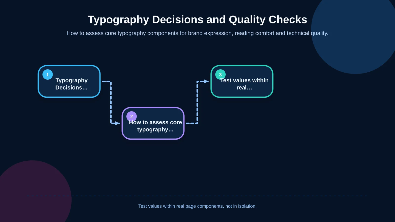
Readability does not depend on one ideal font size. X-height, character width, line length, weight, background contrast and content density all affect how text feels. Two typefaces assigned the same CSS size can appear substantially different on screen, so decisions must be tested with real content on real devices.
| Component | Core decision | Quality check | Risk |
|---|---|---|---|
| Body copy | Font size and column width | Scanning in long-form content | Tiring lines or excessive wrapping |
| Line height | Rhythm suited to the typeface | Text enlargement test | Overlapping or disconnected lines |
| Font weight | Limited set of roles | Visibility on small screens | Weak or excessive emphasis |
| Contrast | Text and background pairing | WCAG ratio and real-screen test | Faint text and reduced access |
| Web font | Required files and fallbacks | Slow-connection and layout-shift test | Delayed or jumping content |
Body copy and line length
Body text should be comfortable to read without zooming and should allow the eye to find the beginning of the next line naturally. Very wide columns make that return movement difficult; extremely narrow columns create constant wrapping and interrupt the rhythm of a paragraph.
Instead of treating a particular character count as an inflexible rule, observe reading rhythm across desktop, tablet and mobile layouts. Set an appropriate maximum width for the content area and account for sidebars, cards, tables and other components that reduce available space.
Line height, paragraph spacing and white space
Closely packed lines make content feel dense and tiring. Excessive line height, however, can weaken the connection between lines in the same paragraph. Line height should respond to the typeface and text size, while spacing above and below headings should communicate which content belongs together.
W3C’s guidance on text spacing explains that users should be able to modify line, paragraph, letter and word spacing without losing content or functionality. Components should therefore avoid rigid heights that cause enlarged or respaced text to overlap, disappear or overflow.
Balancing weight and emphasis
If every section is bold, nothing is truly emphasised. Define a limited set of weights for body copy, subheadings, links, data and actions. Thin weights may look refined in large headings but become difficult to read at smaller sizes or against low-contrast backgrounds.
Italics, uppercase text and expanded letter spacing should also have narrow, deliberate roles. Restrained emphasis helps users identify what matters instead of forcing them to process competing signals.
How does content hierarchy guide users towards action?
Most visitors do not read a corporate page from beginning to end. They scan the title, subheadings, evidence, highlighted details and calls to action. Typographic hierarchy should help them answer three questions quickly: What is this page about? Is it relevant to me? What should I do next?
- The page title states the main subject or promise.
- Section headings divide the argument into meaningful parts.
- Subheadings help readers navigate detailed information.
- Body copy explains scope, evidence and conditions.
- Links and buttons make the next step visible.
These roles should not be distinguished by size alone. Weight, spacing, colour and placement all contribute to hierarchy. Visual appearance must also align with semantic HTML: text that looks like a heading should use the correct heading element so assistive technologies and search engines can understand the page structure.
How should typography scale on mobile screens?
Mobile typography is not created by proportionally shrinking a desktop design. On narrow screens, oversized headings can wrap unpredictably, long words may overflow and button labels can break across two lines. The mobile system must rebalance type according to viewport width, content priority, touch targets and typical reading distance.
Relative CSS units and bounded fluid values can create smoother scaling between small and large screens than abrupt jumps at breakpoints. A formula is not enough, however. Long headings, numbers, names, error messages and translated content still need to be checked on actual devices.
Spacing must be responsive too. Oversized gaps delay access to the core message, while tightly packed blocks undermine scanning. In a comprehensive corporate web design process, the typographic scale should be developed alongside information architecture, components and responsive interface behaviour.
Accessibility: contrast and flexible text
Not every colour in a brand palette is suitable for text. Pale grey descriptions, words placed over images and links styled to look inactive frequently lack sufficient contrast. According to WCAG 2.2 guidance on minimum text contrast, the target is at least 4.5:1 for normal text and 3:1 for large-scale text. Thin or unusual letterforms may appear even lighter in practice and deserve additional scrutiny.
Accessible typography goes beyond a contrast score. Text should remain available when the browser is zoomed, components should tolerate user-defined spacing, links should not be identified by colour alone and important copy should not be embedded in images. Keyboard focus indicators and error messages also need legible, consistent treatment.
Defining these behaviours at component level allows every new page to inherit the same standard. Accessibility becomes part of the design system rather than a final audit performed just before launch.
How should web font performance be managed?
Typographic quality should not come at the cost of a slow page. Downloading multiple families, weights and character sets can delay visible text or cause layout shifts when the preferred font replaces its fallback. The web.dev guide to font best practices explains how font-loading choices can affect experience metrics including FCP, LCP and CLS.
Identify the weights actually used, consider modern WOFF2 files and remove unnecessary glyphs only when language needs and licence terms allow it. Whether files are hosted by a third party or served through the organisation’s own infrastructure should be decided through measurement, privacy requirements and operational ownership. Preloading may help the browser discover a critical font earlier, but preloading every file competes for bandwidth.
Fallback selection also requires care. If fallback metrics differ greatly from the primary face, text may reflow when the font loads. Test the font-display strategy, fallback metrics, caching and behaviour on slower connections. Performance is an initial criterion of the typography system, not a technical patch added after design approval.
What are the steps for planning a typography system?
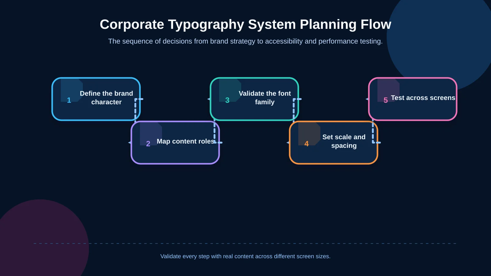
A sustainable system begins with brand and content analysis rather than browsing a font catalogue. Decisions should then be validated through representative pages, reusable components and technical testing.
- Define the brand character, audiences and communication tone.
- Map page types and content roles such as headings, body copy, data, forms and buttons.
- Test candidate families with real content and every required language.
- Set rules for size, weight, line height, text width and spacing.
- Validate desktop, tablet and mobile scales, including unusually long content.
- Complete contrast, zoom, text-spacing, loading and layout-shift checks.
Document decisions as named roles within the design system. “Page title” communicates intent more effectively than “32-pixel bold,” and it retains that intent if the values change later. Content management interfaces should offer meaningful styles rather than unlimited size and colour controls that allow consistency to erode.
Common corporate website typography mistakes
Expressing the brand only through a display heading
A distinctive headline face can create a strong opening, but brand identity must also work across body copy, forms, tables, numerical data and mobile interfaces. Focusing only on the hero section leaves the rest of the system unresolved.
Using too many styles and weights
Giving every content type a new visual treatment adds signals without necessarily adding meaning. A restrained set of clearly differentiated roles strengthens hierarchy and may reduce the number of font files required.
Testing the design with placeholder copy
Layouts built around short, idealised phrases often fail when real content arrives. Long product names, percentages, dates, multilingual headings and form validation messages should appear during design, not after development.
Treating a design file as the finished system
An interface looking polished in a design tool does not mean its rules have reached development and content management. Without typographic tokens, component states, responsive behaviour and controlled editor options, consistency will decline over time.
How can you evaluate whether a typography system works?
Evaluation should go beyond whether stakeholders like the font. Can users understand the main message quickly, locate the right sections while scanning and distinguish actions from explanatory content? Are mobile line breaks natural? Does information remain intact when text is zoomed or respaced? Is text visible and layout stable during font loading?
Answer these questions through design reviews, accessibility checks, performance measurement and observation of real users. After launch, analytics, on-site search behaviour and form journeys can reveal pages where hierarchy or readability is obstructing progress. Typography then becomes an organisational standard that evolves with the content rather than a one-off stylistic choice.
Make typography a working part of your brand
Corporate website typography sits at the intersection of brand character, content strategy, accessibility and technical performance. The right system does more than make pages attractive: it clarifies information, builds confidence and reveals the path towards an enquiry, quotation or other business goal.
Kumsal Agency combines an Art Director-led creative approach with digital brand consulting, design systems, responsive development and sustainable content management. To plan a readable typography system that reflects your brand and works across screen sizes, contact Kumsal Agency.