


Aydınlatma metni yükleniyor…
Approved screens in a Figma file do not necessarily mean a design is ready for development. Developers need access to colours, dimensions and assets, but those details alone cannot define a working digital product. The handoff must also explain how each screen responds to different data conditions, what users see during an action, how layouts behave across screen sizes and which outcomes count as correct.
An incomplete Figma handoff creates an invisible interpretation gap between design and development. Developers fill that gap with reasonable assumptions, product managers expect different behaviour, and designers request revisions after seeing the implemented interface. The result is not limited to visual inconsistencies: unclear decisions can affect the budget, schedule, usability, accessibility and testing process.
A reliable handoff is therefore not a one-off file transfer. It is a collaborative process that converts design decisions into implementable and verifiable product rules. The following framework can be applied to websites, e-commerce platforms, customer portals and mobile applications.
Why is a Figma link not enough?
An interface file often presents the product under ideal conditions: content fits, the connection works, the user enters valid information and every service returns a successful response. Real users encounter long content, missing product images, invalid form entries, delayed APIs and restricted actions. If these conditions are absent from the design, developers must guess both the expected behaviour and its visual treatment.
Figma’s Guide to Dev Mode describes capabilities such as inspecting properties, downloading assets, comparing changes, adding annotations and managing development-ready status. These features make handoff easier, but they do not create product rules automatically. A tool can display a measurement; the project team must still define when it changes or which message appears after a failed payment.
The delivery package should consequently preserve the context behind decisions as well as pixel values. Every critical point that could make a developer ask, “What should happen here?” is a potential missing deliverable.
In what order should a complete design handoff be prepared?
Instead of treating handoff as a final inspection, plan it as a body of work that matures throughout the design process. This sequence turns a collection of screens into a testable development package.
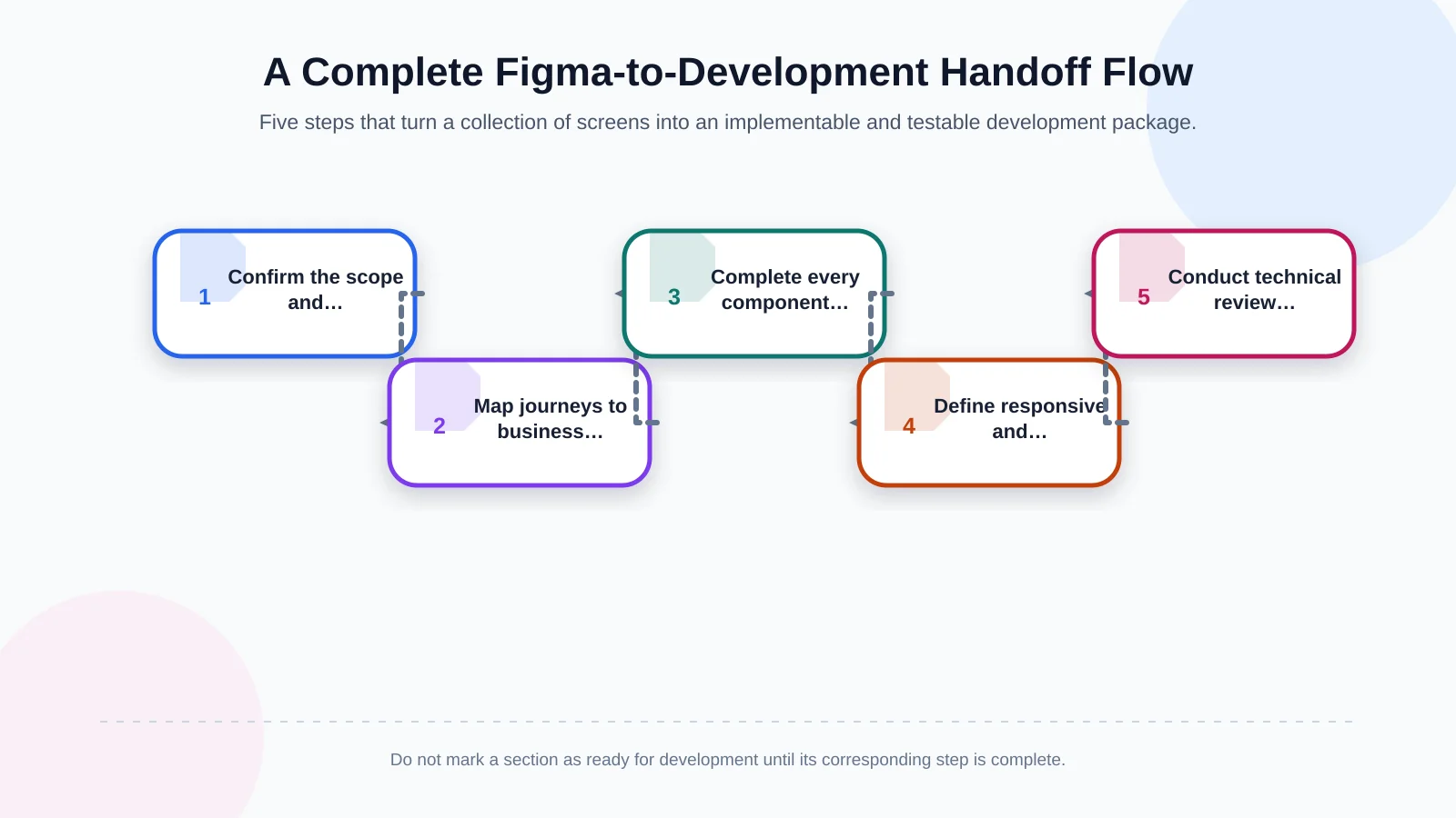
1. Confirm the scope and screen inventory
Record the platforms, user roles, pages and journeys included in the release. Give every screen a unique, understandable name. Do not hide visually similar screens under one design when they use different permissions, data sources or business rules. Clearly identify excluded functions and features scheduled for a later phase.
2. Map journeys to business rules
Placing screens next to one another does not explain a journey. Show its entry point, decisions, return paths and completion conditions in a prototype or linked flow document. For registration, baskets, quotation approvals and document uploads, document role restrictions, validation, time-outs, cancellation rules and recovery paths.
3. Complete components and their states
Organise recurring elements—buttons, fields, cards, modals, tables and navigation—as components with clear variant names. In addition to the default appearance, include hover, focus, disabled, loading, error, success and empty states where relevant. The team then inherits a shared behavioural vocabulary, not merely static screens.
4. Document responsive and accessibility rules
Explain what changes between desktop and mobile examples. Specify content order, table adaptation, navigation transformation and minimum touch-target behaviour. Keyboard order, visible focus, alternative-text requirements and the way errors are announced should also be part of the delivery.
5. Hold a technical review and acceptance session
The designer, developer, product owner and, where necessary, content owner should review the package together. Record open questions, connect resolved decisions to the relevant screens and mark only completed sections as ready for development. Finish with representative acceptance scenarios that can be tested.
Show every screen state and content scenario
The most commonly omitted deliverables are conditions outside the happy path. A populated list may be designed while first use, zero results, empty filtered results, loading, partial data and service failure are forgotten. Each condition requires a different explanation, interface treatment and user action.
Forms need more than empty and completed fields. Include required-field errors, invalid formats, character limits, server errors, submission in progress and successful completion. State whether feedback appears below a field or at page level, where focus moves and whether entered data is retained. In e-commerce journeys, address unavailable stock, invalid coupons, changed prices, declined payments and duplicate submission attempts.
Provide realistic content boundaries too. Test recommended title lengths, image ratios, missing profile pictures, large currency values, date formats and text expansion in additional languages. A card that looks balanced with placeholder copy may fail when it receives an actual product name. Content rules should say whether text wraps, truncates or expands its container—and whether the full value remains accessible.
This is more than visual polish. Storybook explains how separate “stories” can capture a component under different conditions for development and review. Its approach to documenting component states as distinct examples can help teams align Figma variants with implemented components and test the same scenarios consistently.
| Review area | Commonly omitted condition | Required deliverable | Verification |
|---|---|---|---|
| Lists and search | Zero results or partial data | Message, action and visual treatment | No-results query test |
| Forms | Error, waiting or success | Field-level and page-level feedback | Invalid-data test |
| Content | Long or missing data | Limits, cropping and fallback | Real-content example |
| Services | Delay or outage | Loading, retry and data retention | Error-response test |
| Permissions | Unauthorised action | Hide, block or explain | Role-based test |
Responsive behaviour means more than drawing three screens
Desktop, tablet and mobile designs are useful reference points, but the essential deliverable is the behaviour between them. A fixed breakpoint is not always sufficient. Describe how a component reacts as its available space narrows, including which element shrinks first, moves to another row, becomes scrollable or disappears.
Document the grid, maximum content width, outer margins and column relationships. Moving a product grid from four columns to two and then one is straightforward. Turning filters into a drawer, making a comparison table scroll horizontally or keeping primary actions visible requires explicit decisions. For long tables, identify priority columns and decide whether rows become cards on small screens.
Image cropping, video ratios, on-screen keyboard behaviour, device safe areas and landscape orientation are particularly important for mobile products. When the product will be developed with React Native, native differences between iOS and Android should be reviewed as part of the design. Kumsal Agency’s mobile application approach combines product goals, user requirements and technical constraints across both platforms.
Specify interactions, motion and user feedback
Connecting one screen to another in a prototype does not fully define an interaction. Document the trigger, conditions, duration and result. Clarify whether clicking outside a modal closes it, what the back action does, whether unsaved changes generate a warning and how the system responds when an action is repeated.
For animation, include its purpose, timing approach, starting and ending states, and reduced-motion behaviour. Define when a loading indicator appears, whether a small delay prevents flicker during fast operations and how long completion feedback remains visible. Motion should explain change or preserve context rather than delay the user.
Feedback must also be accessible. The W3C’s Web Content Accessibility Guidelines (WCAG) 2.2 include requirements related to programmatically determinable names, roles and values, as well as status messages that assistive technologies can identify. Focus order, keyboard operation, error relationships and success announcements should therefore be designed deliberately, not left as implementation details for developers to resolve later.
What should a design system and asset package include?
Consistency improves when colour, typography and spacing values are delivered through variables and styles instead of being extracted from scattered screens. Name colours according to purpose rather than appearance—for example, text-primary, surface-warning or border-disabled. A typography scale should define font family, weight, size, line height and letter spacing together.
Each component needs documented anatomy, sizes, variants, states and usage rules. A primary button definition might explain which actions qualify, how often it can appear within one view and how icons align. Mapping Figma component names to their equivalents in the codebase also makes later revisions easier to track.
For icons, illustrations and photographs, specify file format, resolution, scaling, cropping and background requirements. Remove unnecessary layers from SVG assets and flag licensing or usage restrictions. Developers should receive an intentional source package rather than turning arbitrary exports from individual screens into production assets.
Connect technical expectations and the data model to the design
An interface cannot be separated from its data and business rules. Link sorting, filters, pagination, currency and date formats, role-based visibility, upload limits and integration responses to the relevant screens. If a design displays an “approved” badge, the team needs to know which system supplies that state, when it changes and how the update is communicated to the user.
If the API is not ready, create a sample data contract. Record the field name, data type, requirement status, possible values and null behaviour. This gives front-end and back-end teams a shared expectation before integration begins. The same review should cover masked sensitive data, role separation, information that must not enter logs, failure responses and safe retry behaviour.
For portals, administration panels and integration-heavy products, handoff should be planned alongside the custom web development scope. This keeps interface decisions connected to data sources, authorisation, security, performance and maintainability.
Define change management and acceptance criteria
Silent Figma changes after development starts can make even a well-organised file unreliable. Mark delivered sections with a version or status, and record the date, reason, affected screens and owner of every material change. Do not leave critical updates only in comments; connect them to the relevant task in the team’s project-management system.
Prepare verifiable acceptance criteria for every important journey. Replace “must be mobile-friendly” with an observable statement such as: “On narrow screens, filters open in a drawer, the trigger displays the number of active filters and the list updates when selections are applied.” Acceptance should cover functionality, error handling, accessibility and content resilience as well as visual fidelity.
At the end of the handoff session, share the open-question list, decision owners and target dates. Design approval and development acceptance are separate milestones: the first confirms visual and experience decisions, while the second confirms that the working product meets the agreed rules.
Figma handoff checklist
- Are all in-scope platforms, roles, screens and journeys listed?
- Are empty, loading, error, success, unauthorised and offline states shown?
- Have realistic content lengths and missing-data scenarios been tested?
- Are responsive transformations and content priorities documented?
- Are component variants, design variables and asset formats organised?
- Are validation, feedback, keyboard and focus behaviours defined?
- Are data fields, roles, integrations and security expectations connected to screens?
- Are change records, owners and acceptance criteria in place?
- Has a technical review been completed with developers and open questions resolved?
Manage design and development as one product process
A complete handoff is not simply a larger collection of screens. Its purpose is to express design intent, system behaviour and business expectations in a form every discipline can interpret consistently. This reduces avoidable rework, makes testing more concrete and helps the product remain coherent across devices and real-world data conditions.
Kumsal Agency combines Art Director-led, brand-specific web and digital design with custom web development, React Native mobile applications, e-commerce and user-experience planning. From information architecture and responsive behaviour to components, data security and sustainable delivery, design and software are planned as complementary parts of the same product.
To transfer your Figma design to developers with fewer gaps and plan the design and development process together, contact Kumsal Agency.