


Aydınlatma metni yükleniyor…
A digital product’s user experience is shaped by more than its home screen, navigation and successful journeys. The few words shown when a payment fails, a search returns no results or an order is completed can directly affect whether the product feels usable and trustworthy. At these critical moments, effective UX writing answers three questions without delay: What happened? What does it mean for me? What should I do next?
Error, empty-state and confirmation messages should not be treated as interface copy added just before launch. They are the visible expression of the product’s brand voice, business rules, user roles, permissions, data flows and integration states. Vague or inconsistent messages increase support demand and leave users unsure whether an action was completed. A coherent message system guides people across web software, mobile apps, e-commerce journeys and ERP-connected portals.
Why is UX writing part of product infrastructure?
UX writing is not simply the practice of finding short labels for buttons. It connects user intent, the system’s current state and the available next actions through a shared language. “Transaction failed” may be technically accurate, but it does not explain whether the problem concerns the payment method, connection or stock availability. “We couldn’t charge your card. Check the card details or choose another payment method” turns uncertainty into a practical recovery path.
Message design should therefore begin during product discovery. When mapping user journeys, teams need to define more than the ideal path. Missing data, unauthorised access, timeouts, connection failures, integration delays, duplicate submissions and partial completion should also be considered. Kumsal Agency’s research-led Digital Brand Consulting approach connects brand voice with genuine user needs and touchpoints. Messages can then function as a product-wide communication system rather than a collection of unrelated sentences.
How do you create an effective system message?
Before writing, diagnose the moment in which the message appears. What was the user trying to do? What does the system know with certainty? Can the user correct the problem? Was any part of the action completed? What is the safest primary next step? Copy written without these answers may contradict the system’s actual behaviour.
Nielsen Norman Group’s error-message guidelines recommend making messages visible, explaining the problem in understandable language, offering a constructive solution and avoiding blame. The same logic applies beyond errors: users should first understand the state, then see its effect and, whenever possible, continue through one clear action.
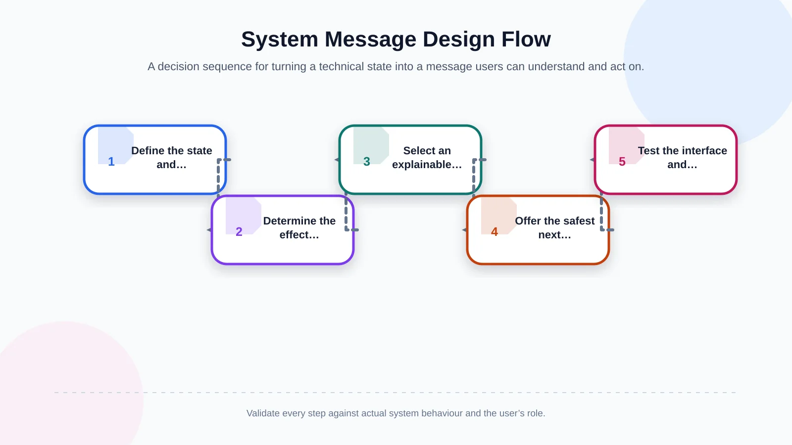
Five steps from system state to user action
A shared decision sequence helps product, design, content and development teams create consistent messages. Start by identifying the event type and source, then decide which information can be shown safely. If the user can resolve the situation, prioritise that recovery action. If the problem is systemic, do not ask them to complete the form again without reason. Explain whether their data was preserved, when to retry or how to obtain help. Finally, test the copy, interface behaviour and accessibility together.
- Name the state: error, loading, empty content, success or partial success.
- Explain the known cause in language the user understands.
- Clarify the current status of the action and any submitted data.
- Present the safest next step as the primary action.
- Test against real system responses, devices and user roles.
Error messages: Explain the problem and provide a recovery path
A useful error message contains three elements: what did not happen, why it happened when the cause is known and how the user can proceed. Replace “Invalid input” with a specific instruction such as “Enter a 10-digit phone number.” Field-level errors should appear beside the relevant input. If a page contains several errors, provide a clear summary that helps users reach each affected field.
Not every technical detail belongs in the interface. Stack traces, database names and raw API responses reduce clarity and may expose sensitive information. When support teams need an error code, display it as a secondary reference rather than the main message. Instead of “ERP_TIMEOUT_504,” say: “We haven’t been able to transfer your order to the ERP system yet. Your order details are saved; try again in a few minutes.”
Avoid telling users to check their information when they cannot resolve the underlying outage, permission issue or integration failure. If the system retries automatically, say so. If another submission could create a duplicate record, warn the user clearly and prevent repeated action at the interface and API levels. This combination of precise messages, safe retries and line-level validation is also important when teams plan B2B bulk ordering and error handling.
Empty states: Explain the absence and make the first step visible
An empty screen is not always an error. A user may be opening the product for the first time, may not have created any records, may have deleted all existing data, may have narrowed the results with filters or may lack permission to view the content. Using “No records found” for every case collapses very different situations into one unhelpful response.
IBM Carbon Design System’s empty-state guidance recommends explaining the absence in context and offering a productive next step when one is available. A first-use screen might say, “You don’t have any projects yet,” followed by “Create your first project to track tasks with your team” and a “Create project” button. When a search returns no matches, changing the query or clearing filters is usually more relevant than creating a new record.
Choose the message according to the cause of the empty state
The content should reflect why the space is empty. For first use, explain the value of the area and offer a starting action. For a search with no results, make it easy to review the query and active filters. If access is restricted, identify the permission issue and explain how to request access. A loading failure must never masquerade as an empty data set; doing so creates false confidence and may lead users to make decisions based on missing information.
- First use: Explain what the area is for and offer one clear starting action.
- No search results: Confirm the query and provide a way to change it or clear filters.
- Insufficient permission: Explain what cannot be viewed and how access can be requested.
- Loading failure: Identify the connection or service problem and offer a safe retry.
Confirmation messages: Confirm the outcome, not just success
“Success” is not a sufficient confirmation on its own. Users need to know which action was completed, where they can see the result and what happens next. “We received your request” and “Your request has been approved” describe different states. That distinction has operational consequences in orders, payments, document uploads and multi-stage approval workflows.
A strong confirmation repeats the completed action by name: “Your order has been created.” It then supplies a meaningful reference: “Order number: 10482.” Finally, it explains the next stage: “It will be transferred to the ERP system after approval by your dealer manager.” Depending on the context, the message may also show a masked email address, an estimated review period or a link back to the record.
For reversible actions, a short-lived “Undo” option can provide a smoother experience than repeated confirmation dialogs. High-risk actions such as money transfers or permanent deletion may require both a pre-action check and a post-action confirmation. Copy alone is not enough: button states, idempotency controls and transaction records must also prevent duplicate orders when users click or tap repeatedly.
Accessible messages do not rely on colour alone
Error, success and waiting states cannot be communicated only through red, green or animation. The message needs explicit language, a programmatic relationship with the relevant control and predictable keyboard focus. Dynamically inserted notifications must also be detectable by screen readers.
W3C’s explanation of WCAG 2.2 status messages describes how success, result, waiting, progress and error notifications should be identifiable by assistive technologies without unnecessarily moving focus. Teams should select an appropriate status role or live-region behaviour according to urgency. Announcing every minor update as an alert can be as disruptive as failing to announce an important change.
How do you maintain consistency across web, mobile, e-commerce and portals?
Consistent UX writing requires a state-based content model, not just a vocabulary list. A message inventory can record the screen, triggering event, user role, technical source, current copy, proposed copy, primary action, support reference and accessibility behaviour. The meanings of verbs such as “Save,” “Submit,” “Send for approval” and “Place order” should remain stable throughout the product.
Kumsal Agency’s Art Director-led Digital Design approach considers copy alongside visual hierarchy, component behaviour and brand character. Connecting this system with custom web software, React Native mobile apps, e-commerce platforms and ERP-integrated portal development reduces the gap between messages shown in design files and responses produced by the live system.
A shared component library can define patterns for errors, warnings, information, success, empty states and loading. Templates should not replace context, however. A lost connection in a mobile app may offer offline work, while a web portal may require session renewal. A dealer’s permission message may also differ from the diagnostic information available to an administrator.
| State | Information to explain | Primary action | Approach to avoid |
|---|---|---|---|
| Error | What failed and the known cause | Correct or retry | Making a technical code the main message |
| First use | The area’s purpose and benefit | Create the first record | Saying only “No data” |
| No search results | The query or active filters | Clear the filters | Forcing a create-new action |
| Confirmation | The completed action and reference | View the result | Saying only “Success” |
| Partial success | The completed and pending stages | Track the status | Implying that the entire process is complete |
How should a UX message system be audited and measured?
Begin with critical journeys: registration, sign-in, payment, ordering, form submission, document upload, approval and ERP transfer. Inventory successful, failed, delayed and partially completed states for each journey. Then assess every message for clarity, actionability, consistency, accessibility and technical accuracy.
In usability testing, do not ask participants only whether they like the message. Ask: “What do you think happened?”, “Was your action completed?” and “What would you do next?” Their answers reveal whether the message works. Repeated phrases in support tickets, rapid clicks on the same button, exits from empty screens and abandonment after failed transactions can expose further opportunities for improvement.
Ownership should not remain ambiguous between product, design and development teams. Version content changes, assign reviewers and include relevant messages in acceptance criteria whenever a business rule or integration changes. UX writing then becomes part of the product’s sustainable quality system instead of a final-round editorial correction.
Turn uncertain moments into trustworthy product communication
Users do not judge a digital product only when everything works. Trust is shaped by how honestly the system responds to an error, whether an empty screen offers direction and how clearly a completed action is confirmed. Effective UX writing is a product behaviour: it avoids blame, explains the state of the user’s data and provides a realistic next step.
To review the critical journeys and system messages in your digital product, contact Kumsal Agency. By bringing together user research, brand language, digital design and custom software development, your team can build a sustainable message system that reduces support demand and transaction uncertainty.