


Aydınlatma metni yükleniyor…
Dark mode is more than a modern colour option for an operational dashboard. In ERP, warehouse, order management, field service and manufacturing systems, the chosen theme can affect how quickly users distinguish information, how comfortably they work through long shifts and whether they notice a critical condition in time. Yet a dark background does not produce the same outcome for every person, task or workplace. A design that works well in a dim control room may reduce performance in a sunlit warehouse or on a purchasing screen dominated by text and tables.
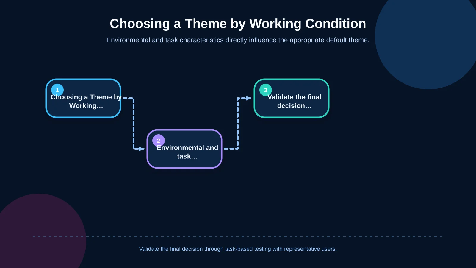
The useful question is therefore not “Is dark mode better?” but “For which users, tasks and working conditions does it produce better results?” A sound decision considers ambient light, time on screen, data density, text size, visual accessibility and the consequences of an error together. Where conditions vary, offering light, dark and system-matched options is usually more dependable than imposing one theme on everyone.
What does dark mode change in an operational dashboard?
Dark mode uses light text and interface elements on dark surfaces, a presentation known as negative contrast polarity. Implementing it properly involves much more than turning the page background black. Table rows, form fields, separators, charts, status colours, overlays, focus indicators and disabled controls all need to be redesigned for a new surface hierarchy.
This detail matters in operational software. A weakness that might remain a cosmetic issue on a marketing website can cause a shipping instruction to be misread or an alarm to be overlooked in a live operations environment. Cards drawn with nearly identical greys can lose their layering. Thin type can appear faint, while bold type may seem heavier than it does on a light surface. Nielsen Norman Group’s assessment of dark-mode usability issues also highlights the need to consider the visibility of layers, separators and floating elements—not only text readability.
When can dark mode be beneficial?
In low-light, controlled workspaces
In a night-shift control room, dim security centre or enclosed production booth, large white surfaces can become intrusive light sources. Dark mode may reduce the brightness difference between the display and its surroundings, softening the visual transition when an operator looks between screens, controls and physical equipment.
That advantage does not automatically make text easier to read. Small type, weak contrast and compressed rows can still undermine performance, even when the environment appears ideal for dark mode. Screen distance also matters: a wall-mounted production display and a desktop terminal may require different type sizes, spacing and brightness settings.
On monitoring screens that remain open for long periods
Dashboards used primarily to monitor stock movements, machine states, vehicle locations or service requests are strong candidates. If a screen remains active throughout the day, users check it in short glances and the interface relies on numerical states rather than continuous reading, reducing large bright areas can create a calmer monitoring field.
“Long use” alone is not a sufficient criterion. Light mode may still perform better during extended sessions involving accounting entries, explanations, contracts or other text-heavy content. Research reviews summarised by Nielsen Norman Group indicate that visual performance can often be stronger with light interfaces for users with normal or corrected vision. Monitoring time and reading time should therefore be assessed separately.
When a small number of critical signals must stand out
A dark surface can make a limited set of important signals more conspicuous when the hierarchy is carefully controlled. A production stoppage, temperature threshold or delayed shipment can attract attention through an icon, a concise label and sufficient brightness contrast.
If every state is rendered in saturated red, amber or green, however, the hierarchy collapses. Colour should support meaning rather than carry it alone. Errors, warnings and successful outcomes should also use labels, icons, shapes or patterns so that users can identify status without relying exclusively on colour perception.
When might light mode be the better choice?
In warehouses, vehicle cabins and field environments with strong daylight, dark surfaces can become difficult to distinguish because of glare and reflections. Raising display brightness may also eliminate much of the comfort dark mode was intended to provide. Light mode can be helpful when users frequently compare information on screen with printed paperwork because it reduces the visual jump between white paper and the interface.
Dense table scanning, long-form review, report comparison and repetitive data entry also deserve a light-mode evaluation. On ERP screens containing compact codes, dates and amounts, the primary task is often maintaining the correct row position. Dark text on a light surface may make letterforms and row boundaries clearer for many users. A single compulsory dark theme is especially risky when the workforce spans different ages, levels of vision and display quality.
Dark mode may also fail to create a coherent experience when the dashboard contains document previews, product photographs or maps with predominantly white backgrounds. If the navigation shell is dark but the task content remains bright white, the user still experiences abrupt brightness changes. Theme decisions must cover the real content used during work, not merely the application frame.
Dark, light or user-selectable: Decision criteria
One corporate default should not be applied blindly to every role. A shift supervisor monitoring alarms in a control room and an office user preparing purchase orders may access the same ERP data but perform fundamentally different work. The first detects changing states in low light; the second compares long tables and completes forms. Theme requirements should consequently be evaluated by role, device, environment and task.
- Dark mode: A strong candidate for low-light environments, prolonged monitoring, a limited number of critical indicators and screens with little long-form text.
- Light mode: Often more suitable for bright environments, dense reading, printed-document comparison and outdoor work.
- User-selectable themes: Usually the safest approach when the same system serves different shifts, devices, settings and user profiles.
- Task-specific views: A large monitoring display may default to dark while a connected data-entry module defaults to light.
When users can choose, the preference should be stored at account or device level rather than reset after each session. Following the system setting is a useful starting point. As MDN explains in its documentation for the prefers-color-scheme media feature, browsers can detect the operating system’s light or dark preference. Operational software should still provide an accessible in-product control so users can adapt to changing shifts and environments.
| Working condition | Preferred option | Reason for the decision | Point to check |
|---|---|---|---|
| Dim control room | Dark mode | Reduces the brightness difference between the screen and its surroundings | Small text and alarm contrast |
| Bright warehouse or field environment | Light mode | Helps preserve content distinction under glare | Outdoor test on the actual device |
| Dense tables and text | Light mode | May support extended reading and row tracking | Incorrect row selections |
| Different roles and shifts | User-selectable themes | Adapts to changing environments and user preferences | Preference stored with the account |
How can accessibility and readability be protected?
Dark mode is not synonymous with accessibility. Each theme must be validated independently. The W3C explanation of the WCAG 2.2 minimum contrast criterion specifies a ratio of at least 4.5:1 for normal text and 3:1 for large text. These thresholds are a starting check; font weight, display quality, ambient light and actual task performance must also be tested.
Pure black backgrounds and pure white text are not always ideal. Extreme contrast can produce a sense of glare or vibration for some users. Dark grey surfaces, off-white text and controlled intermediate tones may create a more balanced hierarchy. Conversely, softening contrast by making essential text too grey can erase information. Serial numbers, quantities, dates and status labels should be measured and tested on the displays used in practice.
Status must never depend on colour alone, particularly for users with colour-vision deficiencies or low vision. A failed row should include a meaningful label and icon as well as red styling. Keyboard focus, selected rows, required fields, errors and disabled controls must remain unmistakable on dark surfaces. Charts can add line styles, markers or direct labels instead of separating series only by similar hues. Zoom and operating-system high-contrast settings should continue to work.
Make the dark mode decision in five steps
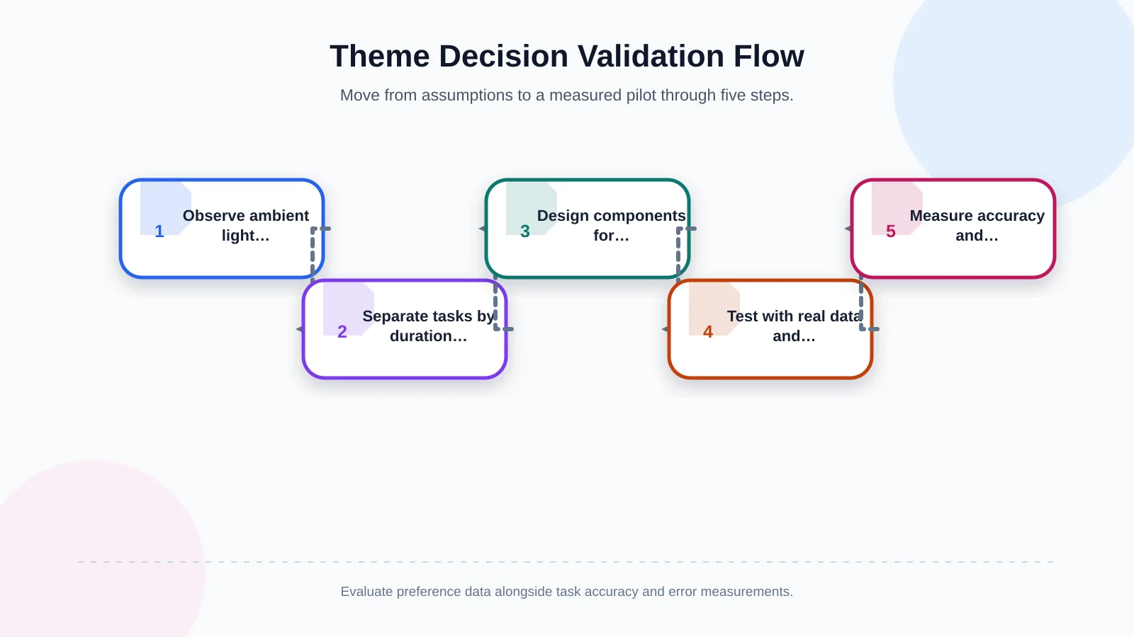
1. Observe the working environment on site
Record operating hours, ambient light, reflections, device types and viewing distance. An interface planned under office conditions may behave very differently on a warehouse terminal, rugged handheld device or wall-mounted manufacturing screen.
2. Classify tasks by duration and risk
Separate monitoring, searching, reading, data entry, approval and intervention. Identify where selecting the wrong row, missing an alarm or entering an incorrect quantity would have serious consequences. Visual preference must not take priority over reliable completion of critical tasks.
3. Design components for both themes together
Do not treat dark mode as a late colour inversion. Define surface, text, border, state and interaction tokens for both themes from the outset. Kumsal Agency’s Art Director-led digital design approach connects the visual language with functional hierarchy, brand expression and accessibility.
4. Test with real data and edge cases
Evaluate not only empty states but also tables with hundreds of rows, long product names, simultaneous alerts, inactive fields and connection failures. Include different display qualities, brightness levels, zoom settings and realistic viewing distances. Test complete workflows rather than isolated components so that transitions between dashboards, forms, maps and document previews are visible.
5. Measure outcomes during a pilot
Compare themes with representative users performing genuine tasks. Track completion time, incorrect selections, undo actions, missed alarms, support requests and stated preference. Subjective comfort matters, but it should not be the only criterion. For critical workflows, accuracy and detection time take precedence.
Why should operational dashboard design be planned with software architecture?
Theme design begins in the interface, but its long-term reliability depends on the underlying software. Role-based screens, stored preferences, real-time alarms, chart libraries, third-party modules and mobile terminals must follow the same design system. If later ERP modules introduce different colour rules, the meaning of critical states becomes fragmented.
Kumsal Agency’s custom web development practice considers user roles, real workflows, data structures and integration requirements together. In enterprise resource planning projects that connect finance, sales, inventory, purchasing, production and operational data, dashboard appearance cannot be separated from process logic.
This joined-up approach makes light and dark themes part of authorisation, state management, security and maintainable development rather than a superficial skin. It also allows teams to define different defaults by role or device without duplicating business logic, while shared tokens keep alerts and interactions consistent as the system grows.
Conclusion: The best theme is the one that fits the work
Dark mode can provide meaningful benefits in low-light spaces, on monitoring displays that remain active for long periods and on dashboards where a small number of critical indicators must stand out. Light mode may be safer in bright field environments and during dense text or table reading, small-type work and printed-document comparison. If several roles and shifts use the same platform, offering a choice is often more appropriate than enforcing one theme.
The decision should be validated through real task performance—not fashion, personal taste or brand colour alone. To plan a dashboard interface around your operational team’s working conditions, user roles and critical tasks, contact Kumsal Agency.