


Aydınlatma metni yükleniyor…
Changing the height of a button, the error behaviour of a form field or the structure of a card may look like a minor interface adjustment. In a shared design system, however, one component can affect hundreds of screens across corporate websites, e-commerce platforms, administration panels and mobile applications. A visually appealing decision can reduce accessibility; a technically simple edit can weaken brand consistency; and a solution designed for one product can cause regressions elsewhere.
For that reason, design system component changes should not depend on the personal approval of one designer, product manager or developer. A sound governance model brings together the design owner, the relevant product or business owner and the technical team, using agreed acceptance criteria. Accessibility, content, security and brand specialists should join when the risk calls for their expertise. The objective is not to create a large approval committee, but to involve the right people at the right point.
A component change needs a three-way decision structure
Final authority may vary with the scope of a request, but three perspectives should always be represented. The design owner protects the visual language, interaction patterns and integrity of the system. The product or business owner validates the user need, business value and priority. The technical owner assesses feasibility, dependencies, performance and long-term maintenance. This prevents arguments such as “it looks better”, “the client requested it” or “it is easy to code” from becoming sufficient grounds for approval.
What the design owner approves
Depending on the organisation, the design owner may be a Design System Lead, Product Design Lead or Art Director. This person examines whether the proposal fits the brand character, existing design tokens, component states, visual hierarchy and relationships with other patterns. They should also ask whether a new variant is genuinely necessary or whether the need can be met through an existing option and clearer usage guidance.
Kumsal Agency’s Art Director-led digital design approach treats brand direction and product interfaces as parts of the same decision system. This helps teams preserve a recognisable visual language without ignoring the practical behaviour required by websites, software and mobile products.
What the product or business owner approves
The product or business owner confirms which user problem the request solves, which commercial objective it supports and why it should be addressed now. A component intended for a single short-term campaign should not automatically receive the same priority as a change that improves purchasing, registration or quotation journeys.
This role must also define success before implementation. The relevant measure might be task completion, form errors, support requests, conversion, abandonment or time on task. Without a measurable outcome, the team may release a technically correct component without learning whether it produced a meaningful improvement.
What the technical owner approves
The frontend or mobile engineering owner reviews the effect on code architecture, API contracts, browser and device support, performance and test coverage. They establish whether the change is backward compatible, breaks existing props or parameters, or alters analytics, data handling or authorisation behaviour.
The same visual component may have separate implementations across the web, React Native and e-commerce environments. Approval therefore cannot be based on the design file alone. The technical review must cover the production implementations, their consumers and the cost of keeping them aligned over time.
Decision flow from change request to release approval
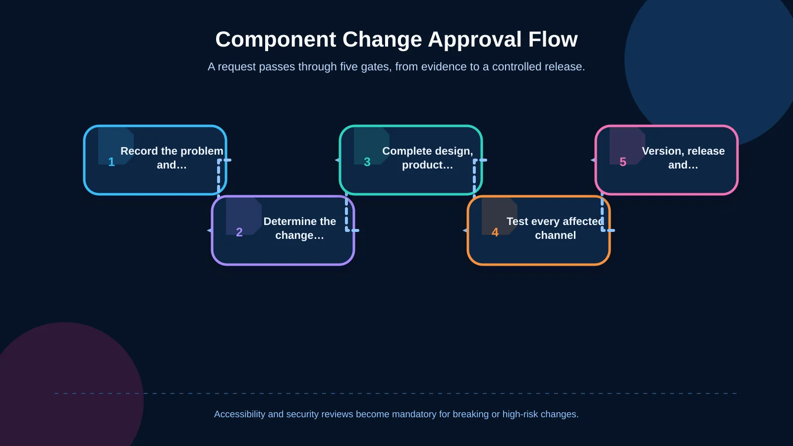
The approval process should be visible, evidence-led and short enough to avoid unnecessary meetings. Every request can begin with the same template, while low-risk visual corrections and changes affecting user behaviour or data flows follow different review paths.
1. Define the problem and attach evidence
Begin the request with the observed problem rather than a preferred solution. Record the affected users, screens, channels, frequency of use and current behaviour. Evidence may include user research, analytics, support tickets, accessibility testing or a documented defect. If evidence is insufficient, move the proposal into a discovery queue instead of rejecting it outright.
2. Establish scope and change class
Classify the request as a fix, minor improvement, new variant, breaking change or new component. Correcting a colour token and changing the keyboard behaviour of an input do not require the same level of scrutiny. Classification determines the required approvers, test depth, version type and release communication.
3. Complete design, product and technical review
The design owner checks system consistency, the business owner validates need and priority, and the technical team assesses implementation. For interactive components, accessibility should be a distinct acceptance gate. The W3C’s ARIA Authoring Practices Guide offers guidance on roles, states, properties and keyboard interaction for common interface patterns. Its examples are not a ready-made production design system, so teams must still test against their users, content and technology stack.
4. Run impact analysis and prototype testing
Use the component inventory to identify every affected screen across websites, mobile products, e-commerce platforms and administration tools. Test relevant states such as default, hover, focus, active, disabled, loading, empty, error and success. Include content expansion, localisation, zoom, keyboard use and screen-reader behaviour.
The GOV.UK Design System’s component contribution criteria expect published solutions to be useful, consistent and adaptable across contexts, as well as tested with browsers, assistive technologies and devices. That principle provides a strong foundation for internal acceptance criteria.
5. Version, release and monitor the result
Publish the approved change under the same version across the design library, code package and usage documentation. For breaking changes, provide a migration guide, a deprecation date and named teams responsible for adoption. After release, monitor defects, usage and business outcomes, and keep a tested rollback plan available.
The U.S. Web Design System component lifecycle makes maturity visible through statuses such as experimental, stable, use with caution and deprecated. A similar model tells internal teams how confidently they can adopt each component.
Who must approve each type of change?
Sending every request to every specialist slows delivery. Defining no thresholds at all creates uncontrolled change. A practical model specifies mandatory approvers and consulted roles for each change class.
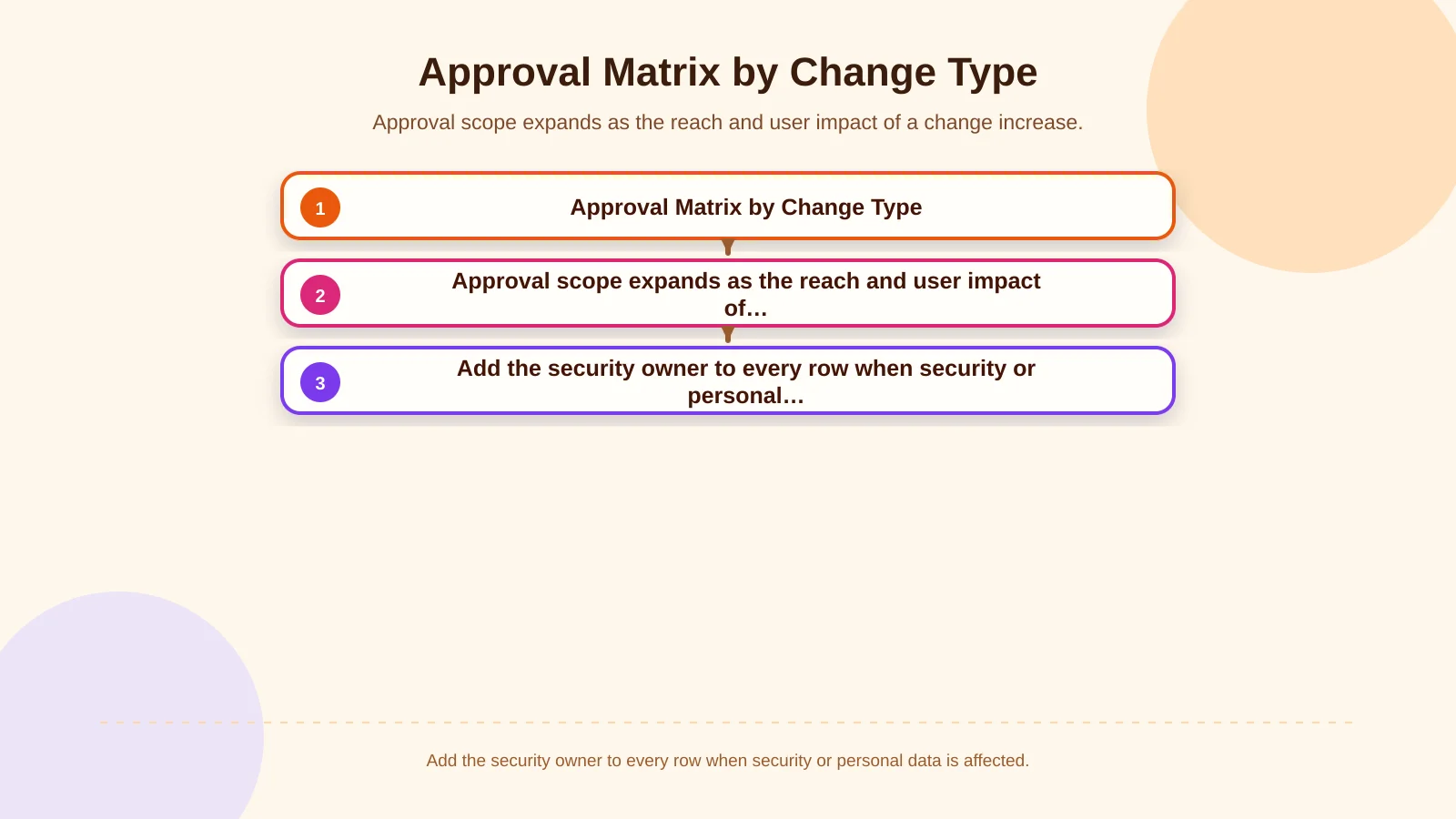
A documentation typo may require only the system owner’s approval. Changes to token values, spacing, icon sizes or typography affect visual consistency and generally need both design and technical review. Requests that alter user journeys, form validation, checkout steps or permission behaviour also require the product owner. If personal data, authentication or payment information is involved, security and compliance owners must join the process.
A new component or a breaking change requires the highest review level. In addition to design, product and technical approval, teams should examine real-user testing, accessibility validation, migration cost and channel reach. The decision record must show not only who approved the proposal, but also which evidence supported it and which residual risks were accepted.
| Change | Mandatory approval | Additional control | Release condition |
|---|---|---|---|
| Documentation correction | System owner | Content accuracy | Patch release |
| Visual token or variant | Design + technical | Screen regression review | Cross-channel testing |
| Interaction behaviour | Design + product + technical | Accessibility | Acceptance testing |
| Breaking change or new component | Three-way council | User testing and migration impact | Major release and migration guide |
Five criteria for approving a component change
Brand and system consistency
The proposal should align with established colour, typography, spacing, motion and icon principles. Consistency does not mean making every channel look identical. Touch targets on mobile, keyboard focus on the web and information-dense product interfaces in e-commerce may require different treatments. Teams can preserve shared principles while defining platform-appropriate behaviour.
User need and usability
A change should address a genuine user problem, and the proposed interaction should be understandable in testing. One stakeholder’s preference or the discovery of a similar pattern in a competitor product is not sufficient evidence. Frequently used forms, navigation, search, cart and checkout components deserve prototype testing focused on successful task completion.
Accessibility
Turn contrast, visible focus, keyboard order, accessible names, error identification, screen-reader announcements and touch-target size into acceptance criteria. Accessibility is part of the design decision, not a general check performed just before release. Visual approval is insufficient if an interaction works only with a mouse or communicates status only through colour.
Technical feasibility and security
The technical team should assess dependencies, data contracts, performance cost, automated tests and security exposure. Visual revisions to file uploads, sign-in, payment or personal-data forms can conceal functional risk. Connecting interface decisions with a sustainable implementation plan is central to Kumsal Agency’s custom web development approach.
Impact on existing screens and channels
Do not assess a change only through the new screen that prompted it. Teams need to know which products use the component, how many variants exist and which versions remain in production. A React Native implementation may not expose the same properties as its web counterpart. An e-commerce platform may add dependencies through themes, payment extensions or campaign rules. Approval without an impact inventory increases the risk of hidden regressions.
How to establish a RACI-style responsibility model
For each component family, identify the person responsible for the work, the accountable approval owner, specialists who must be consulted and teams that need to be informed. For form components, for example, a design system designer may carry out the work; the Design System Lead approves the design decision; the frontend lead approves the technical decision; and the product owner confirms business priority. An accessibility specialist may be consulted, while web, mobile and e-commerce teams are kept informed.
Accountability should not give one person unlimited veto power. If a mandatory criterion in design, product or engineering is not met, move the request to “revision required” rather than simply “rejected”. If disagreement remains, escalate the decision to a predefined product or design system council and record the reasoning and accepted risk. Decisions then depend on visible criteria rather than personal authority.
Common design system governance mistakes
- Updating the design file without aligning the code library and documentation.
- Judging requests by visual preference without seeking user evidence.
- Sending minor corrections and breaking changes through the same approval path.
- Assuming a component tested on the web is automatically safe on mobile and e-commerce channels.
- Reducing accessibility review to colour contrast alone.
- Deprecating a variant without a removal date or migration guide.
- Naming the decision owner but failing to assign ongoing maintenance ownership.
To prevent these failures, the component catalogue should record the owner, lifecycle status, supported platforms, most recent review date and known limitations. A single change record should bring together the problem, evidence, affected versions, acceptance criteria, test results, approvers and release plan.
How to implement an approval model in your organisation
Begin by inventorying existing components and the channels in which they appear. Assign design and technical owners to component families, define change classes and specify the mandatory controls for each class. Then standardise the request template, decision record, test environment, versioning model and release communication.
Pilot the process with a small team and a heavily used component family such as buttons, inputs or modals. Track average decision time, requests returned for revision, post-release defects and screens left on an old version. Simplify approval thresholds if the process creates avoidable delays; strengthen impact analysis and testing gates if regressions reach production.
Kumsal Agency combines Art Director-led experience design with custom web software, e-commerce development and React Native mobile application development. This allows component decisions to be evaluated not only in a design library, but also in terms of real product behaviour, performance, security and sustainable maintenance.
Conclusion: Assign approval authority according to risk
Design system component changes should be approved by roles representing the impact of the decision, not by one individual. The design owner protects system and brand integrity; the product or business owner validates user need and business value; and the technical team safeguards feasibility and maintainability. Accessibility, security and content specialists become mandatory participants when the associated risk is present.
Effective governance is not about collecting more signatures. It means defining the request with evidence, making its impact visible, testing it against appropriate acceptance criteria and releasing it through a traceable process. Plan component ownership, approval stages and cross-channel impact controls for your web, mobile and e-commerce products with Kumsal Agency.